
TOTAL # OF ARTISTS INTERVIEWED: 69
TOTAL # OF ARTISTS WHO CREATED THEIR OWN ALBUM ART: 31
TOTAL # OF ARTISTS WHO MENTIONED KANYE WEST: 6
TOTAL # OF PHOTOGRAPHY-BASED COVERS: 21
TOTAL # OF PAPER COLLAGE-BASED COVERS: 6
TOTAL # OF SKULLS: 41+
TOTAL # OF ANIMAL-RELATED BAND NAMES: 10
TOTAL # OF ANIMALS: 6
TOTAL # OF SHARKS: 2
This article is our big wrap-up piece for 2010, and it was a long-time in the making. We hope you enjoy it.
#90
Wow & Flutter
Equilibrio!
Mt. Fuji Records
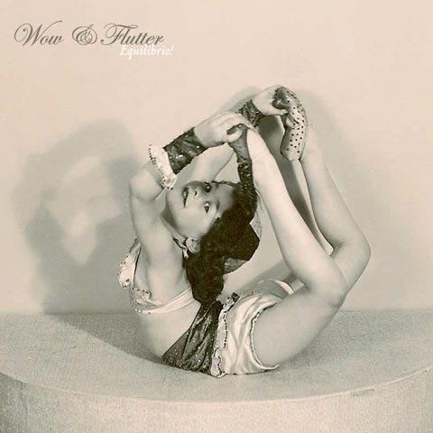
You know how sometimes things just work well for a title? Well, Wow & Flutter’s title for its latest LP, Equilibrio!, definitely fits that description. In case you are unaware, “equilibrio” is the Italian word for “balance,” and Wow & Flutter’s frontman, Cord Amato, describes what such a title means for the album, saying, “The Balance of Life is an underlying theme that keeps recurring throughout the album. I’m part Italian, so Equilibrio seemed like a good fit. Our bass player wasn’t totally sold on the title until we added an exclamation point, thus it became Equilibrio!.”
On the cover of Equilibrio!, we find a child bent in a circular shape staring at the camera, a dandy smile on her face. “I got a bunch of old photos from my aunt and found these great old dance photos that my grandfather took of my mother,” says Amato. “I liked them so much I decided to scan them at a high resolution and use them for the album art. I did some minor Photoshop touch-up work, but that was about it.”
Maybe it was chance or divine destiny, but when Amato stumbled upon this picture, the gods smiled and granted him with the knowledge that this photo was perfectly made for Equilibrio!, and for this incarnation of Wow & Flutter. After years of making music, the band has finally found a sound that’s not too crass and not too indie; Equilibrio! comes off as the most rounded out and balanced version of the band’s music so far. Magnifico!
About The Artist
Cord Amato is the band’s frontman, who is a production designer for a ski company, by day. – www.wowandflutter.net

#89
Shellshag
Rumors In Disguise
Don Giovanni Records
Remember making mixtapes back in the ’90s? It was hard work, trying to sequence each song correctly to make the perfect mix. Nostalgia for mixtapes hits you like a hurricane when you see the cover for Shellshag’s second full-length album, Rumors In Disguise. Displaying two rows of tapes and recordings from all their years together, the cover serves as a visual timeline of the band. If you look carefully, you’ll find inside jokes, alternate titles, and future projects — all awaiting your curious eye.
The band’s previous album, Destroy Me I’m Yours, boasted similarly telling album artwork. “The picture reveals the environment that the band operates in and shows years of flyer [and] all the music gear acquired/used throughout the years…” says Shellshag. For the band’s latest album, they wanted to take the same approach.
“… All we knew for sure is that we wanted the art to have a similar busy feel and to come from a place of truth, realness, and to once again reflect Shellshag’s deep history,” the band explains. They took the route of carefully hand-selecting each tape on the cover, “… using some for inside jokes to ourselves and friends, some that had alternate titles we had once considered, some that have the original demo recordings of the songs we used on the album, and others just cause they looked cool.”
The selected tapes were arranged, and the scan was used directly for the album cover. “It is our personal history, which, after 15 years, deeply defines the band,” the band members explain.
As a band known to embrace garage bands and the DIY scene, Shellshag leaves itself bare and open with its music, extending an invite to all who are willing to find it. It’s no surprise, then, to see a cover that graciously and humbly does the same to the peripheral.
About The Artist
Shellshag took art direction and photography into its own hands. – www.starcleaner.com
#88
Florene
Homemade Extacy
Waaga Records
The brothers behind the artwork for Florene are art lovers, first and foremost.
“We used to dream of becoming musicians, but we spent way too much time developing the band logo or album art rather than practicing guitar,” say Justin and Preston Deanda. “Likewise, when we dreamed of becoming pro skaters, we always spent all our time drawing deck art instead of practicing ollies. If you can do both really well, then you should keep doing it.”
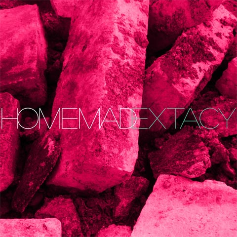
With the artwork for Florene’s Homemade Extacy, the Deanda brothers worked off of an existing vision Florene had.
“The band had an idea of what they wanted aesthetically, and there was a visual language already existing in their past materials that we wanted to carry forward,” the Deandas explain. “Once we heard a few tracks, it was clear how it should look.”
They treated a digital photograph of “lots and lot of concrete” to create what looks vaguely like homemade ecstasy, adding the right colors and clean typography to tie the cover stylistically back to Florene’s brand of electronic music.
About The Artists
Graphic design by brothers Justin Deanda and Preston Deanda, of The Eastsiders. – eastsiders.tumblr.com
#87
Dinowalrus
Bead
Kanine Records
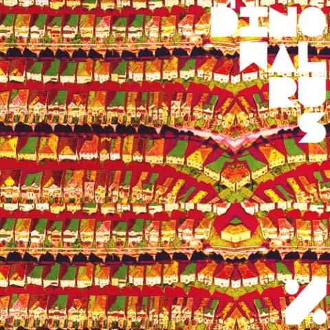
Based off of a found Wikipedia image of a suburban neighborhood as seen from above, the album cover for Dinowalrus’ % is a neon-colored delight in photo manipulation.
The piece was created by guitarist Pete Feigenbaum, who approached the project with only a loose conceptual idea. “I just started jamming and riffing until something stuck. I knew I wanted something textural, repetitive and abstract… to reflect our blown out psychedelic tendencies,” Feigenbaum says. “I wanted something that was very explosive and colorful and playful, while still being mysterious and slightly ominous.”
Feigenbaum pulled images from his archives and utilized a combination of Photoshop and general digital street smarts to create the piece.
“I have accumulated an archive of images that might be good source materials for album artwork…” says Feigenbaum. “The image in question was an image I found on Wikipedia, taken by a Canadian aerial photographer named Ian Duke. It had a hand-drawn, collagey, and flat look even in its original form, so I knew it would be a great starting point.”
As the image had a Creative Commons License, Dinowalrus was allowed to use the image without attaining any official clearances. For Feigenbaum to create his band’s album artwork resulted in a special experience, and Feigenbaum is not afraid to name-drop the visually-talented musicians he admires. He gives props to RISD bands like Javelin, Fang Island, Black Dice, and musicians with design firms and illustration collectives, like Nolen Strals from Double Dagger and Post Typography, and AIDS Wolf from Seripop, respectively.
About The Artist
Artwork created by band member Peter Feigenbaum, who is an installation artist; his current project is called Trainset Ghetto, for which he “created a hyper-real simulacrum of decaying NYC in the ‘80s using miniatures… built from scratch and then photograph[ed].” www.dinowalrus.com/sights.htm + www.peterfeigenbaum
The Extras
“The back cover is the inverse colors of the front cover,” describes Feigenbaum. “The typography utilizes our bands’ “official” font, Packer. I like arranging type to create triangular motifs that evoke the tusks or teeth of the mythical dinowalrus, so I did this here, too.”
#86
Thieves Like Us
Again And Again
Shelflife Records
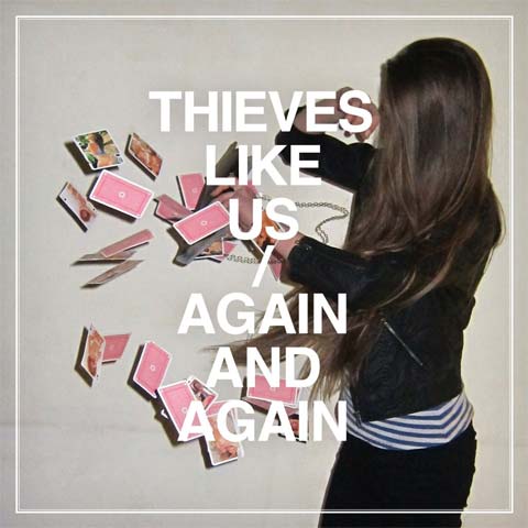
The cover artwork for Thieves Like Us’ Again And Again evokes a nostalgia about past mistakes. Designers Mattias Jakobsson and Peter Ström worked with the band, who chose the centerpiece photo for the album cover. From there, Jakobsson and Ström stepped in.
“With [Thieves Like Us], we have a bit different approach compared to our other projects… we are very good friends with Björn, Andy and Pontus and therefore work more intuitively than usual,” explain Jakobsson and Ström. “All TLU albums are based on the same dogmatic concept: visual references to the musical references in TLU’s work, short [turnaround] times… and a kind of lo-fi approach to the details.”
About The Artists
Design and typography by Mattias Jakobsson and Peter Ström of Konst & Teknik. – www.konst-teknik.se
#85
Keegan DeWitt
Nothing Shows EP
Daytrotter’s Record Barn
BUY / DOWNLOAD THIS ALBUM
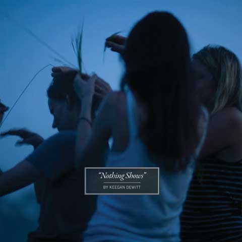
According to Keegan DeWitt, his musical project as having “little to no funds for artwork.” Hence, doing what many musicians do — relying on oneself and one’s resourcefulness for album artwork.
“I am a fan of so many talented photographers, but at some point, you can’t convince people to be endlessly charitable,” DeWitt says. “It’s this balance of first discovering the images, and then trying to not get your hopes up too much in case you can’t get rights or [can’t] afford the rights. For this artwork we went through two different photographers and sets of photographs before, at the very last minute, we stumbled onto the photography of Benjamin Alsop.”
Alsop, a good friend of the photographer of Keegan DeWitt’s first full-length, Islands, had captured this cover photograph during an evening he and his friends had spent out in a misty field in rural New Jersey. Coincidentally, the photo was taken where DeWitt had shot the cover for Islands, although the two images were taken on separate occasions.
In the photograph, a group of friends is facing out into a field; people have their backs to the camera, some blurred and some in focus. Captured in these shots is what DeWitt refers to as “the brevity of special moments.”
“There is something about [the picture] that makes you think of being in the midst of it, not wanting it to end,” says DeWitt. “I am always really driven by a term coined by Walker Percy where he refers to a “sad little happiness” – [of] these sad, simple, beautiful, clear, calm, amazing moments in life that are super brief and operating on a super low frequency. The idea that you can be standing in the middle of this field in the foggy mist with everyone, and no one is saying anything, but quietly, everyone knows that in this moment, they are all closer than they probably will be again, and they all understand something essential about themselves.”
Most of the inspirations behind Nothing Shows come from sources outside of music, many of them literary. “Most of my writing springs from photos, film, [and] literature rather than hearing other music, so visuals are a very large piece of the writing/development process,” says DeWitt. “For every release, large or small, I’m always pretty picky about the art… The artwork has to excite people’s imaginations without spoiling any of the mystery, and most importantly… it has to give some clue about the density of everything that maybe the music can’t.”
About The Artists
Photography by Benjamin Alsop. – web.mac.com/benjaminalsop
Layout and typography by Ralph Lauren.
Concepts by Keegan DeWitt.
#84
Four Tet
There Is Love In You
Domino Recording Company
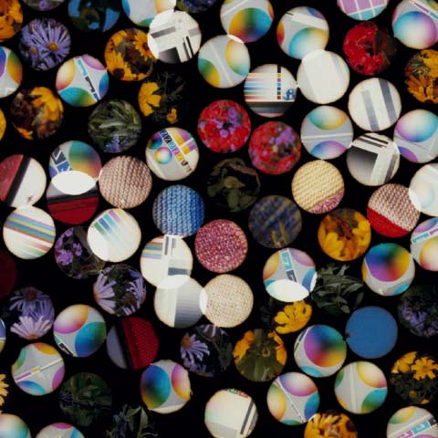
The circular shapes on the cover of There Is Love In You initially come off as 1″ buttons scattered on a black surface, but closer inspection reveals what looks like projections displayed through microscopic holes. Whether that is true or not, the overlapping of shapes and slight blending of surfaces makes for interesting connections — which are perhaps representative of human connections?
About The Artist
Design by Matthew Cooper.
Design and photography by Jason Evans. – www.jasonevans.info
#83
ESKMO
Self-Titled
Ninja Tune
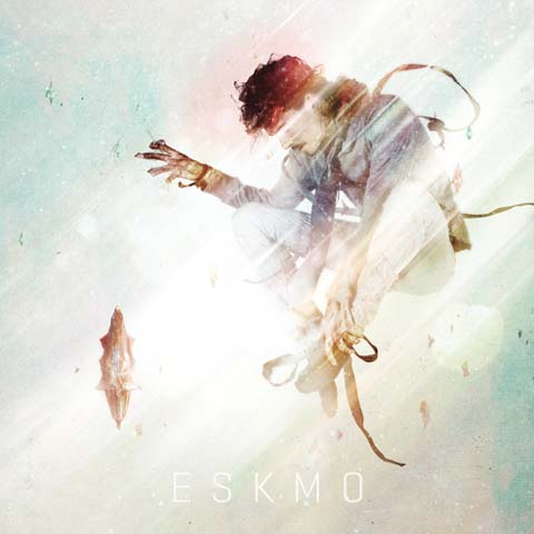
ESKMO’s self-titled album features artwork with ESKMO jumping through the air, diagonal lines of refraction and light whipping through and over his body, each piece of movement like the individual notes and layers of his music.
Creation began with a basic visual theme concocted by ESKMO himself, which aimed to capture vibrant colors and energy emanating from his body.
“I came up with the idea of having him levitate, and we pretty much went from there,” says designer and photographer Karol Lasia. Lasia had been speaking online with ESKMO for a few years prior to the collaboration, and the two had been desiring to work together for a long time.
“We started out with photography of Eskmo jumping up and down on a trampoline in all sorts of weird poses. I then chucked the best ones into Photoshop and edited them,” Lasia explains. “Altogether, the cover also incorporates paint, scanned materials and 3D models.”
About The Artist
Designed and photographed by Karol Lasia, an artist based in Amsterdam. – www.khomatech.com
#82
Acid Tiger
Self-Titled
Deathwish Inc.
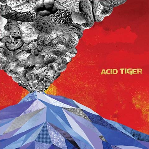
Prior to becoming a member of Acid Tiger, illustrator and designer Adam Wentworth was enlisted to create the album cover for the band’s self-titled debut release.
“There was a pretty solid concept from the start. The artwork for this record was very much a collaboration with [vocalist] J. Rattlesnake. He had the initial idea and was essentially the art director for this project,” explains Wentworth. “There had always been this idea of bees and brains, or bees in the brain, associated with the band as they would write material. The plan was to take that idea and filter it through the collage-y and hand-done treatment that a lot of old riff-rock records had.”
For inspiration, the two looked at great record covers from the past, including Steppenwolf’s 7, ZZ Top’s Tres Hombres, as well as pieces by Superstudio and Kate Gibb.
“[J.] brought in sketches of his idea for the cover composition, as well as the inside spread,” says Wentworth. “I used his sketches as a base and built everything on top of them digitally in Photoshop. Originally, we wanted to build the artwork by hand, but due to time constraints and to allow for easier revisions down the road, we decided to do it all digitally.”
As Wentworth generally works as a commercial designer, he mapped out and set timelines for the creative process. “I approached the workflow in a different manner than I usually would have and set time limits on how long I could spend on one element or action, and there were certain tools I wouldn’t allow myself to use,” Wentworth explains. Once the cover spread was approved by the band, Wentworth and J. Rattlesnake loosened up the process for the inner spread and engaged in what Wentworth calls “somewhat of a Photoshop tennis match.”
“We kept the file in a Dropbox so we could both access it and make changes in color and basic shapes,” he explains. “Once we were happy with the base, I began adding textures and J. did any final color correcting needed.”
About The Artist
Design by Adam Wentworth, who is an illustrator and designer for commercial broadcast projects and occasional interactive installations. “I would like to do more work with music and bands in the future, but it’s a matter of scheduling, usually. I spent most of 2010 working on a network rebrand, which was rewarding but an incredibly intense project that prevented me from taking on any side jobs. Hopefully, in 2011, I can have a bit more variety in the projects I’m able to work on,” Wentworth says. – www.adamwentworth.com
Concept and additional design by J. Rattlesnake, vocalist of Acid Tiger.
The Extras
“It was strange that this record, which features a large, erupting volcano on the cover, was released the same week that a large, erupting volcano was discovered in Iceland,” jokes Wentworth. “Eyafjallajökull clearly ripped us off, as the artwork was completed months before its actual release date in April.”
#81
The Phantom Band
The Wants
Chemikal Underground
UK indie rock band The Phantom Band loves to take album art into its own hands. For 2010’s The Wants, the band continues its pattern of creating artwork with an extremely eclectic and all-encompassing bent.
To connect the artwork for The Wants with the band’s last release, Checkmate Savage, keyboardist Andy Wake says he knew that he wanted something which was “quite immediate and had plenty [of] colour, with some semblance of narrative.”
While guitarist Duncan Marquiss spearheaded the design of Checkmate Savage, Wake was in charge of the artwork for The Wants, and decided to further the band’s visual identity with another collage that felt subtly off-kilter.
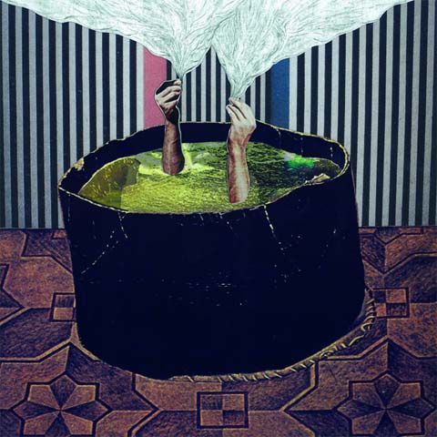
“I decided that another collage would be a good idea… with a similar, not-quite-symmetrical composition to it, that would help further a general Phantom Band aesthetic,” says Wake. The image is a collage with a bit of pencil drawing; it is surreal, with hands poking upwards out of what looks to be a cauldron.
For Wake, the pattern of musicians creating their own artwork echoes changes in the music industry. “The main thing, I suppose, is money,” he says. “Paying a designer to produce images is now a real luxury for many, and a superfluous expense for most, so it’s happening less and less…
“But another factor is that, while the internet may be instrumental in helping the music industry run out of cash, it is also removing geography as a factor in the distribution of music. A listener can just as easily buy an album by an artist on the other side of the world as they can by an artist who lives next door to them,” says Wake. “Artists and labels seem to be trying to find ways of re-personalising the music. Artists producing their own artwork, both as album covers and as ‘extras’ to give their records more appeal is, I think, one of the ways in which they are doing this.”
About The Artists
Artwork by The Phantom Band. “Even if an individual in the band takes the lead on the album artwork (so far we’ve taken turns), it is still a completely collaborative process — one where every band member is invited to contribute, discuss, veto,” says Wake.
Front cover collage by keyboardist Andy Wake, who is also a mixed media and multi-disciplinary artist, primarily in gallery contexts. – www.phantomband.co.uk
The Extras
“I wanted the artwork throughout the album to be quite eclectic so that, even though I did most of it, it would look like it could have been produced by a whole team of different artists, because that’s something that I think is reflected in our music, in changing direction from one song to the next,” says Wake. “A few of the images within the booklet are done by other band members Duncan and Greg, plus two guest artists.” The back of the album is charcoal and pencil on coral-colored paper, while the inner sleeves contain a manipulated found photograph, two pencil and charcoal drawings, a watercolor by Duncan, and a hand-written tracklist.

#80
Superhumanoids
Urgency
Hit City U.S.A.
In a time where an album’s title has generally lost meaning as a central theme, Superhumanoids’ Urgency gets a gold star for following the rules. With a cloud of exhaust on unpaved ground, in their debut EP, Superhumanoids create an album that fiends and scoundrels might listen to as they escape from the law and the fear of old age.
Front and center, the album artwork features a photograph from UK photographer Alex Howard. Howard was solicited by band member Cameron Parkins and art director Hassan Rahim.
“Cameron and I both subscribe to some great blogs in our RSS feeds, and one particular photographer and one of my favorite photo blogs caught my eye,” Rahim explains. “We decided to contact the photographer, named Alex Howard, with the idea we had, and he supplied the perfect photograph. I aimed to make the design complimentary to the image.”
The rest of the project was largely a graphic design-based affair, with Rahim taking the reins. As he had previously worked with the band before, the rest was smooth sailing.
This release is the perfect soundtrack for a drive down the coast or lonely nights speeding through the desert. It’s music that reminds us to live the life we all know won’t last. Like the cover and the music insinuates, you need to listen to this, urgently.
About The Artists
Photography by Alex Howard. – www.alex-howard.co.uk
Art direction by Hassan Rahim, who utilizes photography and mixed media to create strong contextual pieces which are both appealing and alarming to an audience. He is also part of Them Rag, a magazine by Los Angeles-based artists. – www.hassanrahim.com + www.themrag.com
The Extras
The LP release was limited to 300 copies with red vinyl.
#79
Tyvek
Nothing Fits
In The Red Recordings
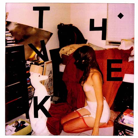
Detroit-based garage rock band Tyvek has taken its raw and raging tendencies and channeled it into an album cover for Nothing Fits. The piece merges an uncomfortable, confounding Polaroid with a typeface the band has grown accustomed to and even slathered onto its drum kit.
About The Artist
Photography by Christine Brache (also known as ZzzZz).
#78
Sun Airway
Nocturne Of Exploded Crystal Chandelier
Dead Oceans
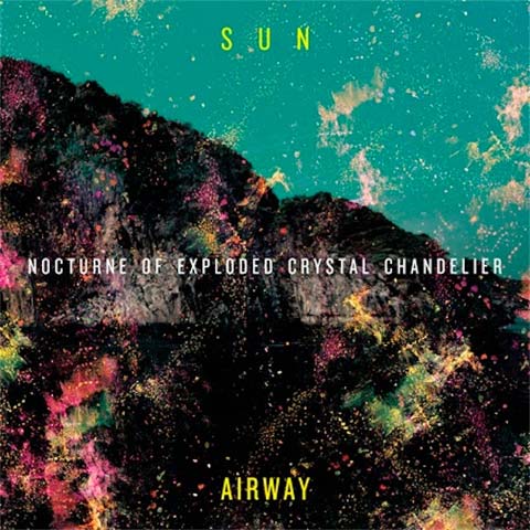
Sun Airway member, Jon Barthmus, captures the band’s spacey pop style in his design for Nocturne Of Exploded Crystal Chandelier.
“I wanted [the album cover] to be based on instinct and not be literal at all. I just wanted to create a visual equivalent that would stir up the same set of feelings as the music itself,” Barthmus explains. “Artwork is extremely important to an album as a whole. It’s part of the gestalt of the whole thing. the audio and visual will remain married together for all time, and it’s usually the visual that comes first.”
But Barthmus is quick to say that having band members create a band’s visuals is not always the best idea. “Sometimes it can work out great, but often you run the risk of having an artist who is great at songwriting but not great at visuals, despite his best efforts,” he says. “I probably wouldn’t have taken this on if I wasn’t a graphic designer or artist in real life.”
Given just how accurately Barthmus captured what he set out to do, one can only imagine that he probably created the artwork while listening to the disc on repeat. The cover was created almost entirely in Photoshop, the result of a digital, stylized collage. Typography was handled in Illustrator and imported into Photoshop.
About The Artist
Artwork, design, and layout created by band member Barthmus, who is also a graphic designer and builder of furniture. – www.sunairway.com
#77
Clipd Beaks
To Realize
Lovepump United
Northern California-based psych-rockers Clipd Beaks’ latest record, To Realize, seems to inspire introspection and meditation, by way of a textured wall of drone, noise, and distorted, layered miscellany. The band simply creates music which seems to go with the intangible ebbs and flows of life, and when one sees a live performance by Clipd Beaks, it becomes obvious that the band members are lost in their own instrumental wrangling.
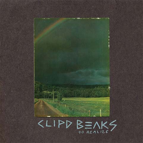
Sometimes, when one goes with the flow and plans only loosely, opportunity presents itself and coincidences make themselves significant with little to no effort. The image on Clipd Beaks’ hand-crafted cover for To Realize was designed by the band’s vocalist and frontman, Nick Barbeln, and its photograph was a thrift store find from around the time of the band’s formation a whopping eight years ago, in Minneapolis.
“Someone out there had framed this photograph of a country road below a heavy ominous black sky, and had painted the frame black to match,” Barbeln explains. “It’s a very introspective image that has always moved me a great deal, and when we ended up making this record that lyrically and thematically was all about introspection, I took this picture — that I had been living with all this time through the different homes I’d been in these past eight years… and scanned it for the cover.”
And when Barbeln removed the picture from it frame, he was in for yet another pleasant cosmic surprise.
“It had a prayer on the back,” says Barbeln, “that said, ‘… forever and ever, a world without end.'”
About The Artist
Artwork by Nick Barbeln, vocalist and frontman of Clipd Beaks. – http://www.facebook.com/pages/Clipd-Beaks/49270968289
#76
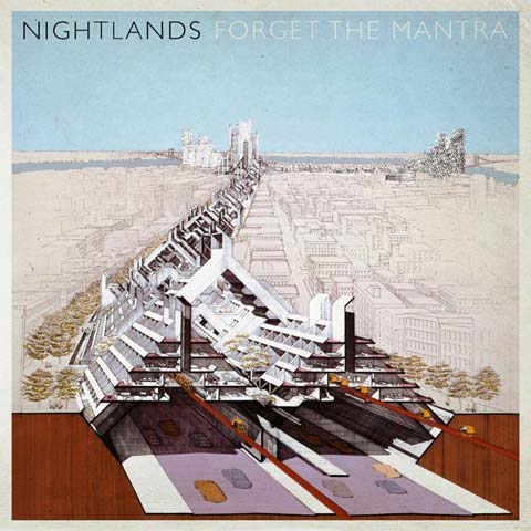
Nightlands
Forget The Mantra
Secretly Canadian
When listening to the airy textures of Nightlands’ debut album for Secretly Canadian, Forget The Mantra, one certainly can infer that the band might be interested in space and otherworldly things. The case is only strengthened by a look at the song titles, which include “Glass Vaccuum,” “Longways Homebound, 2010,” and “Fly, Neanderthal.”
It turns out that Dave Hartley, the man behind Nightlands, really is a huge fan of sci-fi.
“I wanted the Forget The Mantra art to have the vibe of a ’60s or ’70s sci-fi paperback cover, and the Paul Rudolph illustration fit the bill perfectly,” he explains.
The cover image was created by late artist and architect Paul Rudolph, who donated a large number of his drawings to the Library Of Congress after his passing. After Secretly Canadian’s in-house designer, Daniel Murphy, located the image, it was approved by Hartley, who describes the artwork by saying, “It’s like a utopian city on a futuristic desert island… The cover needed to be simultaneously both detailed and mysterious, with a sense of looking to the future through the prism of the past.”
Rudolph’s piece fit this description on multiple levels. “This illustration has unfinished portions; these pencil outlined parts remind me of a dream — the way it is always writing and recreating itself on the periphery,” Hartley explains. “I’m really thankful to have my music paired with an image as beautiful as this.”
About The Artist
Original image created by the late Paul Rudolph, an American architect known for his complex floor plans.
Design by Daniel Murphy, Secretly Canadian’s in-house designer.
#75
The Bandar-Log
AK-747
Self-Released
Unlike many album cover artists who run free with their own interpretations of a band’s muic, Nils Larsen, a friend of The Bandar-Log, basically followed the band members’ artistic directions to create the artwork for AK-747.
“Part of what made doing this record so fun to work on was that they already had a pretty strong idea of what they wanted and were great about communicating their ideas,” says Larsen. “The original concept involved the great white hunter character standing aside an atomic bomb which has seemingly been shot down in a safari hunt.”
Through the creative process, the original concept morphed slightly. “Dave [Norwood] came to me and was talking about going in a different direction and had this idea for a shaman character,” Larsen explains. “They were good about keeping me in the loop with any new decisions, as well as being patient with me, as I have never done any package design before and was sort of stumbling through with some additional software woes that befell me.”
Nearly the entire album artwork was done on the computer, for editing ease. The final product is equally whimsical as it is epic.
About The Artist
Artwork by Nils Larsen.
Art direction by The Bandar-Log.
#74
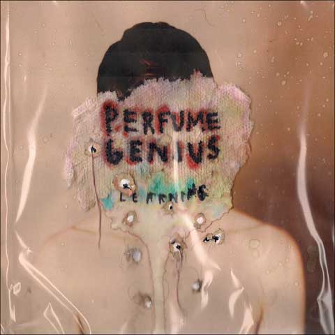
Perfume Genius
Learning
Matador Records
Holistic and nostalgic, Learning is an album that captures dirty and scarred portraits of humanity. Promotional materials for Learning included promo photos in where Mike Hadreas, aka Perfume Genius, had a swollen face and black eye, but even when one keeps that photo in mind, the creative process behind the artwork for Learning is quite gnarly.
“I started with close-ups of skin textures I printed from the internet. I wet some paper towels and pressed them in to the print-outs while the ink hadn’t fully dried, which would produce these fragile little scraps that looked like scabs or peeled skin. I applied them around a portrait in such a way and used acrylics mixed with some thumb-blood and spit to paint the rest,” Hadreas describes. “At one point, I buried the whole thing in the yard for a while. There is also some hair and various things slopped on. I understand this process makes me sound like a goth hippie, which is accurate.”
“I knew I wanted it to be fairly disgusting, but only if you looked closely,” Hadreas continues.
The deteriorating image, creating using everyday objects, utilizes melting faces and bleeding words to show how time passes; no one can escape the grasp of the ugly. It might not be the most appealing thing to be reminded of, but when art can remind people of their mortality, it helps put the rest of life in perspective.
About The Artist
Composition created by Mike Hadreas, of Perfume Genius.
Photography by Angel Ceballos. – www.robotangel.com
The Extras
“The back cover was larger sheets of the paper towel skin that I put in the microwave for a couple minutes and then wrote the song titles in sharpie, which bled and in my eyes produced a tattoo effect,” says Hadreas.

#73
Toro Y Moi
Causers Of This
Carpark Records
Showcasing transparent digital layers which warp through a three-dimensional space, Causers Of This has album artwork that resonates with the chillwave music of Toro Y Moi. How lovely that the man behind the project, Chazwick Bundick, is also the album’s designer.
About The Artist
Design and layout by Chazick Bundick, aka Toro Y Moi.
Photography by Bryan Bush.


glad someone is paying attention to album art these days! this is great!