If you are just joining us, START FROM THE BEGINNING.

#36
Glasser
Ring
True Panther Sounds
Glasser’s Ring is a mash-up of styles — a brilliant combination of the fragilities of new age with the boldness and power of the earth mother Gaea. Ring‘s album cover, which intrinsically seems to harbor just such an idea, has explosions of paint which rise up out of a fragile glass base.
Artist Tauba Auerbach explains the piece, saying, “The cover art is a painting that I made by shattering a piece of glass on a panel, and then using the shards a stencil, lifting up one at a time and spraying paint in the hole left by the missing piece.” The existing piece, entitled Shatter III, was created by Auerbach in 2009, and she suggested the piece to the band.
For Auerbach, the relationship between musical and visual output is exciting, and increasingly important. “I personally like seeing how musicians translate something that moves through time (their recorded music) into something static (an image),” she says. “… It’s so tempting for folks to just download music for free on the internet, so if a record is an interesting aesthetic object in its own right, then more people are likely to purchase it, and musicians deserve to be paid for their talent and hard work.”
Though Auerbach is not in Glasser, she is a partner to Glasser’s Cameron Mesirow on a musical performance art project, appropriately entitled Auerglass. Auerglass is a two-person pump organ which cannot be played alone. Two musician sit on either end of the organ, and, “each player has a keyboard with alternating notes of a four octave scale. Each player must pump to supply the wind to the other player’s notes.”
About The Artist
Artwork by Tauba Auerbach, a multi-disciplinary artist who paints, creates installations, makes jewelry, and more. – www.taubaauerbach.com/

#35
Aloha
Home Acres
Polyvinyl Records
On Aloha’s latest LP, Home Acres, struggles of hometown identities and history come like waves of nostalgia, hitting listeners in handfuls. With each member of Aloha coming from a different city, with different childhoods, it isn’t strange for the band to encounter clashes when trying to create a cohesive identity. However, what they do share, which is reflected in their music, is a constant longing for home.
Daniel Danger’s art for Home Acres serves as a visual representative for these themes. Though he was given very fragmented and divergent visual cues to work with, Danger took the band’s collective history and incorporated his own take.
“I thought my best route was to just go nuts and hope they’d all like it,” Danger says. “The album, to me, had reoccurring themes of time passing… with glimpses of sadness in the narrator’s past, but with great optimism — yet anxiety — towards the future… I wanted something akin to a 1930s garden party at some Great Gatsby mansion that had simply been abandoned for an undetermined reason, and the house sat alone for an undetermined amount of time.”
Using these elements as a springboard, Danger crafted a cover piece that is brilliant and haunting. The dark hues and line art of the album cover create an atmosphere of a degrading memory, with only outlines of a dream left over.
About The Artist
Daniel Danger is a full time printmaker and artist from Boston. “Outside of making and selling pretty things I make, I do regular gallery shows and commissioned work for record labels and movie studios and such,” says Danger. – www.tinymediaempire.com
The Extras
The artwork was created based off of a real rural mansion from the 1920s. “The final pieces are a pen and ink, a little brushed tonal washes, and a good solid two weeks of meticulous tiny lines on a Wacom tablet,” Danger explains. The original cover of the record was also printed as a 3-foot-wide, hand-inked 2-color Intaglio print, limited to fifty copies. It is available for sale on www.tinymediaempire.com.

#34
A Sunny Day In Glasgow
Nitetime Rainbows
Mis Ojos Discos
Finnish artist Jaakko Mattilla uses watercolors to somehow capture rainbows and patterns the way a printmaker might.
As a friend of A Sunny Day In Glasgow’s Ben Daniels, once Mattilla listened to Nitetime Rainbows, he knew exactly which of his pieces would be an appropriate visual companion to the album – both visually and contextually. That piece was The Song, one of Mattilla’s first forays into printmaking.
“I have had the idea for this piece for many years before I even tried printmaking,” says Mattilla. “That was the only technique [with which] I could make this circle (a copper aquatint print with 5 individually hand-painted plates).”
The final product was difficult to achieve, and its coloration could not be more perfect. “Lately, I have been trying to make grey with colors in traditional printmaking techniques, and it’s really difficult,” Mattilla explains. “It’s actually quite the opposite what the masters were trying to do back in the day. The process is quite complicated, but the end result seems really good even though it’s been scanned and reprinted.
About The Artist
Artwork by Jaakko Mattilla, a full-time Finnish fine art and multimedia artist. – www.jaakkomattila.fi
#33
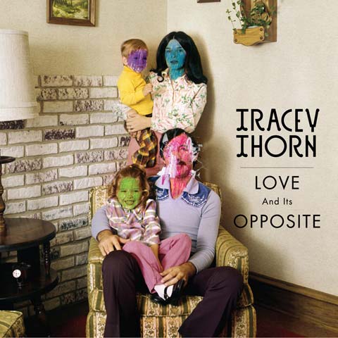
Tracey Thorn
Love And It Opposite
Strange Feeling Records
Tracey Thorne’s recent body of work has been very much focused on the idea of home and the dysfunctional family unit. Love And Its Opposite is no different, as made quite evidence by its domestic album artwork. After a chat between Thorn and designer John Gilsenan about common threads and themes of the album, the two decided that “the idea of odd or broken-looking portraits would suit perfectly,” according to Gilsenan.
A campaign photo shoot was out of the question due to monetary constraints. Gilsenan decided to turn to old family photographs and his own archive, but “nothing quite hit the spot.” It was through stock photography libraries that suitable images surfaced.
“I put these to Tracey and the label, and we agreed this was the way to go,” says Gilsenan. “I then had the image reproduced as a printed photograph; I then scratched into and drew on it with felt tip pens before re-scanning [it].”
But a stock photography route has the potential to lead to fun and funny results, as Thorn and Gilsenan discovered. “The 7” for Oh, The Divorces! has a great image of an odd-looking couple wearing matching frilly shirts. Shortly after it was released, Tracey got an email from the model, who happened to be a big fan. His friend had called him up and told him he was on the cover of a Tracey Thorn record, and he couldn’t believe his luck,” says Gilsenan. “We are now waiting for all the folk who’s faces I mutilated on the album cover to call up, and we’ll be one big happy family again.”
About The Artist
Design by John Gilsenan of London’s IWANT. – iwantdesign.co.uk
Concept by Tracey Thorne and Gilsenan.
#32
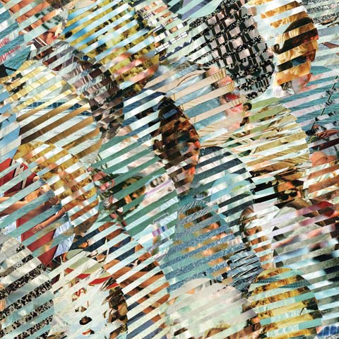
Wildildlife
Give In To Live
Volcom Entertainment
BUY / DOWNLOAD THIS ALBUM
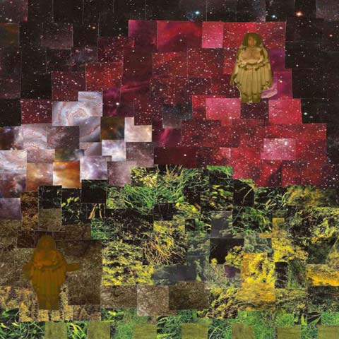
The collage on the cover of Wildildlife’s Give In To Live is a concept that was developed while the band was on tour one night.
“I just had this collage idea pop out of thin air,” says singer and guitarist, Matthew J. Rogers. “We did this underwater photo shoot, and it was really So-Cal sunny out, so the light and the blue tones were really popping off. I thought about how rad it would be to use these photos as the basis for a collage. I had this idea for what I’ve been calling a tapestry collage bouncing around in my brain, and that’s what this is… I’m sure it’s been done a bunch, but I haven’t seen it [before].”
What Rogers did was combine two overlapping images to create a pattern. “I wanted it to be like a visual drone,” he explains. “It’s the first time I tried it out; I don’t think it was 100% effective, but ya know, deadlines!”
The painstaking idea was executed by Rogers while he was sitting on a milk crate, with a clipboard in hand. “I didn’t have a desk…” he says. “It took a really long time… I’m scared to do it again, BUT I WILL! All told, it probably took close to 40 hours.”
This method speaks a lot to Rogers’ artistic style in general, which seems rather off-the-cuff, spontaneous, and heart-felt. “I do whatever when something needs to get done. I like making things for something, if that make sense…” Rogers explains. “I doodle, but I’m trying to get on this collage thing a little harder in the next couple months… I wanna try out some new shapes and a more controlled palette.”
About The Artist
Collage by band member Matthew Rogers.
#31
Deerhunter
Halcyon Digest
4AD
BUY / DOWNLOAD THIS ALBUM
Using a photo by George Mitchell, the cover for Deerhunter’s Halcyon Digest is a simple black-and-white image which some find grotesquely appealing and others find bizarrely disenchanting.
About The Artist
Photography by George Mitchell.

#30
The Sleeping
The Big Deep
Victory Records
When a band isn’t designing its own album artwork, hiring an artist who is a long-term friend is the next best thing. Artist and designer Jeffrey Ramirez details his friendship with The Sleeping’s vocalist, Doug Robinson, saying, “Earlier in the year, when Doug Robinson moved back [to Long Island] to start working on this record ,he had been couchsurfing around town,” Ramirez says. “I live in a house with a few close friends, a foosball table, and a big basement scattered with instruments, so it wasn’t long before [Robinson] was spending weeks at a time on our couch. He had seen some other albums I had worked on and asked me to pitch them some ideas.”
According to Ramirez, The Sleeping was incredibly easy to work with and gave him few restrictions; the eventual product hinged largely on Ramirez’s relationship to Robinson. “I was lucky to have gotten to know Doug real well while he was living out a lot of the things he was writing about,” explains Ramirez. “Because of that, it was easy to relate to the idea of him moving from coast to coast, jumping from couch to couch, trying to find love, family, and an idea of a ‘home.'”
Ramirez did a large amount of thrifting, antique shopping, and digging through his grandfather’s belongings to find the perfect pieces to tell the story. He photographed various combinations until finally, the right one stuck.
“All of the objects inside the suitcase were intended to represent things that you pick up or leave behind in your travels: friends, lovers, family, etc.,” explains Ramirez. “It’s the idea that you still take a piece of them with you, wherever you end up, whether you want to or not.”
About The Artist
Artwork and photography by Jeffrey Ramirez, who runs All Invisible Things and plays in the band Sleep Bellum Sonno. – www.theupstudio.com

#29
Flying Lotus
Pattern+Grid World
Warp Records
BUY / DOWNLOAD THIS ALBUM
The second Flying Lotus album cover on our 2010 list, the artwork for 2010’s Pattern+Grid World EP features a close-up portrait of Theo Ellsworth’s intricate, feathery characters. With an album title like Pattern+Grid World, Flying Lotus certainly could have taken the artwork into any number of stereotypically “cool” directions, but instead, he chose to go with the soft rippling drawings of Ellsworth. And from this was born mutual inspiration, with artist inspiring musician and musician inspiring artist.
About The Artist
Artwork by Theo Ellsworth, a Portland-based illustrator and artist.
Flying Lotus – Camera Day (taken from Pattern+Grid World) by Warp Records

#28
Future Islands
In Evening Air
Thrill Jockey Records
BUY / DOWNLOAD THIS ALBUM
The twisted forms on the cover of Future Islands’ In The Evening Air echo a continuation of the band’s aesthetic, which features a piece by artist Kymia Nawabi. Nawabi is a former member of Future Islands, from back when the band was called Art Lord And The Self-Portraits in the early ’00s.
“I love that I am still involved with the band,” says Nawabi. “I have done four album covers for them.”
The album cover for In Evening Air features an acrylic, ink, and watercolor mixed media piece Nawabi created, entitled And Next, Next…Next…. At 24″ by 24″, its softness and color palette is well-matched for the album.
About The Artist
Mixed media artwork and text by Kymia Nawabi, who has an upcoming exhibition in March 2011, at SUGAR Gallery in Brooklyn, NY. She also has a Kickstarter in the works for a Future Islands music video. – www.kymianawabi.com + www.kickstarter.com
#27
Woodsman
Mystery Tape EP
Lefse Records
BUY / DOWNLOAD THIS ALBUM
Woodsman’s guitarist, Trevor Peterson, is a individual who embraces the process of creation no matter what route it takes. He echoes this mentality, whether he’s creating the music or the artwork for Woodsman.
“I feel like the idea that people having multiple creative outlets isn’t anything new. I’ve always played music my entire life, but I don’t really see it as my main medium,” Peterson muses. As a musician with a BFA in Visual Arts, Peterson believes that his generation views visual and musical synthesis in a innovative way.
“We’ve grown up with the notion that image and sound are to be married, and a lot of us conceptualize ideas on multiple levels and actually have the skills to implement those ideas on a wide range of mediums,” he says.
The collage for Woodsman’s Mystery Tape EP was comprised of magazine and Polaroid cutouts glued onto paperboard, in a way that cascades loosely from purples to greens. The product is simultaneously cohesive and disjointed, not unlike the music of Woodsman.
“I think that because I play in the band and contribute to the songwriting process, the concept for the art came from the same ideas that the record has vibing inside of it,” Peterson explains. “I just blend those same ideas into a visual form; it’s all about making the viewer/listener actually think about what they’re seeing/hearing. Not only should it be pleasant to look at or listen to, but I think the same moods should carry over from the cover art to the guitar tone three minutes into the third song.”
About The Artist
Artwork by Woodsman’s guitarist Trevor Peterson, who also works with collage and experimental film. – woodsmanman.tumblr.com
The Extras
“The back is our friend Chris’ Costco ID card scanned and blown up in Photoshop,” says Peterson. “I liked the idea of using a hand-made visual and enhancing it with modern technology. I think it kind of fits with how Woodsman records albums, as well.”

#26
MYTY Konkeror
I miss the future.
Twin Lakes Records
BUY / DOWNLOAD THIS ALBUM
In honor of MYTY KONKEROR’s amazing album cover for I miss the future., here is a part of a short and revelatory essay from album art designer and band member, Michael Oskar Kleinsteuber:
“The album name fell from the heavens. It actually ended up on our wall from the crayons of a 10-year-old girl at my daughter’s second birthday party. The phrase nailed a concept I had been struggling with for years during the creation of these songs. The notion that in youth we see clearly and yearn for a straight line to an ever-increasing truth. The fact that we grow through this to a place where innocence and artlessness are considered the embarrassing calling cards of the inexperienced.
– I miss the future that I once saw so clearly — not the future that was promised, but the future that seemed (teleo)logical to anyone who went from grunting and crawling to speaking and running, to adding and subtracting, to a seemingly ever expanding sense of things.
– I miss the future and then I saw the picture that my daughter brought home from preschool where they used a crude picture with a kind face to tell my child about a man who tried to change things and do the right thing, and where this notion has now taken root in my child’s mind to grow into an incomprehensible story of complexity and cruelty the more and more she learns about it. The album cover fell from the heavens.
– I miss the future because this picture has been photocopied a bazillion times across the world and planted into little heads as a story of true humanity and civic involvement and tragedy.
– I miss the future because a four year old wrote on this picture: ‘Martin was a nice man’ with a hand still new to all those words.”
About The Artist
Design and layout by Michael Oskar Kleinsteuber. – www.twinlakesrecords.com

#25
White Hinterland
Kairos
Dead Oceans
BUY / DOWNLOAD THIS ALBUM
One of few minimalistic beauties for the year 2010, the album artwork for Kairos was created by one of White Hinterland’s two members, Shawn Creeden. Since White Hinterland’s second release in March 2008, Creeden has been the main visual force behind the band’s releases and merch. For Kairos, White Hinterland decided to go with a photograph, a departure from previous albums.
“Since the last two releases had had my drawings on them, and we viewed this album as a sort of dramatic shift musically… it required a similar shift in visuals,” explains Creeden. “The songs on this record were also very personal to Casey and we wanted to have the photo be of her, but at the same time, somewhat obscured and ethereal, like the songs themselves.”
The two took a number of photographs in locations around Portland, with the final image taken at the Oregon Zoo. “I thought of that location because there are these beautiful aquatic areas that you can view through these thick, scratched-up aquarium windows,” shares Creeden, a member of the Zoo. “You can capture someone’s reflection in them, and it looks layered and ghostly and nice.”
About The Artist
Artwork and photography by band member Shawn Creeden, who is also a multi-disciplinary artist. – www.shawncreeden.com

#24
No Age
Everything In Between
Sub Pop Records
BUY / DOWNLOAD THIS ALBUM
Designer of No Age’s past releases, Brian Roettinger was once again enlisted to craft the packaging for Everything In Between. The album, which marks a shift in sound for the Los Angeles-based former duo, now turned trio, seems to be represented in a crumpled up handbill.
About The Artist
Artwork and design by Brian Roettinger, of Hand Held Heart. – www.handheldheart.com

#23
Growing
PUMPS!
Vice Music
BUY / DOWNLOAD THIS ALBUM
New York experimental electronic band Growing has gone super glam for its album cover for PUMPS!
The eight-track album, which drones on without huge swells or dramatic changes, is the type of album to which you can stare at the center of its collaged artwork, getting mysteriously lost in its layers of pink rings.

#22
Run On Sentence
You The Darkness And Me
Hush Records
BUY / DOWNLOAD THIS ALBUM
The album artwork for Run On Sentence’s You The Darkness And Me serves as a reminder for why purchasing physical copies of an album is often more charming than just simply appreciating an album cover through digital means. Though quite simple, You The Darkness And Me comes with well-thought-out packaging, through and through. And it all began with a concept from Run On Sentence’s “only permanent member,” Dustin Hamman.
“I had the title already, and [with] it being a “trinity” concept, a triangle seemed appropriate. I liked the idea of having 3 shapes inside of the triangle and the darkness being visually represented by the same shape within itself. I wanted the exterior of the album to be simple and almost drab, so that when you pulled out the CD and insert, the bright colors would be an exciting contrast,” says Hamman. For the exterior packaging, Hamman worked with designer Kyle Durrie; together, they found fonts and colors that worked and designed the back label and inside of the case.
The insert and CD itself are a bright explosion of shape and form, as previously alluded to. For it, Hamman turned to friend and Portland-based fine artist, Mark Warren Jacques. “[I] chose a piece of his artwork which I thought was a perfect fit for the record,” says Hamman. “Luckily, he was willing to let us use it.”
For Hamman to have a hand in creating his own album artwork was of significance. “Music is a loose language with which you can translate your perspective of the world and still get many interpretations of it,” says Hamman. “Art is the same way, and if you’re trying to share a cohesive vision with people, it makes sense to have the same creative force behind both the music and the art.”
About The Artist
Exterior design by Dustin Hamman and Kyle Durrie. – www.myspace.com/runonsentencemusic
Layout and letterpress printing by Power And Light Press. – www.powerandlightpress.com
Interior artwork by Mark Warren Jacques. –
The Extras
“The artwork that Kyle and I did was all done on her computer and then turned into polymer plates, which were used in loo of lead plates to letterpress the images onto the cd cases, which Kyle also designed and we hand-glued,” says Hamman.

#21
How To Destroy Angels
Self-Titled
The Null Corporation
BUY / DOWNLOAD THIS ALBUM
Mark Weaver’s lovely, polished album artwork for Trent Reznor’s latest post-industrial side project, How To Destroy Angels, is one that has graphic designers across the board drooling. In what looks like a digital illustration or collage, Weaver combines disparate elements in a horizontally-oriented piece featuring a wonderful color palette.
About The Artist
Artwork by Mark Weaver, a commercial artist whose clients include Wired Magazine, The New York Times, and Good Magazine. – www.markweaverart.com

#20
The Angry Orts
Self-Titled
Self-Released
BUY / DOWNLOAD THIS ALBUM
As many bands turn inwards to themselves or outwards to firms or professional designers to create their album artwork, The Angry Orts opted to take a pretty traditional route for its self-titled release. It hired illustrator and printmaker Amanda Lee James, who created the band’s album artwork with what seems like very pure motives.
Though The Angry Orts had in mind the image of an animal for its album cover, James sketchd up a whole series of potential animals before the band decided on the nautilis. “From there, I drew up the final version and then consulted with [The Angry Orts] on colors, fonts and layout,” says James.
The cover is a pen and ink drawing, which James then colored digitally. The resulting image has the hues and lovely linework of a good print, and her history as a printmaker becomes apparent through it. The relationship between artist and band seems more than harmonious, and James’ care seems evident, especially when one delves into her memories regarding album cover artwork.
“When I was a kid, I would always look through my parents’ records, and I remember falling in love with Revolver before I’d ever even heard it,” recalls James. “Even today when I buy a new album, I always open it up and look at all of the packaging as soon as I step out of the store.”
About The Artist
Artwork by Amanda Lee James, a Portland-based illustrator and printmaker. – www.amandaleejames.com

#19
Liars
Sisterworld
Mute Records
BUY / DOWNLOAD THIS ALBUM
Brian Roettinger, a veteran of creating innovative album artwork, was a long-time friend of Liars — even before the band was a band. Roettinger began the artistic process of creating the album artwork for Sisterworld just as he normally does, discussing with the band what the record means. For Roettinger, conveying the themes and concepts behind an album is much more important than visually representing the music itself, and with a conceptual album like Sisterworld, this process is especially important.
“At this point, I’m not not too concerned with hearing [the record] — if its even completed,” Roettinger says. “So, long before the record was completed, we all had a discussion about where this record was coming from, and from there, we had a handful of ideas. I presented one idea and made a few mock-ups, and that was really it.”
The themes of Sisterworld touch on the subcultures and alternative spaces the residents of Los Angeles create, in order to cope with the city’s shallow surface. The ornamental window on the cover of Sisterworld seems to hint at a secret world behind it — a simple idea, but it fully captures the album’s message.
The limited edition album artwork for Sisterworld Reinterpretations, a remix album featuring tracks from Sisterworld, is accompanied by unique three-dimentional packaging that was also designed by Roettinger.
About The Artist
Artwork and design by Brian Roettinger, of Hand Held Heart. – www.handheldheart.com