THE BREAKDOWN
12 Collage
+ 14 Digital Illustration, Drawing, Design
+ 19 Illustration, Painting, Drawing
+ 8 Black And White Photography
+ 22 Color Photography
+ 6 Deluxe Packaging
+ 10 Fashion, Sculpture, Installation
_____________________________
91 Album Covers For 2011

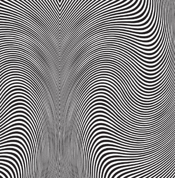
Apteka – Gargoyle Days
QUOTES FROM:
DYLAN MCCONNELL, DESIGNER
ADAM LUCAS, APTEKA’S GUITARIST AND VOCALIST
THEMES & CONCEPTS
“We had worked with a sorta paranoid, dark op-art theme in the past for posters and albums (with a brief interlude of lopping off girls’ heads). High contrast and fluid — that’s what I was going for.” – Dylan McConnell
COLLABORATION
“We’ve been working with Dylan pretty much since the band formed. He’s done all our cover art, and most all of our show posters so far. Things clicked from the beginning. He just has a knack of taking what we’re doing musically and expressing it in a visual way. The funniest part is that we’ve never really met. He lives in Portland, and we’re in Chicago. A mutual friend turned us on to him, but we’ve never had the chance to meet in person. It’s all been through email. Which is kind of a weird way to communicate artistic intentions, but somehow it works, and he’s become this mysterious fifth member of the group.” – Adam Lucas
Record Label
Carpark Records
The Artists
Design – Dylan McConnell
Mediums & Materials
Collage, Digital, Typography (hand-drawn)
“Reality of another dimension”

Boris – New Album
QUOTES FROM:
ATSUO, BORIS’ DRUMMER AND VOCALIST
COLLABORATION
“I have known [the artist] for years and felt that her style could fit to music, sound, concept and direction of New Album perfectly, so I decided to ask. Boris gave her demo tracks and let her do whatever she liked. As soon as the work was done, her MacBook crashed, and the original data was gone.”
THE EXTRAS
“The actual size of the work was determined to make the 12″ vinyl jacket. The original painting was long [and] sideways; I divided it into both outside and inside of gatefold cover.”
Record Label
Sargent House
The Artists
Design – Boris
Painting – xhxix (pronounced “hi”)
Mediums & Materials
Photoshop, Graphics Tablet

Crystal Stilts – In Love With Oblivion
Record Label
Slumberland Records
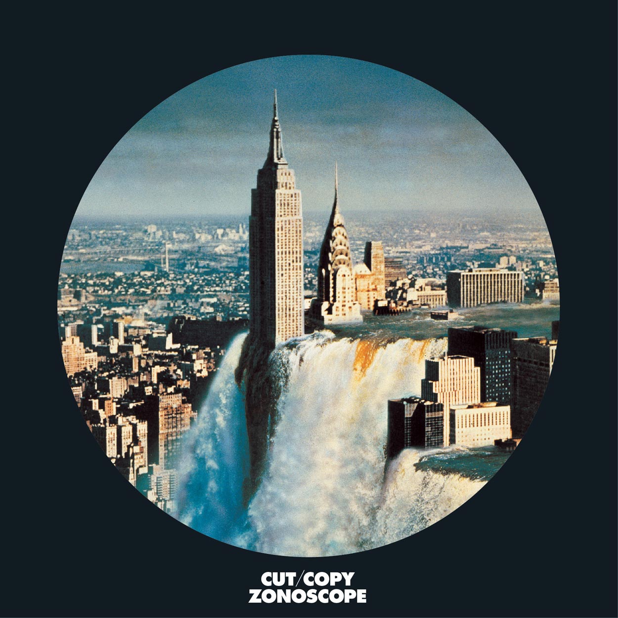
Cut Copy – Zonoscope
Record Label
Modular Recordings
“Spacey”

Equals – Self-Titled EP
QUOTES FROM:
MATT TOMAN, EQUALS’ DRUMMER
THEMES & CONCEPTS
“I was working with a lot of imagery from this Russian space book before I made the final product and then went into a different direction. It just kind of happened. Before I had what is the cover now, I was doing detailed stippling drawings. It’s a shame that none of that stuff got used, but maybe I’ll go with that approach again someday. In the end, you could say that the cover does have this sort of dark, mysterious, spacey vibe to it which doesn’t fall far from what I was going for in the first place. It’s moody but also has some luminosity to it. It’s simple, but it’s bold. It’s sort of clean, but it’s jagged. Having chaos but having space [or] room to breathe. The colors, the textures… I think that ties into our music, but you can tie whatever meaning you want to it really.”
CREATIVE PROCESS
“I was sort of doodling and happened to make this intricate circle design. I simplified it by cutting out all of the lines, scanned it in and then started toying around in Photoshop… this happened to be what I came up with in the end.”
Record Label
Self-Released
The Artists
Design – Matt Toman
Mediums & Materials
Digital
Gypsy Treasures – Buried Goods
Record Label
Not Not Fun
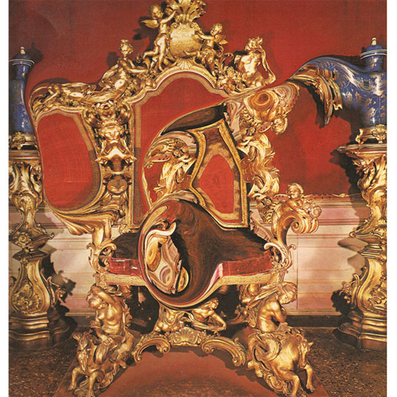
“At a remove.”
Oneida – Absolute II
QUOTES FROM:
DAN SCHECHTER, ARTIST AND DESIGNER
THEMES & CONCEPTS
“Absolute II is the final installment of Oneida’s Thank Your Parents triptych, following Preteen Weaponry and Rated O. Sonically, the album is quite distinct from the first two, with the band for the most part abandoning their normal instrumentation. I wanted the art to follow the stylistic themes from the first two releases but capture the sense of expansion and obliteration in the music. It’s about stepping back, or through maybe, to achieve a larger vision.”
CREATIVE PROCESS
“I’m not sure how interesting it is, but at some point, while designing Absolute II, I realized the art was tracking a process of sight and insight — a maturing understanding of the world… I started coming up with the idea for Absolute II I was thinking about how the themes from the art — looping illustrations of water, patterns, repetition/connection — fit with the themes of the music. In the case of Absolute II, this notion of unbounded sound. It occurred to me that the scale of the art was getting smaller, as if the viewer is moving away. With Absolute II it gets to the point that the representative nature of the illustrations is lost. It abstracted. It just seemed a fitting end to a series called Thank Your Parents — a coming of age story (ha!).”
THE EXTRAS
“The cover for Absolute II was drawn in pen and reversed. The entire cover of the album is wrapped in the illustration. Actually, it’s a pattern repeating from left to right and bottom to top. The inside of the gatefold contains a collage. You need to see the real thing. It’s a whole package. The cover and inside are stylistically very different but equally important. When working on the cover illustration, I actually kept turning it so that from a creation stand point, there is no up or down. Since it’s a looping pattern, I just figured out which section [and] orientation I thought looked the best for the cover.”
Record Label
Brah Records
The Artists
Design & Layout – Dan Schechter
Mediums & Materials
Drawing (pen), Collage, Digital
“Dusty but loved.”
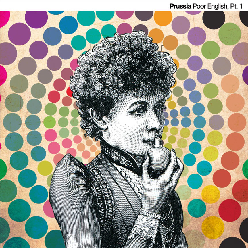
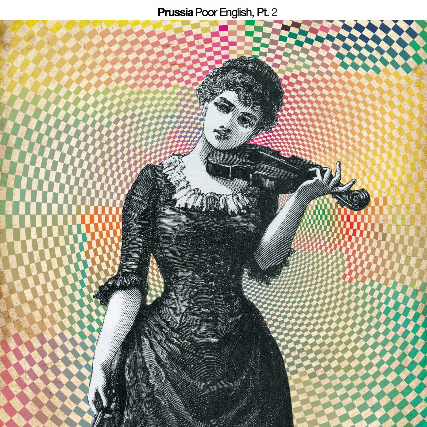
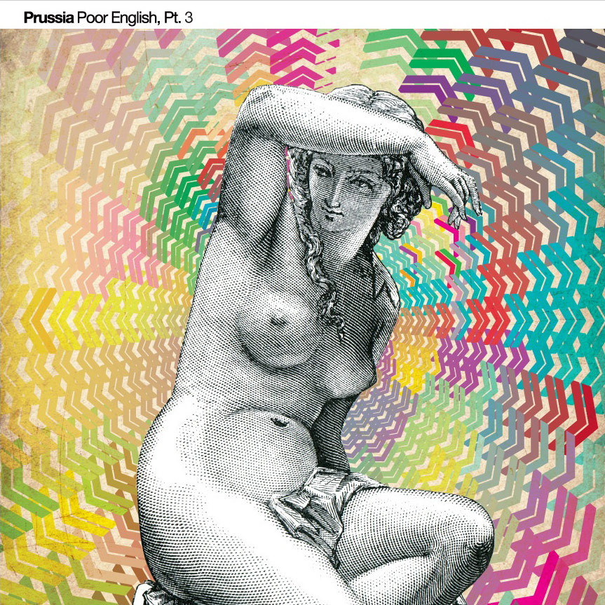
Prussia – Poor English Series
QUOTES FROM:
JUSTIN AMES, ARTIST AND DESIGNER
THEMES & CONCEPTS
“I got a copy of the album approximately a year before it was released, so I had some time to sit with the songs and really digest what was being expressed. I saw a mixture of conflicting themes and time frames, so I wanted to express that anachronism on the visual side, while still subtlety referencing a detail here or there.”
CREATIVE PROCESS
“Ryan and I were living together during the writing of most of the songs for Poor English, and I remember him mentioning how he didn’t want Prussia to be this band that could be easily pigeon-holed. After hearing the final recordings, I had a better understanding of their new direction, so I tried to do something that reflected a change from what came before.”
COLLABORATION
“I’ve known Ryan and Adam for years. Once upon a time we were all very close and I think our lives became intertwined in a way where we’d constantly be mentally collaborating on most any idea. I created the first EP’s cover while bored at work one day and showed it to Ryan and he thought it made sense for what they were doing.
“The song ‘Justin, The Pornographer’ was named after an incident I got in to while living with Ryan. An old friend of mine was staying with us for a few days, and she had agreed to take some nude photographs with me. I had set up this little studio in our basement and was running this fog machine to create an effect. It was all good fun, until my girlfriend showed up and didn’t know what the hell was going on. Shortly after that, our other roommate came around after having earlier taken some acid, to this house filled with fog, a naked girl, and my very unhappy girlfriend. I think the song is about this moment that sort of signifies all this crazy debauchery we were all partaking in at the time, and how we’re all kind of on the fence about it. Anyways, the 3rd EP’s cover is homage to that song.”
Record Label
Self-Released
The Artists
Artwork & Design – Justin Ames
Mediums & Materials
Photoshop, Illustrator, Scanner
“Mysterious”
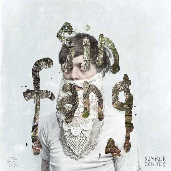
Sin Fang – Summer Echoes
QUOTES FROM:
INGIBJÖRG BIRGISÓTTIR, ARTIST AND DESIGNER
THEMES & CONCEPTS
“I also did the cover for the first Sin Fang album, Clangour, and for that, me and Sindri decided to make a disguise for him, so we made a paper beard. For this album, we wanted to use that disguise again, but in a more polished way because Summer Echoes is a little bit more polished than Clangour, I guess.”
CREATIVE PROCESS
“I had the basic image in my head, but then it kind of evolved as I was working on the photographs. We knew we wanted to have the cover light and kind of simple. The letters were kind of spontaneous. I was playing around with letters that Sindri had painted and put the forest inside them, and we instantly liked it. The abstract natural patterns of the branches are a nice contrast with the pattern of the doily-beard.”
Record Label
Morr Music
The Artists
Design & Photography – Ingibjörg Birgisdóttir
Mediums & Materials
Photography, Painting (watercolors), Photoshop
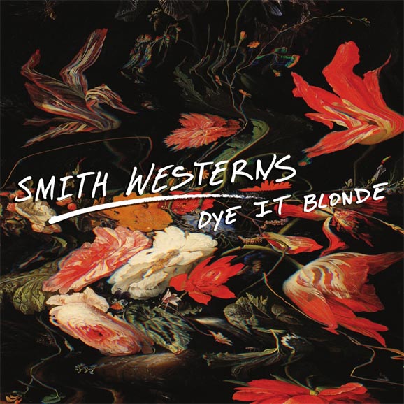
Smith Westerns – Dye It Blonde
Record Label
Fat Possum Records
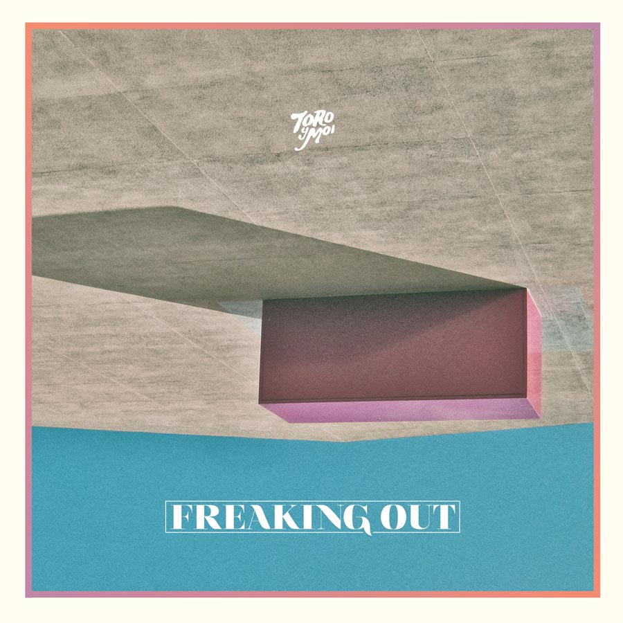
Toro Y Moi – Freaking Out EP
Record Label
Carpark Records

Tropics – Parodia Flare
Record Label
Planet Mu
The Artists
Design – Sam Chirnside
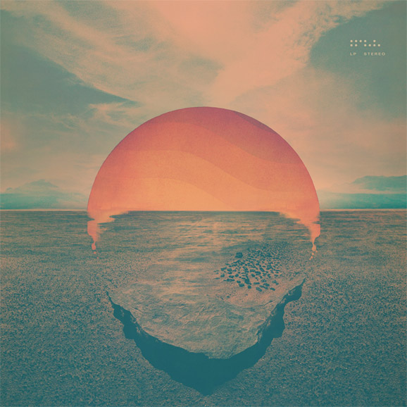
Tycho – Dive
Record Label
Ghostly International
The Artists
Design – Scott Hansen

“A mixture of old magic and young magic”

Young Magic – Night In The Ocean / Slip Time 7″
QUOTES FROM:
LEIF PODHAJSKY, ARTIST AND DESIGNER
THEMES & CONCEPTS
“Everything I do for Young Magic is rarely based off one idea or concept but rather an ethos, an exploration of the self and the universe that we all share maybe… There’s no real need for words; both parties get each other and each other’s work. I just try to let go, trust, and create something which captures this. The piece I think encapsulates the raw, liquid, dark and tribal spirit of these songs.”
CREATIVE PROCESS
“As I said at the start, it’s a shared ethos. I spent time in the Mexican hills with Isaac, we had many adventures, saw and felt many strange things. I almost killed us trying to collect wood on a four-wheeler…”
COLLABORATION
“I have been friends with Isaac and Young Magic for a long time, we often work and share in each others creativity. I think Isaac likes to push me to make the best artwork that I can possibly make… that or have a mental breakdown…”
Record Label
Carpark Records
The Artists
Design – Leif Podhajsky
Mediums & Materials
Old Magic, Young Magic
SEE: LEIF PODHAJSKY’S AMAZING BLOG, MELT


[…] 12 Collage + 14 Digital Illustration, Drawing, Design + 19 Illustration, Painting, Drawing + 8 Black And White Photography + 22 Color Photography + 6 […]
[…] 12 Collage + 14 Digital Illustration, Drawing, Design + 19 Illustration, Painting, Drawing + 8 Black And White Photography + 22 Color Photography + 6 […]
[…] 12 Collage + 14 Digital Illustration, Drawing, Design + 19 Illustration, Painting, Drawing + 8 Black And White Photography + 22 Color Photography + 6 […]
[…] 12 Collage + 14 Digital Illustration, Drawing, Design + 19 Illustration, Painting, Drawing + 8 Black And White Photography + 22 Color Photography + 6 […]
[…] 12 Collage + 14 Digital Illustration, Drawing, Design + 19 Illustration, Painting, Drawing + 8 Black And White Photography + 22 Color Photography + 6 […]