
THE BREAKDOWN
12 Collage
+ 14 Digital Illustration, Drawing, Design
+ 19 Illustration, Painting, Drawing
+ 8 Black And White Photography
+ 22 Color Photography
+ 6 Deluxe Packaging
+ 10 Fashion, Sculpture, Installation
_____________________________
91 Album Covers For 2011

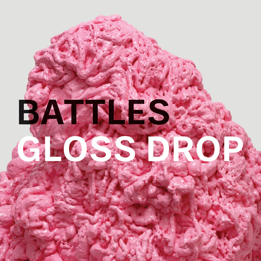
Battles – Gloss Drop
Record Label
Warp Records
The Artists
Design & Art Direction – Dave Konopka
Photography – Leslie Unruh
Mediums & Materials
Photography, Sculpture


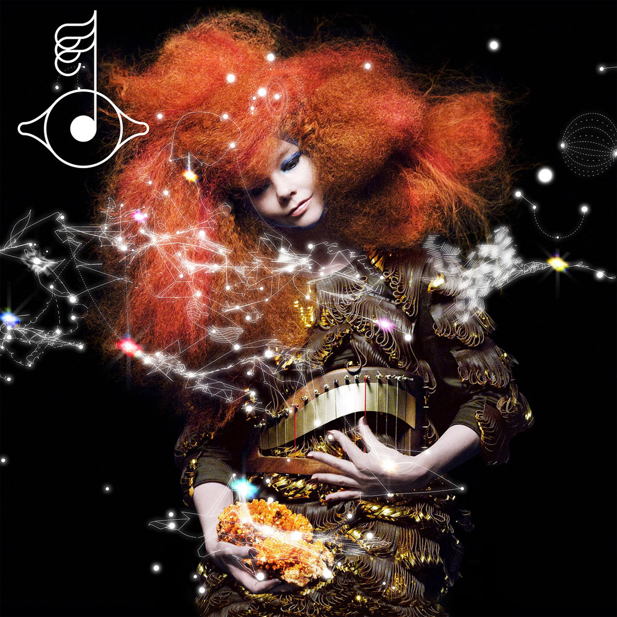
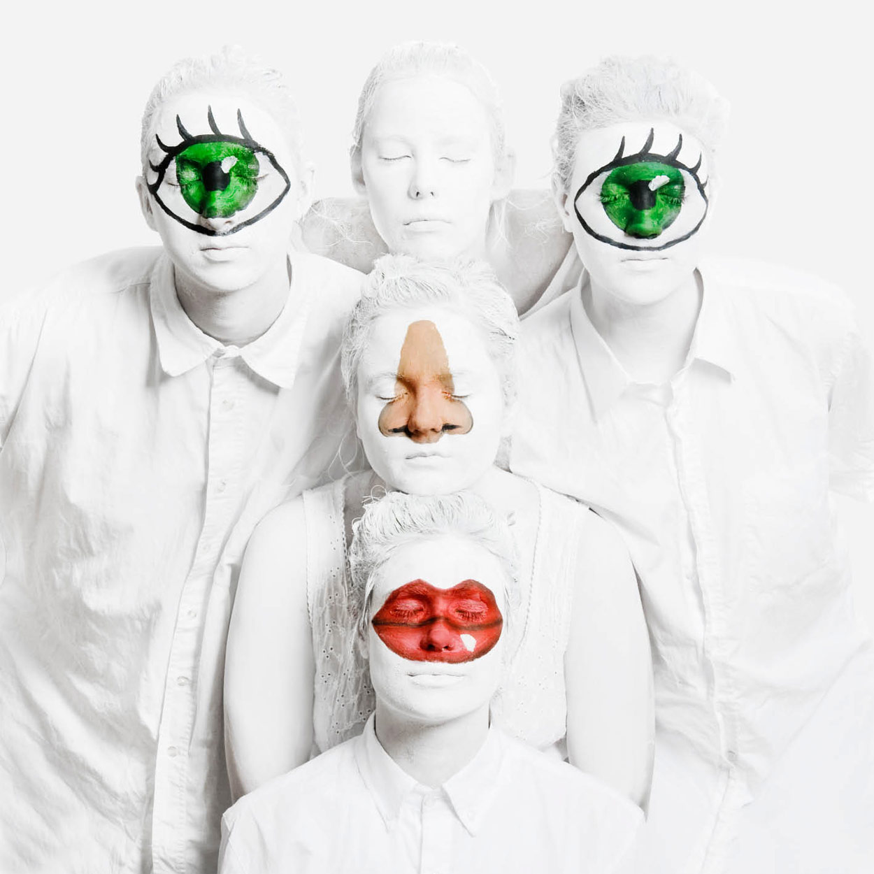
Bjork – Biophilia
Below is a quick sampling of some of Biophilia‘s related materials, all of which are unified by a similar terrestrial-meets-celestial aesthetic. As both stated by David Attenborough and Bjork for Biophilia:
“Forget the size of the human body; remember that you’re a gateway between the universal and the microscopic, then unseen forces that stirs the depths of your innermost being, and nature, that embraces you and all there is. We’re on the brink of a revolution that will reunite humans with nature through new technological innovations. Until we get there, prepare, explore, Biophilia.”
Record Label
One Little Indian
Mediums & Materials
Photography, Fashion
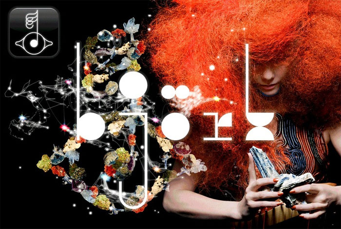


“Organic.”
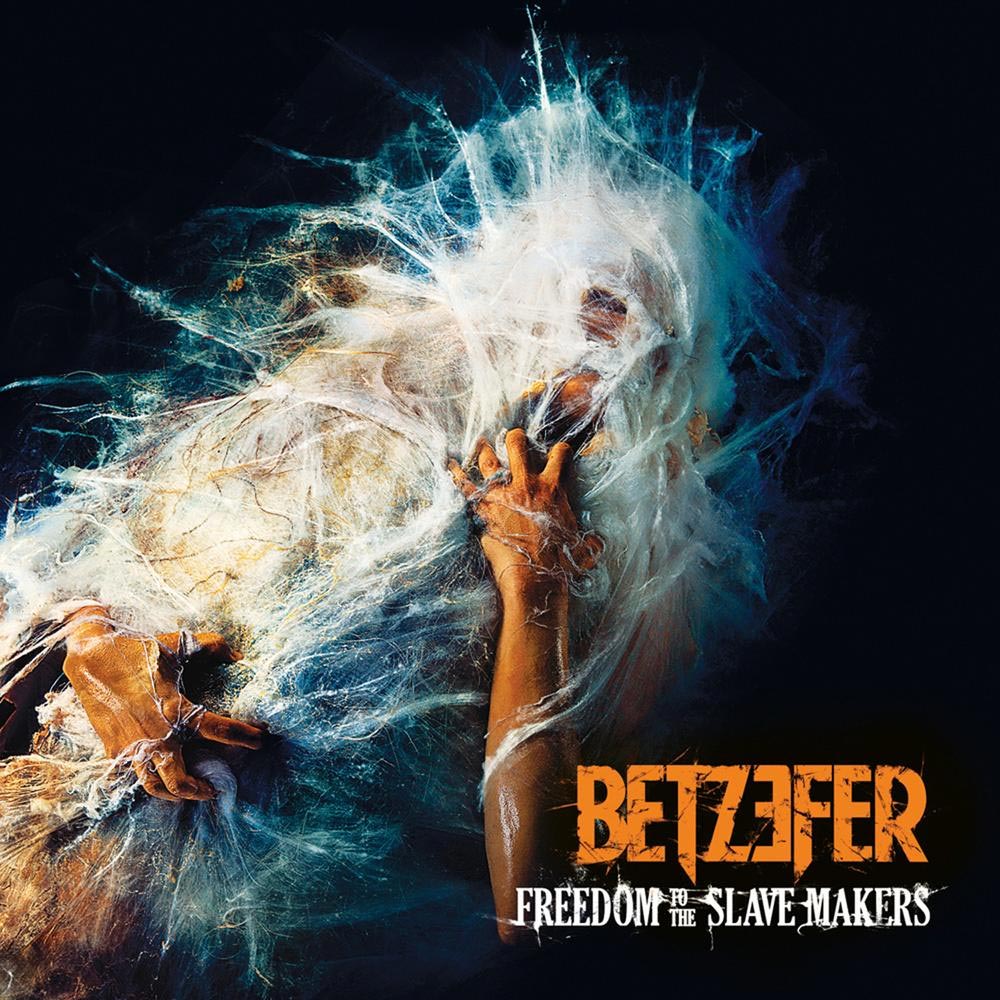
Betzefer – Freedom to the Slave Makers
QUOTES FROM:
AVITAL TAMIR, BETZEFER’S VOCALIST
SHAHAR HEMO, ART DIRECTOR
NIR DOLINER, ART DIRECTOR
THEMES & CONCEPTS
“The theme behind the record is the end of adolescence and the beginning of adulthood, as approached from several angles — mainly on the personal level (the experience of the author) but also the current state of the recording industry and the different turmoils it is going through in this exciting digital age. Since the philosophy behind the entire recording was to create a fully live and organic album which doesn’t utilize modern ‘shortcuts’ often used in contemporary recordings in order to create an organized and massive sound, we decided the same philosophy should apply to the creation of the artwork — which meant keeping Photoshop use to the bare minimum and acheiving the desired goal using precise make-up, lighting, and photography.”
CREATIVE PROCESS
“We actually went through several concepts and photoshoots for the artwork for Freedom to the Slave Makers before finally fixating on the cocoon. It was a lengthy process which took well over a year.”
“We built the cocoon around the model [Omri Jones] using a metal net, cob web spray and cloth before taking a photo of it to be digitally finalized. In the end, the computer’s involvement was kept to the bare minimum which meant cropping and color correction — pretty much the same as with the music itself.”
“Since the record is ultimately a metal record, an industry which has its own language and tradition, it was of paramount concern for the band that just like the music on the record, its artwork would be done first and foremost in good taste and for the sake of art, but [also] fit right in with other metal records on the shelf. In other words, we didn’t want to alienate more traditional crowds, all the while keeping the artistic integrity behind the product. At the end of the day, seeing the work being embraced both by the traditional metal industry and crowds as well as in different art circles makes all the countless hours we spent on the project worthwhile.”
COLLABORATION
“The model [Omri Jones] had to lay there motionless for eight hours straight while the cocoon was being built before finally being released. That moment of finally cutting him loose and photographing him in his anxious state, dripping sweat from the hours he spent inside the contraption under the studio lighting, was really a sight to be seen and ultimately what we wished to capture.”
EXTRAS
The final product was inspired by a ‘phases in the birth of the moon’ poster that hangs up on Shahar’s (the art director for the project) wall. We figured it would be great creating a similar poster which depicts the phases of a man being ‘birthed’ out of his cocoon.
Record Label
AFM Records
The Artists
Art Direction – Shahar Hemo & Nir Doliner
Photography – Gal Hamo
Makeup & Special Effects – Kearn Telias
Model – Omri Jones
Mediums & Materials
Photography, Sculpture, Photoshop
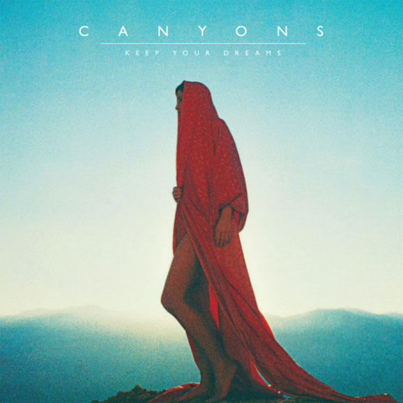
Canyons – Keep Your Dreams
Record Label
Modular Recordings
The Artists
Design – Trevor Tarczynski
Photography – Neil Krug
Model
Joni Harbeck
“New Exotica.”
Co La – Daydream Repeater
QUOTES FROM:
MATT PAPICH, CO LA
THEMES & CONCEPTS
“I’m always looking for images that are equally evocotive and unsettling as a kind of parallel to the Co La sound. In general, this means finding something that is familiar, something that communicates quickly because of its familiarity. I’m then interested in pushing the limit of what the image could signify. Sometimes it becomes more vague, or more confusing. I’m into confusion, not as an aesthetic so much, but as a medium.
“I’d been digging into a lot of ‘exotica’ music from the ’50s – Les Baxter, Arthur Lyman etc. Many of those records cover’s combine an idealized woman with an idealized environment. I was interested in replicating that impetus, but stripping it down to more minimal terms.”
CREATIVE PROCESS
“The cover of Daydream Repeater is a reproduction of a illustration from the cover of a dated fashion monthly. I found a model who was a doppelgänger of the original. With the help of a photographer and designer, we restaged the vintage picture and made it more rich, in color, style, etc.”
Record Label
NNA Tapes
The Artists
Art Direction & Concept – Matt Papich
Design – Sheena Callage
Photography – Joyce Kim
Model – Devon Deimler
Mediums & Materials
Photography, Digital
“Lonely”
Fool’s Gold – Leave No Trace
QUOTES FROM:
JOSHUA JAMES BREIDENBACH, CREATIVE DIRECTOR
THEMES & CONCEPTS
“Do you know when you’re kind of lonely but you kind of like it? This is partially how the record makes me feel, but mostly when you’re really far from home, somewhere new, unknown and really foreign, and you really don’t know anything, but you like that feeling too. I wanted that art to look like that. The fact that it’s a neon sign makes it almost humorous. A neon sign is a beacon to attract, and when there is no one around, it has this whole other thing going on.
“Fool’s Gold have a very mixed international influence… We wanted the images to look like no single place. It could be africa, it could be Vietnam, the Middle East, it could be LA. Nothing in the images really gives it away, but it’s somewhere kind of off the known path. As for concept, as artists ourselves, we don’t feel fulfilled unless there’s an idea informing the work. [But] we tend not to look into album artwork too much. As long as we felt these things I mentioned in the imagery, we knew we were on track.
“They told us about the mood, what they were inspired by musically and visually as they we’re making / finishing the record. They had a quite specific idea about imagery of nighttime and lighting and color. They shared with me a picture of a Rio beach at night, and some bright fluorescent type on a black background.”
CREATIVE PROCESS
“There was an all important Skype moment. It was with with both Lewis and Luke from the band. It was actually our first meeting. I had been thinking hard for days about what to do for this project, We started talking about night time scenes, desert scenes, lighting, artificial lighting and neon colors. It all became clear for a momant, and I told them that I would make a custom neon sign of their name, and have it shot at night on a sand dune. There was kind of a massive ‘yes’ in response to that.”
Record Label
IAMSOUND Records
The Artists
Creative Direction – Joshua James Breidenbach
Art Direction – Chi An De Leo & Gregory Jewett
Photography – Neil Massey
Makeup & Special Effects – Kearn Telias
Mediums & Materials
Sculpture, Photography, Van, Car Battery
“Cinematic
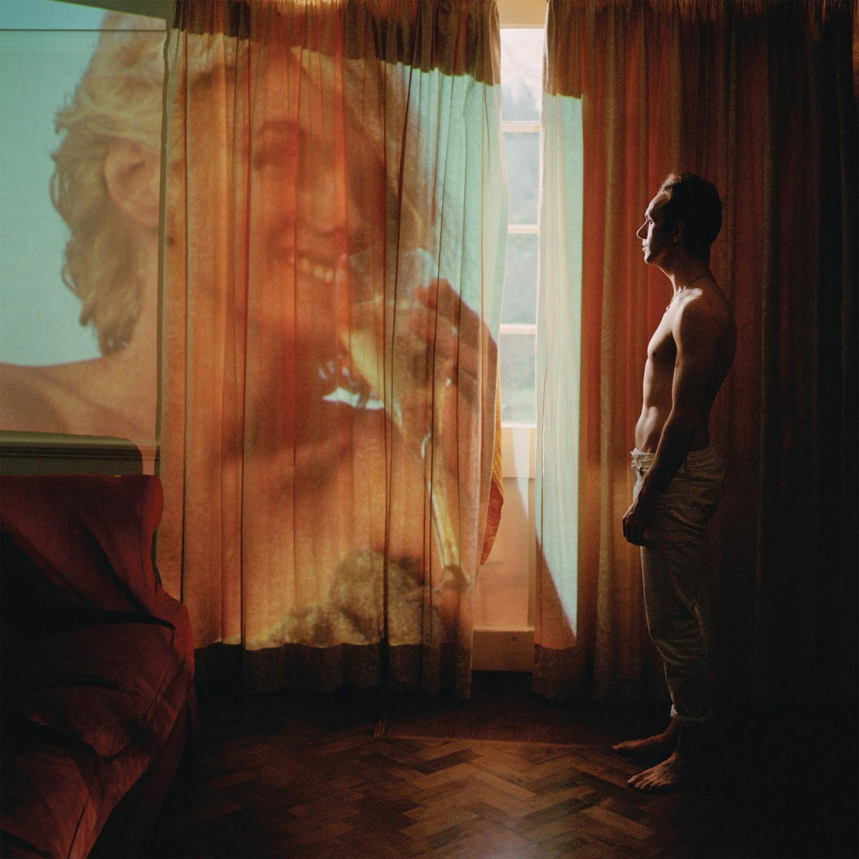
Glasvegas – Euphoric / Heartbreak
QUOTES FROM:
JOSS MCKINLEY, Photographer
THEMES & CONCEPTS
“The concept for this sleeve came from James Allan (Glasvegas) who wanted to use projected imagery in some way. As the project progressed, he had ideas about including the people who had been involved in the making of the album, and he had very definite setups he wanted to achieve for each member. He supplied Village Green, the design studio, and myself with drawings of these setups, which we tried to put into practice.”
CREATIVE PROCESS
“James was pretty adamant that Marilyn Monroe should feature on the sleeve. The band had recorded their album next to the beach on which she had been photographed for the cover image, and James felt that the shot encapsulated the band’s vision for the album. When this picture of James and the projection of Marilyn was shot, there were still questions over image rights, and we weren’t certain we could use it. James was happy to go with a plain white sleeve if the marilyn image couldn’t be used.
“The Marilyn Monroe image could not be used for the US market so the sleeve features James Allan’s mother.”
Record Label
Columbia Records
The Artists
Art Direction & Design – James Allan
Design – Village Green
Photography – Joss McKinley
Mediums & Materials
Photography (film), image-making, projection

Those Dancing Days – Daydreams & Nightmares
Record Label
Wichita Recordings
The Artists
Art Direction & Drawings – Cissi Efraimsson
Additional Design – Anders Wirström
Photography – Johan Bergmark
Back Cover Photography – Emelie Lava Lindgren
Insert Photography – Olle Kirchmeier

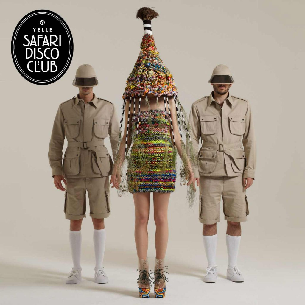
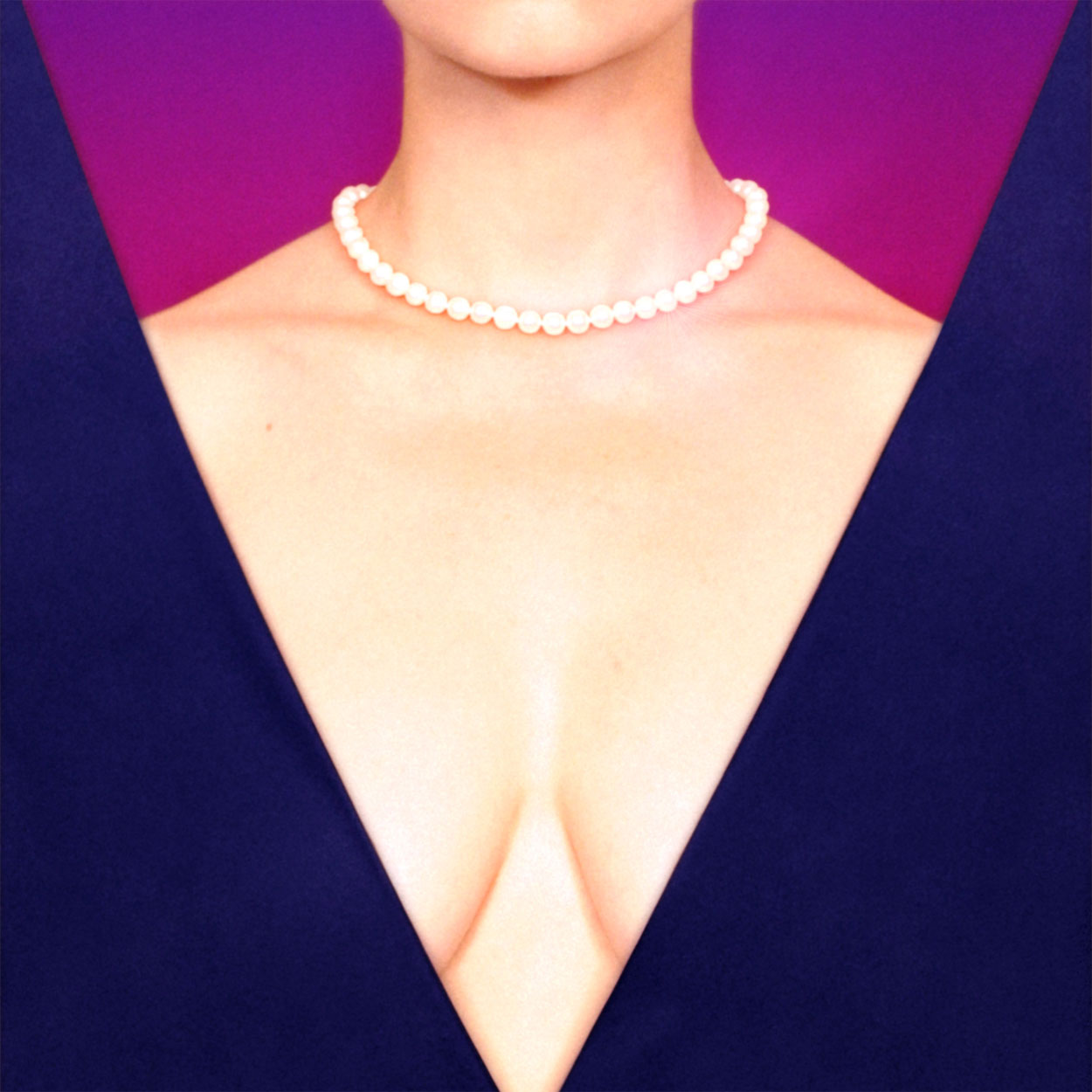
Yelle – Safari Disco Club
Record Label
Cooperative USA / Downtown
Mediums & Materials
Photography, sculpture


“sterile, mist, fog, white, cold, dust”

Zola Jesus – Conatus
QUOTES FROM:
ANGEL CEBALLOS, PHOTOGRAPHER
THEMES & CONCEPTS
“The idea here was derived from abstract inspirations such as sterile, mist, fog, white, cold, dust. It was a vibe, a feeling, an olfactory that needed to take shape visually. I wanted it to be as white as possible. A lot of this would need to be portrayed with styling.”
CREATIVE PROCESS
“[I was provided with] some beautiful examples of visual inspiration in several forms. This help set a vibe or a flavor for me to run with. There was definitely a common flow to all of them.
“The concept for makeup was white like a mask, but I didn’t want it to look Kabuki or mime-like, so I opted for a sort of half coverage for the face done slightly lazily. We did the hair a little messy [and] unsettling; we added white powder to it. We also added white powder on her hands and feet. Then we got adventurous with her arm since the gorgeous dress we used had one arm almost in a cocoon and it left a bare limb. Nika likes to use a lot of graphic lines in her web, t-shirt and projection design, so we pulled from that for the white graphic make up on her arm.
“I had bought this length of white silk to use in the shoot but wasn’t sure exactly what I wanted other than some kind of ‘motion’. The result is the encompassing yet escaping white yolk.”
COLLABORATION
“Nika [of Zola Jesus] and I have shot together several times for her promo materials. We have a symbiotic chemistry that is rare between collaborating artists. It is always wonderful and so much fun working with her.”
Record Label
Sacred Bones
Mediums & Materials
Photography, Fashion
The Artists
Photography – Angel Ceballos
Makeup & Hair – Brandie Carlos
Wardrobe – Linda Kwon
Album Layout – David Correll


[…] Painting, Drawing + 8 Black And White Photography + 22 Color Photography + 6 Deluxe Packaging + 10 Fashion, Sculpture, Installation _____________________________ 91 Album Covers For […]
[…] Painting, Drawing + 8 Black And White Photography + 22 Color Photography + 6 Deluxe Packaging + 10 Fashion, Sculpture, Installation _____________________________ 91 Album Covers For […]
[…] Painting, Drawing + 8 Black And White Photography + 22 Color Photography + 6 Deluxe Packaging + 10 Fashion, Sculpture, Installation _____________________________ 91 Album Covers For […]
[…] http://www.redefinemag.com/2011/year-end-list-album-cover-art-fashion-sculpture-installation/#foolsg… […]