
Geometric & Pattern-Based Album Covers of the Year 2012
SIMPLE || GEOMETRIC


COMPLEX || PATTERN-BASED
Ancestors – In Dreams And Time // AU – Both Lights // Believers – Self-Titled // Ben Vida – Esstends-Esstends-Esstends // Cloudkicker – Fade // DVA – The Fly Juice // Goat – World Music // Hecker – Chimerization // Ital – Hive Mind // Laurie Spiegel – Expanding Universe // A Lull – Meat Mountain EP // Magic Touch x Sapphire Slows – Just Wanna Feel // Man Forever – Pansophical-Cataract // Mike Shiflet – Merciless // Olafur Arnalds & Nils Frahm – Stare // Pangaea – Release // Peace – Delicious // Stephan Mathieu & Sylvain Chauveau – Palimpsest // Swahili – Swahili // Vessel – Order Of Noise // Wild Nothing – Nocturne // The xx – coexist
Ancestors – In Dreams And Time (Tee Pee Records)
Artist unknown.
This record was featured in our Psychoactive Soundscapes: Top 20 Mind-Bending Albums For 2012 article.
AU – Both Lights

ARTWORK & DESIGN BY HOMETAPES – home-tapes.com
CONCEPTUAL HELP FROM SHAWN BRACKBILL – shawnbrackbill.com – AND SADEK BAZARAA – sadekbazaraa.com
“Sara (from Hometapes) and I both collected rocks as kids. Thirty plus years in, we’re still looking down. In the past year, we come across a few slices of Mexican crazy lace agate. They appeared to have entire solar systems living within them. I threw them on a scanner and upped the resolution as high as my computer would allow, then spent time viewing them at high magnification uncovering more textures and shapes. (Fast forward through huge amounts of color adjustment to make them look as close as possible to the real thing.) What you end up with are two sections (front and back cover) of the agate that were originally not much larger than a penny. Up close, you can just live in them. We knew we wanted to take a chance with the print production and decided to print the images on top of foil board. This added more dimension to the agate, and creates an interactive experience for the person holding the record as their reflection becomes part of the cover. Looking out. Looking in.” – Adam Heathcott of Hometapes
PROCESS & COLLABORATION
“From what I can remember, it was definitely a back and forth process that found us going through several ideas. I would send over words and abstract thoughts on where I was coming from with the music/album, and [Adam and Sara would] find interesting visual representations of some the things I was expressing. Both of them are quite brilliant at creating rather magical artwork/packaging for all of their releases. Definitely worth going back and looking through their entire catalog.” – Luke Wyland of AU
RELATED POSTS:
AU Hometapes Portland Musicians
Believers – Believers (Self-Released)
COLLAGE BY WESLEY POWELL OF BELIEVERS
LAYOUT & WEBSITE BY TYLER POWELL
PRINTING BY ALEX DURLAK OF STANDARD FORM – standardform.org
“I tend to become overwhelmed by the infinities that open up when working in any medium, be it musical, visual, linguistic, or otherwise; it’s difficult for me to move forward and make a choice knowing that any choice I make is ultimately arbitrary…
I’m crippled by open-endedness, so in order to maintain a level of sanity and allow myself to complete anything, I try to limit the choices I’m able to make. As the rule for the collages on/in our record, I limited the source material to just one book or one photograph within said book. Working with fractions of an image teaches me to see and appreciate the unnoticed [things] I wouldn’t in a more passive viewing. Textures. Geometries. Absences. Whatever. For me, it’s a meditative process and I like to extend that kind of vision/perception beyond my time holding a Stanley and scissors.” – Wesley Powell of Believers
Ben Vida – Esstends-Esstends-Esstends (Pan)
DESIGN BY BILL KOULIGAS & KATHRYN POLITIS
Artist could not be reached for comment.
Cloudkicker – Fade (Self-Released)
ART DIRECTION & DESIGN BY CHARLIE WAGERS FOR THREE BEARS DESIGN – charliewagers.com
“The title, Fade, is a reference to how memories work and how that ties into nostalgia. Ben was hugely inspired by this Alan Watts quote:
‘There is evidence around — monumental evidence — of a past, of vibrations which have been evoked before, of age-old hills and ancient buildings. Yet these very remains and memories are being reiterated and structured from the vibrations in the present.’
Basically meaning that the past isn’t really the past because it’s still resonating in the present. All of our ideas of what the past was like still come out of artifacts or ideas that we construct in the present, so it’s not really the past at all. With that, I wanted to create this crazy abstract image, that partially represents the dynamics of the audio itself, but also those vibrations, and the encompassing cycle of the past resonating to the present.
[The] Alan Watts quote was originally going to be typed into the album artwork. But Ben ended up scrapping that idea because he encoded the text into audio, which he then hid in the digital download version of the record. That way some listeners would recognize the way it was encrypted, and then they could translate it back to the text. Pretty cool, huh?” – Charlie WagersDVA – The Fly Juice EP (Hyperdub)
DESIGN BY OPTIGRAM – optigram.net
Artist could not be reached for comment.
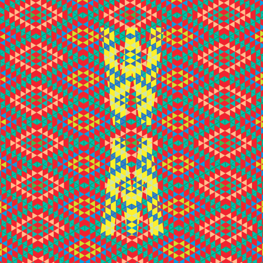
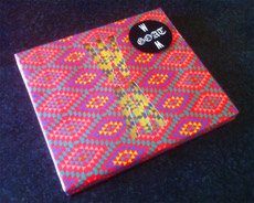
Goat – World Music (Rocket Recordings)
DESIGN BY CHRIS REEDER OF ROCKET RECORDINGS
THEMATIC ELEMENTS
“The idea I had in my head was to use an African pattern [and] make it psychedelic, but also contemporary and modern as well. First, I hunted out some patterns in bookshops and online, found one I liked, and copied it. Then I tried lots of different colourways, as wanted it to have a bright, in-your-face but modern feel. Then I was playing with the album title and the ‘WM’ motif just happened… The idea of the die-cut and contrasting the coloured patterns came from the exploration with a sleeve that messed with the eyes!!” – Chris Reeder
PROCESS & COLLABORATION
[The] album sleeve was born out of circumstance. We had commissioned two ‘already existing’ photos to be used on the front and back of the sleeve. Then a week before we were sending the record to manufacture, the photographer called us and said they had changed their mind and we couldn’t use them!! At the time, we were really disappointed by this — but in hindsight, it was an absolute blessing as the sleeve we ended up with (which we had five days to come up with, design, artwork, and get to the printer) is so much better and unique than the photos we were gonna use.
At first, I thought it would be too expensive to make but our amazing manufacturers, Breed, were able to find a way of doing it within our budget, and we are so chuffed we did as the die-cut sleeve looks amazing on the record racks in shops. By all accounts, it has become a bit of an iconic sleeve already!!” – Chris Reeder
Hecker – Chimerization (Editions Mego)
DESIGN BY NORM – norm.to
“For ‘Chimerization’ Hecker invited the Iranian writer and philosopher Reza Negarestani, to contribute an experimental libretto, ‘The Snake, the Goat and the Ladder (A board game for playing chimera)’ a script that has been recited by a group of speakers and recorded by Hecker in anechoic and sound-attenuated chambers – rooms designed to minimize the reflections of either sound or electromagnetic waves.
Hecker characterizes ‘Chimerization’ as a concept derived from psychoacoustic investigations on difficult-to-define areas between language and non-language, a process focusing on the decomposition of sound and synthesizing incompatible modalities, surpassing their respective particularities without fusing them, in order to obtain a narration beyond immediate comprehension, which may be deciphered through repeated, ‘active’ listening.
‘Chimerization’ is released in the following languages – English (eMEGO 153), German (eMEGO 154), the mother tongue of the artist and Farsi (eMEGO 155), the orginal language of the writer.” – Editions Mego


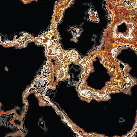
Ital – Hive Mind (Planet Mu)
ARTWORK & DESIGN BY SAM CHIRNSIDE – samchirnside.com
Artist could not be reached for comment.
Laurie Spiegel – The Expanding Universe Reissue (Unseen Worlds)

CONCEPT AND DESIGN BY LAURIE SPIEGEL
ADDITIONAL DESIGN AND LAYOUT BY TOM MCCUTCHON AND UNKNOWN
THEMATIC ELEMENTS
“First I should mention that the CD album cover was based on the 1980 LP cover, so I’ll be talking mainly about that… I love color and texture. I wrote the notes on my Apple II, and it had a Imagewriter I dot matrix. In 1980, printing shops didn’t have any way yet to accept and print from computer data or to print digital images. So I had the idea of creating a texture with the dot matrix printout that could be superimposed (actually masked out of) straight color fields. For the text, I interviewed myself, keeping in mind the kinds of comments and questions my then-quite-unusual music so often elicited, and I wrote enough to be able to fill up both sides of the LP jacket with texture.” – Laurie Spiegel
PROCESS & COLLABORATION
“For the recent CD and LP release, Tommy did a wonderful job of recreating the original design, and also of keeping me in the design loop. We worked closely together in doing the CD design, because it included various elements not present in the original LP album. On-disk printing, the tray card, the 24-page booklet, the UPC sticker — these were all additions Tommy made to the LP design he was recreating, and we coordinated our preferences and thoughts with each other closely on each of those, sending feedback and files back and forth quite a number of times.” – Laurie Spiegel
THE EXTRAS
“They said there was budget for only “1 color”, but in fact that meant only 1 pass of the press. I very much wanted full color, to reflect the aesthetic of the music, to capture a sense of the music. So I suggested, and the printer agreed to do, a split fountain of cyan, magenta and yellow. The colors were all a bit on the darkish side to make the white “print” readable, it having not been print at all but just absence of ink (to avoid another printing pass).
In the original LP edition, as the print run ran through, with the inks in the 3 areas of the trough mixing and blending more and more from the start to the finish of the edition, the colors blended more broadly. At the start of the press run, the 3 areas of color were relatively distinct, but by the end of the run, they were considerably mixed. So, although the jackets looked roughly the same, each was, to some slightly degree, unique. This continual variation of color blending was not duplicated in the re-issue, for obvious reasons.” – Laurie Spiegel
A Lull – Meat Mountain EP (Lujo Records)
SCAN & DESIGN BY NIGEL EVAN DENIS OF A LULL – nigelevandennis.com + electricheat.org
THEMATIC ELEMENTS
“We had come up with the idea for the album a bit from an inside joke. It was something said a couple years ago and when we started writing for the EP it was a bit of a working title that stuck. I think the album cover is much more interesting than the concept. I bought a chuck-eye steak and threw it on the scanner. That’s about it. Ha. Everything ended up digital of course, but it is literally the most raw medium I’ve worked with.” – Nigel Evan Dennis of A Lull
PROCESS & COLLABORATION
“Being an artist and a musician is like a dream come true. The creative process remains completely internal and completely interactive almost as much so as recording the music. The fun part about this band is that when i’m developing the art, i don’t consider my personal style or commercial portfolio. It makes every piece of art I do for the band almost always and entirely conceptual and experimental. It’s another extension of my art and I think it’s a totally fulfilling outlet. We collaborated on the back cover with Chicago artist Bill Connors for some wild illustration. He is a great artist and when I was starting to think about the back cover, it just felt right to show one of his pieces. Really great stuff.” – Nigel Evan Dennis of A Lull
Magic Touch x Sapphire Slows – Just Wanna Feel (100% Silk)
DESIGN & ARTWORK BY BOBBY HOULIHAN – bobbyhoulihan.com
THEMATIC ELEMENTS
“Sapphire Slows released an album a while ago on Not Not Fun, and it was that record sleeve which served as my main inspiration. [Label owners] Amanda [Brown] and Britt [Brown] designed that sleeve using English and Japanese text, and I thought that was a good idea. The record is a collaboration, so the visual concept was to take the title Just Wanna Feel and create a block of text on both the front and the back that was composed of a roughly 50/50 ratio of English and Japanese. The only way to get this ratio somewhat balanced was to translate the Japanese phonetically. Had we done a more literal translation, the Japanese characters would have outweighed their English counterparts, and it would have been really wonky, which the record is not. The tracks are really clean and balanced. Very clear. Very positive. Nothing too complicated. I hope that is reflected in the art. I think it is.” – Bobby Houlihan
PROCESS & COLLABORATION
“Damon was cool with my idea of the text right away. He would send my work over to Kinuko in Japan,and she would okay the translations and make any corrections. She was very helpful in that regard.” – Bobby Houlihan
Man Forever – Pansophical-Cataract (Thrill Jockey Records / Northern Spy Records)
DESIGN BY DAN SCHECHTER – danschechter.com
THEMATIC ELEMENTS
“The album is an exploration of the sounds created by overlapping rhythms. The core of the performance is two drummers playing drum rolls simultaneously on a single drum. What results is a drone molded by the rhythms coming in and out of phase. It has the effect of creating sounds within sounds. I wanted to capture that unexpected sensation and reference some of that logic. I also wanted to build on the moon theme that has featured prominently in several Man Forever designs. The moon cube on the cover references both this structural process as well as the simple sensation of something so recognizable, distorted.” – Dan Schechter
“I just sent the record to Dan and asked him to come up with something cool. I think I told him I wanted it to really pop and be different from the typical cover… that’s it.” – John Colpitts of Man Forever
THE EXTRAS
“The type on the back cover is comprised of every weight of the typeface DIN overlaid atop one another. ‘Din’ has several meanings. A word meaning “awkward sound or racket” for us English speakers, it’s also a common Arabic term for faith, or more specifically, the way you live your life through faith. For Germans, it’s an acronym for their national board of standards and shorthand for the famous type endorsed by that board for their license plates. If you put all that together, we think it’s an apt metaphor for this project. The visual effect of superimposing the various weights is reminiscent of the overlapping rhythms in the music.” – Dan Schechter
Mike Shiflet – Merciless (Type Records)
PHOTOGRAPHY BY MIKE SHIFLET – michaelshiflet.com
ART DIRECTION BY JOHN TWELLS OF TYPE RECORDS – typerecords.com
THEMATIC ELEMENTS
“The album is the second in a series focused on the idea of the world as a machine, indifferent to humanity (see Hurricane Sandy for a recent example), and our attempts to exist within such a structure. The palm photos attempted to address several subplots in that narrative. Primarily the difference between how we see ourselves inside the construct of a world we’ve created and our actual existence.” – Mike Shiftlet
PROCESS & COLLABORATION
“I took the photos myself, but I took some outside direction as the photographer. John Twells from the label (Type Records) offered a lot of great advice after I presented my original ideas to him.” – Mike Shiftlet
AUDIO-VISUAL COMPONENTS
“I’ve been using videos in live performances for the past few years. The images are similar to those on the Merciless and Sufferers covers, with a lot of macro photography involved.” – Mike Shiftlet
Olafur Arnalds & Nils Frahm – Stare (Erased Tapes)
DESIGN BY TORSTEN POSSELT OF FELD – feld.is
THEMATIC ELEMENTS
“The dot in the middle is actually a famous optical illusion. Stare at it long enough and you will figure it out — hence the title.” – Ólafur Arnalds
“The wonderful thing about working with Torsten Posselt on artwork is that you just give him the title, and he [can] just come up with an idea like this.” – Nils Frahm
“Listening to the release for the first time, I found myself staring at a little dark spot on the opposite wall. The longer I stared, the more surreal the spot became; it seemed to grow a halo, even if I knew that this was just my mind playing a little trick on me. So I started looking into some collections of probes into the moment-by-moment workings of our brain, trying to understand this phenomenon. At any given time, the brain is collecting, filtering, and analyzing information and, in response, performing countless intricate processes, some of which are automatic, some voluntary, some conscious, and some unconscious. The designed artwork functions as such a mind hack. By staring at the radial gradient, your mind tells you that it grows a brighter halo around it even though it is not there.” – Torsten Posselt
PROCESS & COLLABORATION
“It is truly a great pleasure to work together with Nils [Frahm] and Ólafur [Arnalds], and I think we complement each other in a really nice way. When I approached Nils with the idea and some test prints, he instantly felt in love with it, and we spent some hours just staring at the little dark spot in the center of the gradient. I highly recommend doing that as well if you happen to have a physical copy of the release.
During the production we ended up staring at dozens of test prints of various gradient sizes, just like wolves staring at the moon.” – Torsten Posselt
AUDIO-VISUAL COMPONENTS
“I think Ólafur and I are very picky about visual aspects. We also work with light and stage designs, seeing that it [all] adds to the overall experience. If we could manipulate even the smell of our music, I am sure we would even design that. This is what control freaks tend to do.” – Nils Frahm
Pangaea – Release (Hessel Audio)
Artist unknown.
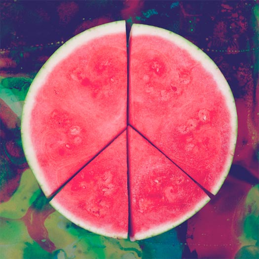
Peace – Delicious (Columbia Records)
DESIGN BY SAM COLDY STUDIO – samcoldy.com
PHOTOGRAPHY BY ELLIS SCOTT – ellis-scott.com
Artist could not be reached for comment. Alternate version created by Coldy which was not used:

Stephan Mathieu & Sylvain Chauveau – Palimpsest (Schwebung)
DESIGN BY CARO MIKALEF FOR CABINA – espaciocabina.com.ar
“The two stones, as the lovers, also resembled to me a heart shape when I was composing them, in the funny random way images inspire meanings. But all these meanings were [the] essence of the design choices with no intention to become literal; there was no need [for] everybody [to] understand them in a linear way.” – Caro Mikalef
PROCESS & COLLABORATION
“We work very closely with Stephan [Mathieau, and it] was important for me to receive his input regarding the album, have a platform of thoughts about the direction he wanted to give to the album and to his label Schwebung, and also to try to interpret his ways of conceiving the visual, aesthetic, etc. He is very active and creative regarding the design of his covers, and his mind is full of interesting visual ideas to be explored. The first instances of a design process were very open; we took them as visual thinking tanks that opened visual directions we both wanted to explore. Then with the chosen options, the design process got more and more fitting to specific expectations and needs. Feedback for me can be as interesting as exhausting sometimes; you realize how arbitrary things can be regarding the visual perception and you test the reception by others. I also had the feedback of my studio partner in Cabina, Coni, which is a valuable reference to me in graphic terms, but mainly what I need to point out is that the design process was very open and mediated by testing several instances and [was] not only my personal isolated work. We both had an interesting dialectic until we got to the final cover.” – Caro Mikalef
AUDIO-VISUAL COMPONENTS
“In general, I don’t use live visuals for my shows; ideally, they are performed on a great sound system in a pitch dark space. I’m using visual aspects in my installation work though, i.e. 16mm projection. Caro and I also built a large kinetic object made from optical lenses, filters and mirrors for a project.” – Stephan Mathieu
Swahili – Swahili (Translinguistic Other)
ARTWORK BY XUA OF SWAHILI – www.facebook.com/XUAsound
THE EXTRAS
“The piece was actually around for almost two years as we recorded and re-recorded the record. It was never intended to be the cover, but as we approached finishing the album, it became clear that this piece was closely tied to the material the whole time. I believe the original basis of the cover is a Christmas album of hymns featuring George Beverly Shea.” – XUA of Swahili
RELATED POSTS:
Swahili Portland Musicians
Vessel – Order Of Noise (Tri Angle Records)
Artist unknown.
Wild Nothing – Nocturne (Captured Tracks)
PHOTOGRAPHY BY SHAWN BRACKBILL – shawnbrackbill.com
LAYOUT BY RYAN MCCARDLE – ryanmccardle.com
“Jack Tatum (Wild Nothing) and I worked hand in hand on this release from the get-go. We went through various stages, starting with collage then going to photography until eventually ending up with this marbled paper idea. We liked what these marbled papers provoked emotionally. I like to think it represented a somewhat “nostalgia in motion.” The die-cut packaging, coupled with the multiple marbled papers, gives the listener a choice of what their cover will be. My hope was that they could place a visual connection with their audible experiences, especially since everyone will pull their own meanings and personal connections from Nocturne.” – Ryan McCardle

The xx – Coexist (Young Turks Records)
ARTWORK BY THE XX

THE ALBUM COVER FOR THE XX’S 2009 RELEASE, XX


[…] work for the two new Spires That In The Sunset Rise LP & the Guardian Alien LP made REDEFINE’s album cover […]
[…] simpler approach. Though it wasn’t as originally intended, it did get mention as one of the top album covers of the year by Redefine Magazine. As the follow-up album was written in a similar era, we stuck with the aesthetic a second […]
[…] http://www.redefinemag.com/2012/2012-album-covers-of-the-year/7/#alice […]