Painting & Illustration Album Covers of the Year 2012
CALM


CHAOTIC
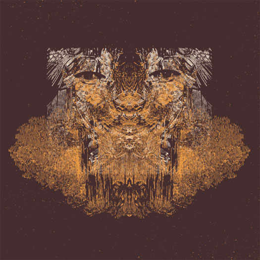
Altar Eagle – Nightrunners // Decimus – 11 // Dustin Wong – Dreams Say, View, Create, Shadows Lead // Father John Misty – Fear Fun // Fergus & Geronimo – Funky Was The State of Affairs // Generationals – Lucky Numbers // Lord Huron – Lonesome Dreams // Machinedrum – SXLND // Matt Carlson – All Moments // Matthew Dear – Beams // Swans – The Seer // Laurel Halo – Quarantine // Moon Duo – Circles // Of Montreal – Daughter of Cloud // Samantha Glass – Mysteries From The Palomino Skyliner // Spires That In The Sunset Rise – Ancient Patience Wills It Again Part II // Three Legged Race – Persuasive Barrier // Tilly & The Wall – Heavy Mood // Torche – Harmonicraft // Ty Segall Band – Slaughterhouse
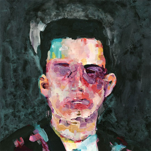
Altar Eagle – Nightrunners (Digitalis)
PAINTING BY RADEK DRUTIS – www.radekdrutis.com
THEMATIC ELEMENTS
It might have been inspired by some things I was interested in at the time, like some vintage Killed By Death 45’s, The Nubs’ “I Don’t Need You”, for example, this old UK comp called Back Stage Pass with Manufactured Romance on it, and a lot of ’60s-’80s Polish cinema. – Radek Drutis
With Nightrunners, we had actually already decided on a totally different cover, and I was working with Radek on art for something else. When Radek sent through his ideas for that and I saw the cover we settled on for Nightrunners, I immediately knew it was perfect. The 10 songs on the album are all different stories about different characters (in their own, vague way), and I felt like this artwork reflected that incredibly well. Add in that Radek’s cover work has been some of my favorite through the years (his cover for Madlib’s Miles Away album is honestly my favorite album cover of the last 10 years), it was a no brainer. – Brad Rose, of Altar Eagle
AUDIO-VISUAL COMPONENTS
“Another band I used to play in, Ajilvsga, always had projections during our live performances that were an important component of those shows. I’m also very interested in doing videos for my music and trying to translate the ideas behind the work into something visual (or, even more interestingly, turning it over to someone else without any input and seeing how they interpret it.)” – Brad Rose, of Altar Eagle
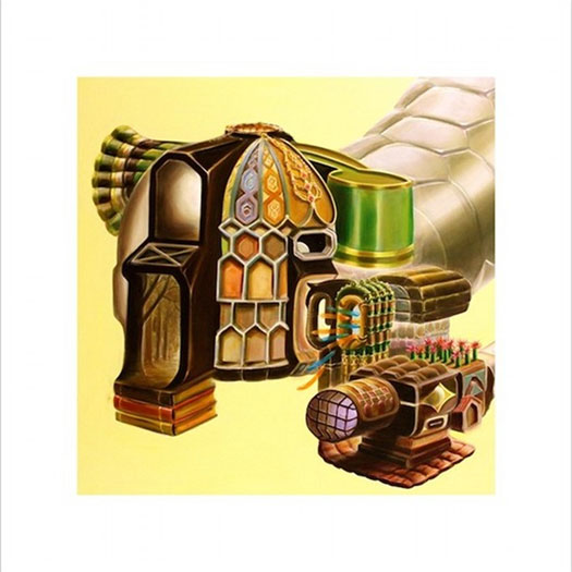
Decimus – 11 (Digitalis)
ARTWORK BY DYLAN MCCONNELL OF TINY LITTLE HAMMERS – tinylittlehammers.com
“When it came time for Brad [Rose, from Digitalis] and I to discuss the art for this LP, I didn’t have any real fleshed out ideas. Part of why I was very excited to work with Digitalis was because of the labels consistently amazing visual aesthetic, so I was very open to Brad’s suggestion. The first thing he sent me was the art we used. I immediately loved it and saw how it related meaningfully to the music. They “belonged” together. I had nothing to do what its inception and its creation was unrelated to the music on the record. In general, I believe that one of the more powerful aspects of the psychedelic experience is the serendipitously meaningful relationship of unrelated stimuli.” – Pat Murano of Decimus
“Honestly I don’t recall – I do remember sending out 4-5 ideas, and this is the one he picked. I had a couple Decimus albums and just kinda riffed by extrapolating… I never actually talked to him but worked through Digitalis.” – Dylan McConnell
Dustin Wong – Dreams Say, View, Create, Shadows Lead (Thrill Jockey Records)
ARTWORK BY DUSTIN WONG
“The drawing for the album was actually based on a photograph of me floating in a reservoir in Maryland called Pretty Boy. I liked the image because it almost felt like the figure itself floated up from the bottom of the reservoir. After being with it for a while, I’ve been interpreting it as a dream floating up to the surface of our subconscious. The figure looks like he’s sleeping, so we are also kind of seeing this dream within a dream idea too. I see it as a representation of a dream emerging, and dreaming itself. [I] tried using the photo for the actual cover, but it felt a bit too raw, since I was in the nude.” – Dustin Wong

“Film is something I studied for a couple of years in college; it’s a very important medium for me. “Diagonally Talking Echo” and “Pink Diamond” were both [music videos] I made this year. I would love to do a narrative for the next one! I’ve played a couple of shows this year with a live video feed, showing my feet and pedals, just so it would make things more transparent to what I’m actually doing on stage. Some people see me up there and just wonder what I’m doing near my feet; some people even think I’m not even playing the guitar.” – Dustin Wong
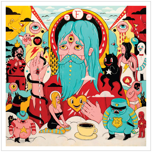
Father John Misty – Fear Fun (Sub Pop Records)
ILLUSTRATION BY DIMITRI DRJUNCHIN – dimitri-drjuchin.com
DESIGN BY JEFF KLEINSMITH
ADDITIONAL DESIGN BY SASHA BARR – thisisthenewyear.com
“The idea that was originally given to me by Josh [Tillman of Father John Misty] was ‘Sunset Strip Sleeze’, which I think is there on some level. But eventually it became more of an abstract idea rather then a direct depiction. My approach was to try to stay within my own style of working, since that’s what made Josh ask me to do the cover, and try to depict aspects of his songs.
“Most of the characters on the cover are a representation of a lyric on the album. You can make a game of it when listening. A drinking game even… if you’re inclined.” – Dimitri Drjuchin
Fergus & Geronimo – Funky Was The State of Affairs (Hardly Art)
ARTWORK BY ANDREW SAVAGE OF FERGUS & GERONIMO
Choice wise words about the album artwork and creative process:
“FUNKY” and “I mean, I always try to look my best.” – Andrew Savage of Fergus & Geronimo
Generationals – Lucky Numbers (Park The Van)
ARTWORK BY SCOTT CAMPBELL – scttcmpbll.com
PROCESS & COLLABORATION
“When working with Scott, the vision really comes from him… I’m wanting him to give us his take on what it should be. Sometimes our starting point might be something that he has made in the past, and we’ll say, ‘Hey, we liked this thing you did. Can you give us another take on that idea?’ Of course at some point there is a back and forth of ideas and we sort of nudge things here or there. But its usually like more minor changes for practical reasons. He is always the source for the larger picture idea.” – Ted Joyner of The Generationals
“The band liked a piece I had done that featured an eye within a hand, so I just set out to do a fresh take on that idea.” – Scott Campbell
AUDIO-VISUAL COMPONENTS
“For this past tour, we took the eye part of Scott’s design and blew it up really big and backlit it. We also built these triangular light boxes that we had onstage that were inspired by the geometry of Scott’s design. Its cool to me to sometimes have a sort of thematic connection between our album art and the visual of our live set up when we are out touring and playing those songs.” – Ted Joyner of The Generationals

Laurel Halo – Quarantine (Hyperdub)
DESIGN BY OPTIGRAM – optigram.net
ARTWORK BY MAKOTO AIDA – mizuma-art.co.jp
Artists could not be reached for comment.
Lord Huron – Lonesome Dreams (IAMSOUND)
DESIGN BY BEN SCHNEIDER OF LORD HURON
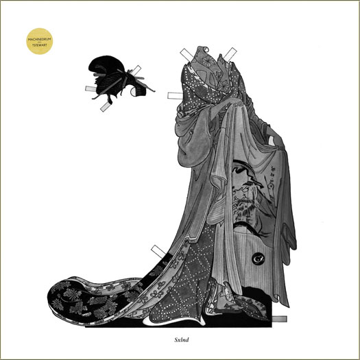
Machinedrum – SXLND (LuckyMe)
DESIGN BY DOMINIC SUM FLANNIGAN OF LUCKYME – thisisluckyme.com
THEMATIC ELEMENTS
“Working from the title SXLND (pronounced ‘SEXLAND’), I had a pretty funny starting point to work from — on top of the notion that we wanted to present these quite varied house-inspired songs [as though they] existed in their own world together. I drew upon the print and illustration of the Japanese geisha, presented as a decorative paper doll to evoke a time when sex and gender politics butted up against high society and ceremony. It was [a] rich visual world of beautiful delicate illustration, but it was suitably heavy and dark. We added a paper doll mannequin to a card insert, and if people chose, they could destroy the outer sleeve to dress the doll.” – Dominic Sum Flannigan
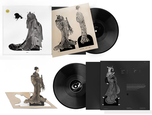
“I like to ask [musicians] not just their ideas about how they visualise the music, but also echoes of how they worked to produce the music. For instance, with Travis [Stewart] (Machinedrum)’s album sleeve for Room(s), I made sure the sleeve was started and finished within the time it took him to produce a song — just two hours. It made the work feel as considered and vital and as the music.” – Dominic Sum Flannigan
Matt Carlson – All Moments (NNA Tapes)
ARTWORK BY JASON TRAEGER – jasontraeger.com
LAYOUT & DESIGN BY MATT MAYER
“I’ve known Jason Traeger for several years now as a friend and collaborator in Oregon Painting Society, and I’ve long admired his playfully surreal, mystical oil paintings. When sequencing the tracks for All Moments, it became apparent [to me] that the mood and feel of these pieces was very different from my last LP, Particle Language, which had a kind of grey-void machine language vibe. These tracks were colorful dream worlds, playful and fun. Jason’s paintings were the first and only idea I had for the artwork. The paintings already existed, so no direction was given to him by me, but he has his own elaborate artistic philosophy and vision, which you can ask him about. Visuals are usually the last thing I think of with my work and I often have a hard time with it; I’ve usually just relied on artist friends of mine to take care of it for me.” – Matt Carlson
Matthew Dear – Beams (Ghostly International)
ART DIRECTION BY MICHAEL CINA AND MATTHEW DEAR
ARTWORK & DESIGN BY MICHAEL GINA – cinaart.com
THEMATIC ELEMENTS
“The album artwork started with a 15-minute call between Matthew Dear and myself, and we just talked. In that short time, we came up with an idea that I was going to paint him live in NYC in front of a camera with things happening around us. That “Beams Story” video came from that conversation, and ultimately, the cover… I really thought about the album like form and colors after hearing the LP. I had a color palette picked out, and that is what ultimately lead the project for me. We knew there was four singles as well, so that was always present on how the project “unfolded” through each single. Matthew Dear was an important part of the process. I don’t know how to describe it, but we just had this understanding of what it was we were going for. He would offer comments here and there but he gave me space to do my thing. I think that is really the best way to direct a project, but both parties have to be on the same page.” – Michael Cina
“There are little hints and clues that inform the design. Like if you look at the LP label on the side a song is on, the song title and the color palettes line up on the back cover of the LP. There are etched messages on each side of the vinyl.” – Michael Cina
Moon Duo – Circles (Souterrain Transmissions / Sacred Bones)
ARTWORK BY WILLIAM SWEENEY – alakazamlabel.com
“There were no specific rules – their brief was very open and I got the sense that they wanted something vibrant and psychedelic, I showed them some old alchemical engravings which I wanted to base the composition on, and they seemed to like them. I also wanted to incorporate some Georges Méliès inspired moon people and give it a sort of lunar rave feel – I think Moon Duo’s music is very danceable and wanted to reflect that a bit. So it was a real mixture of things and a nice collaboration.” – William Sweeney
THE EXTRAS
“I had actually created an illustration for Moon Duo before, without them knowing it was me who did it, for a compilation LP called Menagerie. It was complete coincidence that they contacted me to do the art for Circles; I like to think that mysterious cosmic forces brought us together again.” – William Sweeney
Of Montreal – Daughter Of Cloud (Polyvinyl Records)
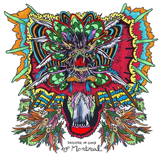
ARTWORK BY DAVID BARNES
Laurel Halo – Quarantine (Hyperdub)
DESIGN BY OPTIGRAM – optigram.net
ARTWORK BY MAKOTO AIDA – mizuma-art.co.jp
Artists could not be reached for comment.
Samantha Glass – Mysteries From The Palomino Skyliner (Not Not Fun)
ARTWORK BY RYO KURAMOTO – crooked-tapes.com
“Beau [Devereaux of Samantha Glass] had already had a great vision of this album. I hope I helped to visualize a part of his beauty.
All the stuff I drop [has] total DIY processes. Screen-printing, papercuts, and folding…. That’s why each artwork has different paper and ink. It’s kind of hard work for one guy [in a] small space, especially [since] Samantha Glass covers are massive. I made more than 500 copies. Each has 2 or 3 colors… maybe I’m trying to getting over DIY’s limitations.
Oh, and [I] always need tons of weed [during the] whole the process.” – Ryo Kuramotov
Spires That In The Sunset Rise – Ancient Patience Wills It Again Part II (Hairy Spider Legs)
PAINTINGS BY TURNER WILLIAMS – turnerwilliamsjr.com
“With Part 1, I had themes flying out my ass; one was this apocalyptic vision of a war-torn beachfront with this old lady rocking in a rocker as fireworks exploded overhead. So I had this very narrative idea for the art, which is why I contacted Turner, whose prints and paintings I loved and thought was capable of creating the details of these nuanced visions.” – Kathleen Baird
COLLABORATION
“Spires originally sent me 80 minutes of music. It was a really dense listening experience, and I started breaking the disc up into shorter albums… I got to know the tunes backwards and forwards after that year. Later, when they said they were going to release the music as two separate volumes, I wasn’t surprised. However, when they sent me the tracklistings, I was amazed to find their choices were really similar to mine! Maybe I tapped into some secret logic within those tunes from hanging out in Spires’ territory too long…” – Turner Williams
“It always starts with sending the artist the music. With Part 1, I started vomiting off all of these visions for Turner, giving him very detailed things to go off on…. we had many exchanges, a few missteps, and eventually we fell upon the bizarreness of Part 1. With Part 2, I decided that I didn’t want to give Turner any guidelines or directions; I wanted to give him complete artistic license without the paranoia of trying to please me — and that worked like a gem. I completely trust him.” – Kathleen Baird

PART 1
Swans – The Seer (Young God Records)
ART DIRECTION & DESIGN BY MICHAEL GIRA OF SWANS
PAINTING & PHOTOGRAPHY BY SIMON HENWOOD – simonhenwood.com
(Editor’s note: There is an additional image that looks like an exploding fuzzy posterior.)
Three Legged Race – Persuasive Barrier (Editions Mego)

ARTWORK BY ROBERT BEATTY – remainsstreet.com
Tilly And The Wall – Heavy Mood (Team Love)
Artist unknown.
Torche – Harmonicraft (Volcom Entertainment)
ARTWORK BY JON SANTOS – eyebleedink.blogspot.de
“A few of the cities on the backs of the Harmon creatures are Atlanta, Miami, Seattle which represent our homes (including Santos who lives in Seattle). The ice cream box packaging has a Rick Smith cone on the front. You can find little things that represent who we are on the sleeve.” – Steve Brooks of Torche
Ty Segall Band – Slaughterhouse (In The Red)
ARTWORK BY TATIANA KARTOMTEN – tatianakartomten.com
Artist was not contacted in time for commenting.


[…] work for the two new Spires That In The Sunset Rise LP & the Guardian Alien LP made REDEFINE’s album cover […]
[…] simpler approach. Though it wasn’t as originally intended, it did get mention as one of the top album covers of the year by Redefine Magazine. As the follow-up album was written in a similar era, we stuck with the aesthetic a second […]
[…] http://www.redefinemag.com/2012/2012-album-covers-of-the-year/7/#alice […]