
In the bi-lingual Japanese and English interview and feature below, Barthmus and NAM’s art director and designer Takayuki Nakazawa offer their perspectives on the creative process, as we further explore the work of both parties.
JAPANESE TO ENGLISH TRANSLATIONS BY MORGAN HARKNESS
Takayuki Nakazawa (NAM):
Our aim was to perfectly match the world of Sun Airway’s music and take that world of sound and enlarge its image visually. I believe that the music and the cover visuals that go with the creation of an album have an extremely intimate relationship. Music and visuals have the power to overcome country and language to convey a message. Creating something so intimate between the US and Japan was an incredible experience, and most of all it was fun! We would like to take this opportunity to extend our appreciation to Jon Barthmus for inviting us to this wonderful project.
私達が今回目指したのはSun Airwayの音楽の世界と完全にマッチし、さらに音の世界をビジュアルによってイメージの視覚的拡大をする事でした。アルバム制作における音楽とカバービジュアルは本来とても密接な関係性をもっているものだと思います。音楽やビジュアルは言語や国境を超えて伝達していく力があり、今回、日本とアメリカの間で密な相互関係をもって制作が行われた事は、私達にとって大変良い経験で、なによりも楽しかった!このような素敵なプロジェクトに私達を誘ってくれたJon Barthmusさんに、この場をお借りして感謝をしたいと思います。
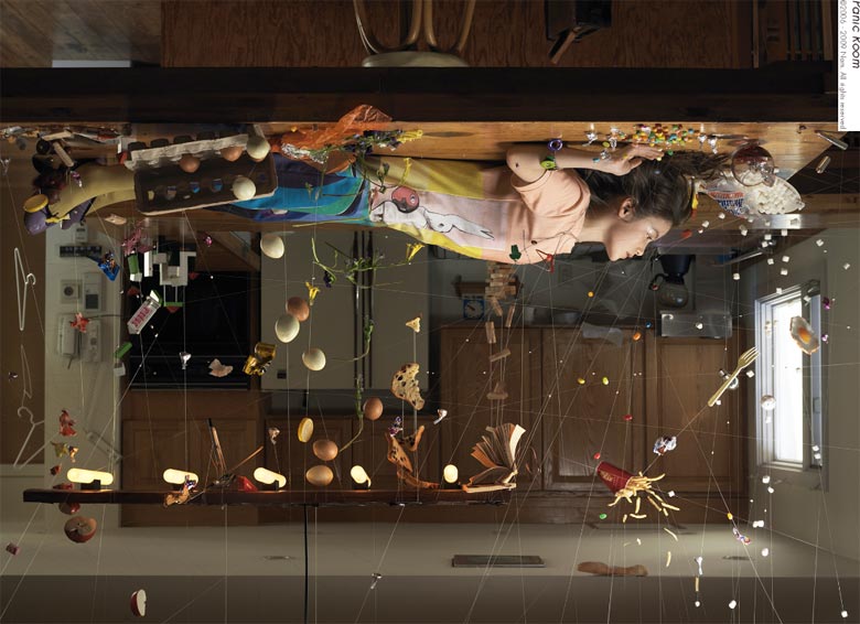
Sun Airway – Soft Fall Album Cover “Making Of”
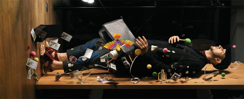
Jon Barthmus of Sun Airway wrote you because he was inspired by “Panic Room” and wanted to recreate it for the cover of Soft Fall.1 In this version, the scene is much softer, with flowers and delicate furniture. How closely did you collaborate on deciding upon the items and visual style?
初期の段階にJonさんから今回のアルバムのキーワードとして「植物」が出されました。この「植物」と言うモチーフは、今回のビジュアルの全体のファンタジックな雰囲気を占めています。そのキーワードを元に、私達はビジュアルの世界観を組み立てていきました。
私がまず思ったのは、自然光を利用して前作よりも、よりリアリティのあるビジュアルにしたら良いと考えました。そこに植物や食器やガラス工芸品等を配置し、絵画的な構成を持った画面にしたら面白いと思ったんです。ミレーの描いたオフィーリアのような…。また他には、少しだけエロティックな要素を隠し味のように入れました。これらはファンタジー的な世界に少し深みを持たせたいと考えたからです。
基本的にビジュアルのディティールに対してJonさんは大きな自由を私達に与えてくれました。仕上がったビジュアルを彼に送ったところ、そのビジュアルを見てタイトルを『Soft Fall』に決めたという連絡が来ました。
Takayuki Nakazawa (NAM):
At the early stage Jon gave us the keyword for the album, “vegetation”. The “vegetation” motif holds together the whole fantastique ambience that makes up this project’s visuals. We assembled the visuals of a world with that word as the foundation.
My first idea was that instead of using natural light as we did in our previous work, it would be better to create an even more realistic visual. I thought it would be interesting to organize a scene with a picturesque arrangement of vegetation, tableware, and glassware. Similar to how Millais depicted Ophelia1… We also added just a little erotic element as a sort of secret ingredient. I thought these things would bring some depth to the fantasy-like world we were creating.
For the most part, Jon gave us an incredible amount of freedom with the details. After we sent him the finished visuals, he contacted us to let us know that he had decided on the title Soft Fall after seeing them.
1 Panic Room was one of NAM’s earliest pieces in this series of work.
2 Ophelia is a painting by British artist Sir John Everett Millais, completed between 1851 and 1852. Ophelia is a character from Shakespeare’s play Hamlet, who is depicted here singing before she drowns in a river in Denmark.

The process took thirty minutes, which seems extremely short. How much was the composition mapped out beforehand? How much was improvised?
まずセットアップにかかった時間ですが30分ではありません。30時間です。徹夜で作業をしました。とてもハードな作業です。でも、これは私達にしてはコンパクトなセットアップの方です。もっと緻密で大規模のセットの場合だと、10数人かかりで4日~5日かけることもあります。
リメイクの為、天地をひっくり返すという大きな構図は既に出来ています。プロップスの配置については現場で即興的に重力の力を意識して、世界が反転した様なプロップスの落下/浮遊する動きの演出をして画面を組み立てて行きました。実際に手を動かしていく事によって面白い構成や演出が浮かんでくるので、それらを柔軟に取り入れた方が、私の場合は事前に構成を決め込むよりも複雑で動きのある緻密な画面に到達しやすい気がしています。
スタジオの選定、モデルの選定などにおいては多くの候補を挙げ、その中から選びました。またプロップスの収集は、ひとつひとつ自分たちで世界観に合うものを探して収集しました。これらのプリプロダクションは世界観を決定するものなので、かなり時間をかけて慎重に行います。
Takayuki Nakazawa (NAM):
Well actually the time we took to set up — it wasn’t 30 minutes; it was 30 hours. We worked through the night. It’s very difficult work. Even so, this was on the compact side of our usual set up time. For more delicate and large-scale sets, we can use around ten people and take four to five days.
For the remake, we already had the big composition ready for creating a world that had been knocked over. To assemble the scene, we arranged the props by improvising with gravity in mind, directing them in ways the objects would fall and float in the pull of gravity if the world was turned upside down. By actually moving them with our hands we would be inspired with interesting configurations and direction. By being flexible and taking in those ideas, it was easier for me to attain a delicate scene with both complexity and movement than deciding it in advance.
We came up with many different candidates for the studio and model selection, and chose one from that list. For the collection of the props, we individually selected each object one by one to fit our made up world. This kind of pre-production decides the appearance of the world we create, so we take considerable time and discretion to carry it out.
In this version, the scene is much softer, with flowers and delicate furniture. How closely did you and NAM work together on deciding upon the items and visual style?
Jon Barthmus (Sun Airway): Well as much as I loved that image and whole series of images, there was still a lot about it that I didn’t think worked exactly with the music. These were all a little too dark in tone. When I initially approached NAM, I mentioned that my dream would be to create this type of situation in a brightly lit palace type setting. Unfortunately locations like that are pretty hard to come by in Japan and were completely out of any budget we might be working with. But in the end I think the simple setting that was created was pretty perfect for the music.
There was a problem with the flowers wilting too quickly in the humidity of the room. How did you fix this problem, and what were some of the other challenges?
水を含ませたティッシュペーパーをアルミホイルで根に巻て水分を与えたり色々対策しましたが、それでも枯れてきたものは結局捨てまた付け替えました。写真をみると少し弱っているものもありますね(笑)。生きている物を吊るのは、今回初めてでした。花は非常にデリケートで苦労しましたね。葉は事前に枯れにくい葉を調べてそちらを用意して行きました。
撮影時に特に大きな問題はなかったのですが、私個人で言いますと画面内におけるプロップスの量の追加をどこでやめるか?という事に少し悩みました。いつもこの点は悩みます。実は、床や空中にはもっと沢山の草花を配置してみたりもしたのですが、試しにモデルにセットに入ってもらった状態を見て、量を少なくしました。荘厳で奇麗でしたが、それではあまりにオーバーで画面がファンタジーに寄り過ぎ、空間のリアリティーを損ねる気がしたからです。セットアップが午後の光を受け、とても静かな撮影現場だったのが今回印象的でした。少し夢の中にいる様な感じでしたね。
Takayuki Nakazawa (NAM):
We took different counter-measures such as wrapping the stems in wet tissue paper with aluminum foil, and ended up throwing the ones away that continued to wilt and replacing them. If you look at the picture, there are some that are a little weak looking [laughs]. This was our first time suspending living objects. Flowers are extremely delicate so we had some trouble. As for the leaves, we researched and arranged in advance for ones that don’t wilt easily.
There weren’t any big problems when we started shooting, but I myself was a bit troubled over when to stop adding more props to the frame. I always agonize over this part. To be honest, we tried adding many more flowers to the floor and ceiling, but when we saw what it looked like with the model in the set we ended up taking some out. It was impressive and beautiful, but it was a little overboard and the scene became too fantastical, taking away from the realistic feeling. During set up we had the afternoon light, and it was a very quiet. This left an impression on me. It had the feeling of being inside a dream.
When did NAM begin work on their series of carefully measured and strung scenes of chaos and movement? How did the idea first develop, and how has it grown from its beginning to the end?
2006年から、グラフィックデザインの視点に写真を癒合させた表現を出来ないかと思い、フォトグラファーの間仲宇と一緒に制作を始め、現在まで作り続けています。私達にはいくつかのスタイルがあり、これらの日常にある物を実際に吊るスタイルはその一つです。
最初はいわゆるテクノロジーを多用したCG表現のちょっとした反動みたいな気分から産まれました。制作しているうちにビジュアル表現におけるリアルとフェイクの曖昧な関係性に興味をもち、この無重力状態をテグスを使って手作業で再構成すると言う手法で、それらが違和感無くフィットするファンタジックな世界観のセットアップで規模や複雑さを増していきました。ファンタジックで奇妙な世界観ですが実際にリアルな空間がそこに存在する事は、シンプルで強い説得力があると思います。よく「何故人や物がよく浮くような作品が多いのか?」と質問されたりもしますが、それは実は自分でもよくわかりません。そのような世界観の中にいる時、すこしだけ自由になるような気がします。そして、この手法でまだまだ制作出来る世界観の余地がある気もしています。
Takayuki Nakazawa (NAM):
It started in 2006 with the idea to merge the point of view of graphic design and photography, and the photographer Hiroshi Manaka and I began working together ever since. We have many different styles, and one of them is to take everyday objects and hang them.
At first it was born from a kind of reaction to the heavy use of CG for expression. As we were creating, we became interested in the relationship between the real and the fake in visual expression. Reconstructing weightlessness by hand with nylon thread, we were able to increase scope and complexity by setting up a fantastical world that fit without creating a feeling of discomfort for the observer. Even though it’s a fantastic and strange world, there is actually realism to it and that has a simple but strong persuasive power. I’m often asked, “Why do you do so much with people and objects floating?”, but I really don’t even know myself. When I am inside that kind of world, I feel like I might be a little more free. I also feel there is still a lot of room to create different worlds with this technique.
During your creation process, does your music take on a visual relationship? Can you tell us a little bit about what that’s like?
Jon Barthmus (Sun Airway): I’ve always been very influenced by the visual. Lyrically, I try to paint something that the listener can actually see and feel. I relate it to looking at a giant Rothko piece where you walk into the room and the weight of it just hits you. You’re immediately immersed in this thing/feeling. Lyrically, I’m always most influenced by films and visual art, in addition to being a graphic designer and artist myself.
Sun Airway – “Close” Music Video
Produced and directed by Ewan MacLeod, the music video for Sun Airway’s “Close” crosses terrains far and wide to end in foggy and inexplicable elation. Again, like the album cover and the music, everything is beautiful upfront, but the mystery lies deeper than surface level.
There is a close relationship here between the ethereal nature of the music and the visuals. There are a series of words on the back cover of Soft Fall. Who were these created by? Before or after the installation project?
この文章はJon Barthmusさんが書かれたものです。想像力が膨らむ素敵な文章です。『Soft Fall』は音楽とビジュアルの関係のみならず、テキストにまで関係性があり、トータルにひとつのビジョンが貫かれた特別なアルバムだと再確認しました。ちなみに、このアルバムのグラフィックデザインもJon Barthmusさんが担当しています。こちらもとても素敵な仕上がりですね。
Takayuki Nakazawa (NAM):
That was written by Jon Barthmus. It’s a lovely composition that swells with the power of imagination. On top of the music and visuals, there is a relationship with the text that pierces through the entire vision, and this reaffirmed to me what a special album Soft Fall is. By the way, Jon Barthmus is also responsible for the graphic design for the album. This was also a very beautiful finish.

Sun Airway Sound Gallery
Directed by Ricardo Rivera.
NAM Art Gallery


www.sunairway.com
www.n-a-m.org
Ω