
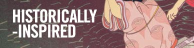
Geometric & Textural Album Covers
Agusa – Högtid (Transubstans)
Artwork by Peter Wallgren
Sounds by Agusa


Arthur Beatrice – Working Out (Polydor Records)
Artwork by Luke George & Elizabeth Rose
Design by Michael Cina
Concept & Sounds by Arthur Beatrice

Elliot Barnes (Arthur Beatrice):
We loved Michael [Cina]’s work with the Ghostly international artists, and a browse through his website was enough to get us in contact with him. He helped greatly in terms of realising our ideas, and was forthcoming with his own as well. We wanted to continue certain aspects of the aesthetic that we had developed over our previous releases, whilst also having a new look for the album release, and he was great at tying in new things, like the embossed and debossed text on the front and back, that made the vinyl packaging so much more tactile – developing on the gloss on matte test that we had used in the past.The images selected presented the painting that we had commissioned, which itself was purely symbolic. The imagery used on the front of the physical release was a product style shot of the painting itself, whilst the digital artwork had a more distant shot, which felt like a nice way of differentiating between the experience that the buyer had with the record versus the download. There are a couple of band shots, to tie in the people responsible for the music, as well as macro shots of the painting itself within the CD booklet. These give a much more in depth view of the surface of the painting, showing it to be a lot more developed and distressed than it seems on the cover.
The Body / Sandworm Split (Thrill Jockey Records)
Artwork by Jon Goldy

clipping. – CLPPNG (Sub Pop Records)
Art Direction by Dusty Summers
Artwork by Tim Lahan
Sounds by clipping.

Damn Right! – Frozen Sun
Tommy Bradel of Damn Right

Hieroglyphic Being and The Configurative Or Modular Me Trio – The Seer Of Cosmic Visions (Planet Mu Records)
Artwork by Unknown

Hollow & Akimbo – Hollow & Akimbo (Quite Scientific Records)
Artwork by Christopher Everhart
Sounds by Hollow & Akimbo

– Jon Visger, Vocalist and Bassist on Hollow & Akimbo
Mark E – Product of Industry (Ghostly International)
Artwork by Michael Cina
Sounds by Mark E

Mark E:
As the producer of the musical content, I was extremely happy to know Michael was going to be designing the album artwork; this comes from the fact he designed my first album too. I really liked what he did with the artwork on [Stone Breaker] (right), so the input from me was to carry on the visual link from Album 1 into Album 2, but to keep in mind that the methods I employed in making the music had changed between the albums. Album 2 was produced using hardware, unlike album 1, which was produced with a computer only. Also, the theme behind the music was based around my upbringing in an industrial area of the UK and how manufacturing had declined over generations.I thought the way Michael used the original design from Album 1 by actually printing it, tearing it, and painting over it by hand was an extremely thoughtful and ultimately succesful way to reflect the hands-on way the music was produced. I think it portrayed the grittiness of analogue synths and drum machines and the raw nature I intended the music to [have], as opposed to the very graphical / digitally-produced imagery on Album 1, which also echoed the music inside.
Michael Cina (Artwork):
The idea was to make something that was timeless and analog. We had discussed some architectural work and it led me to this for some reason. Mark sent me some images, and they were all over the board but mainly comprised of 3D/architectural work, if I remember correctly. We had started out doing a 3D image, but Mark felt it was too digital feeling, so we rescaled back. This is the pattern from his first Ghostly album recontextualized (cut it up) into a more analog and what I consider, 3D environment. I like to see this cover as a painting or also as room full of these patterns.
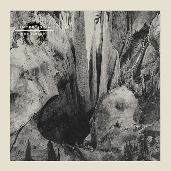
Inter Arma – The Cavern (Relapse Records)
Artwork by Unknown
Korallreven – Second Comin’ (Cascine)
Artwork by NUG
Art Direction by Korallreven and Bear & Co
Sounds by Korallreven

Marcus Joons (Korallreven):
We were after something psychedelic, but in a hypermodern way and not in a way that should remind you of the hippie summer of love in 1969 or the acid house one in 1988. We wanted something that was somewhat offensive and beautiful at the same time. Just like the music, we thought. Then we came to think about NUG.We reached out to NUG, and then we had some drinks where we talked about it all, and he mentioned how important it was for him that it should not just be him repeating his signature paintings with this so-called “spaghetti graffiti”. It had to have the feeling of collaboration between him and us. So I went out to his studio outside of Stockholm a couple of times and sort of directed him in what to do. It was just sooooo fun. And yeahyeahyeah, to collaborate with NUG was of course also a political statement. Lena Adelsohn Liljeroth, right wing politician and Sweden’s former minister for culture, once infamously declared that one of NUG’s video installations, “Territorial Pissings” — where he sprays down an entire subway car, “was not art”. Hahahaha just too funny. Anyway, I’m super happy about it all.
It looks 6000 % better IRL. Think I’m gonna frame one and have it on the wall over my bed.
Lord Raja – A Constant Moth (Ghostly International)
Artwork by Robert Beatty

Oneohtrix Point Never – Commissions EP (Warp Records)
Artwork by Robert Beatty

 Inner Sleeve
POW! – Hi-Tech Boom (Castle Face Records)
Design by Matt Jones of Castle Face Records
Sounds by POW!

“I gave a demo tape of Hi Tech Boom to Castle Face after we recorded it and decorated the tape case with a computer chip. This later inspired the idea for the album cover because it also coincided with the concept behind the record. Matt Jones from CF came across a book called “state of the art” at Adobe Books in SF, and it was filled with pictures of integrated circuits. We got together and collaborated on the layout.
The insert image has a lot symbolic importance to me. It was taken at The Portals of the Past, a monument now standing in Golden Gate Park. Originally, this was the entranceway to a mansion in Nob Hill before the big earthquake in 1906 that caused destruction and flattened almost everything except this entrance. Now it still stands today in Golden Gate Park as a symbol of the perseverance in San Francisco… embodying hope for the future regardless of the struggle we faced in the past.” – Byron Blum of POW!
Tunnelvision – Sky Swallower / Desire Lines (Emerald & Doreen Records)
Logo Design by László Magyar
Design by Eric Schemer of Emerald & Doreen Records
Sounds by Tunnelvision

My first thought was it must be the image that symbolizes the artist’s name, so I imagined a picture that represents the tunnel and visualization… The most important [thing] was the shape, which had to be perfect. The shape is very clear and plain, which shows many feelings: mystique and curiosity… The background only serves to give some depth to the image.
I wanted to use the original Tunnelvision logo design but give it some connection to the album name, Sky Swallower. When I was traveling in Las Vegas last year, I saw huge fake blue skies in some of Las Vegas Casino Hotels and took a picture. The Las Vegas fake sky strangely reminded me of artwork by famous Belgian Surrealist artist René Magritte, who funnily enough, was from the same country as Tunnelvision. Also, the artificial sky opened up another connection to the music as the music as well is produced completely artificial, meaning digital. So there are several connections coming together in the Sky Swallower cover.
TV On The Radio – Seeds (Harvest Records)
Artwork & Art Direction by Julian Gross

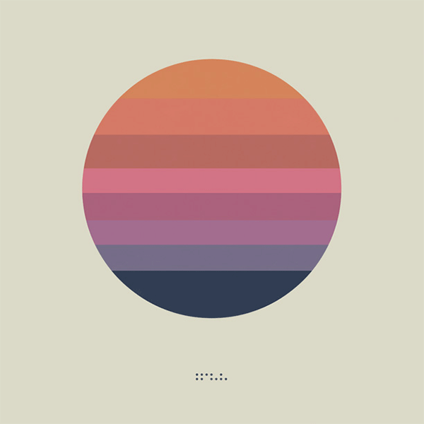
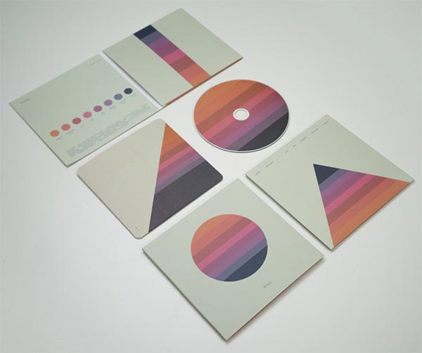
Tycho – Awake (Ghostly International)
Artwork & Sounds by Tycho
Wolves In The Throne Room – Celestite (Southern Lord Records)
Artwork by Nathan Weaver and Rachel Carns

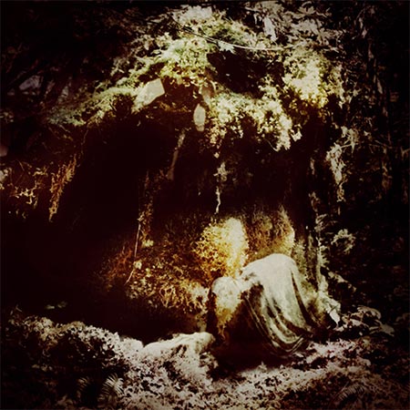
Celestial Lineage Album Artwork
Aaron Weaves (Wolves In The Throne Room):
Usually our songs start with images — whether it’s a painting or a landscape or a picture in our minds. The songs all flow from this collection of images. Our records are really visual for us. It feels like a universe that we can move around in. So it’s easy to decide which images make sense for album artwork. Translating them into a form that works on a LP sleeve is the hard part.
Nathan, the guitar player and singer in Wolves in the Throne Room, created the images but he worked closely with Rachel Carns, a friend of ours in Olympia. Rachel has done the layout on most of our stuff and she has a great eye. That little bit of subtle color correction, cropping and text layout makes such a huge difference. She used to be in a great queer punk band called The Need but now she does design and makes kombucha.


[…] spin. That dynamic is well supported by the album’s cover art, a collage Noah recently told Redefine […]
[…] an album cover he designed for the Philadelphia based band Cassavetes was as picked as part of Redefine Mags“best album covers of 2014”. I thought it was aesthetically pleasing and not much else until I […]
Hey guys, l made that Mansions album art. Thanks for the inclusion! Can you add my name? – Jesse Treece
yes’m! if you have any website or insight to include, feel free to e-mail! huav@redefinemag.com
Cover photo for “To The Top” by Twin Shadow is incredible, I believe Milan Zrnic is the photographer
Indeed!!! An accidental one we forgot to include. Will make a note. Thank you!!