Fine Art & Illustration Album Covers
Adderall Canyonly – The Limits Of All Known Ice (Queue Records)
Artwork by Dylan McConnell of Adderall Canyonly and Tiny Little Hammers

Baba Stiltz – Total (Studio Barnhus)
Artwork by Malin Gabriella Nordin

Malin Gabriella Nordin (Artist):
Baba’s music touches me in a very profound way, it’s almost hard to describe. First time I heard the song “Ja Rule”, I started to cry. I listened to the album 24/7 while working… while sleeping, walking, riding the bus. I didn’t think too much about the outcome; I just wanted to feel the music and work from there.I worked with painting and drawing for the artwork and later I scanned in parts of different works to be able to work with it as a digital collage. I usually never work digitally so many conclusions came from circumstances I’m not used to, mistakes that turned into a part of the artwork…
At first, the album cover was the one you see as the object within the artwork, but when Baba showed me the site boomkat.com, where they photograph the records in a tilted perspective with a shadow reflection, I wanted to try out how my artwork would look like on there… and from there the final artwork progressed.
Cassavetes – Oh So Long (Black Numbers)
Artwork by Jason Andrew Turner
Photography by Matt Ashby
Sounds by Cassavetes

“I have been making a series of these landscapes since about 2000. I view them as static scenes not tied to a moment/time or when/where, as if everything is happening all at once. Each line can be viewed as a heartbeat, a step, or weeks and years. I like to get a little obsessive and to hide a great deal of information in each gestural line, like a code that’s only broken by the viewer’s participation with the work as a whole, akin to decoding a treasure map without a key. I assign the blocks of colors as overarching events that have a resounding importance to the location at hand, and what eventually shapes the narrative of the space. Ultimately, I don’t want to drive a distinct storyline; I prefer the viewer to find it in themselves.
While making the art for this, I listened to the Casavettes album on repeat roughly one million times; I wanted their energy and subsequent influence to be felt in the final work. The rhythm of the lines and the composition are in debt to the album as a whole. Additionally, in the top right corner is a reference/bastardization of the constellation Ophiuchus; I felt its symbolism shares a lot with what Josh uses in his lyrics, wrestling with all his thoughts and feelings…”
– Jason Andrew Turner, Artist
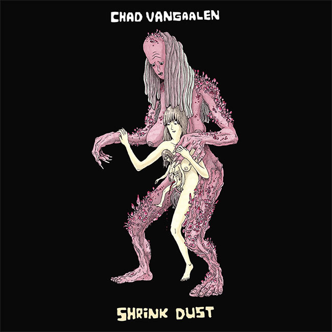
Chad VanGaalen – I Want Your Back (Sub Pop Records)
Artwork & Sounds by Chad VanGaalen
Deptford Goth – Songs (37 Adventures / PIAS)
Artwork by Jordan Kasey


Diners – Always Room (Lost Sound Tapes)
Artwork by Nick Shively
Sounds by Diners

The concept for the cover saw a lot of changes along the way, and in a few attempts to break old habits, I started off in a completely different direction. We talked at first about the cover to Led Zeppelin III — specifically the, almost, baseball jersey-style text. That kind of led me toward wanting to use collage and found photography. I collected a lot of images of grass and water from some old nature magazines, and cut them into strips and rearranged them, but it didn’t really work. I knew the colors I wanted, but when using found images, and old film stock, you lose control over color and texture, and that was something I felt like I needed. Once I switched to using watercolor and pencil, it all started coming together smoothly. We even used an early illustration as an alternate cover for the cassette release.
A lot of the images and colors seen in the cover are sort of nostalgic for us. We both grew up and met in Arizona. Nick now lives in Seattle and I’m still in Phoenix, but capturing an experience and remembered version of Arizona was what I got out of it. Nick half-jokingly told me he was channeling his memories of mowing the lawn in the intense heat of summer. I don’t think anybody would pick up on those feelings on their own, but I see it and I know those feelings. Miserable at the time, but it makes you laugh now.When I first saw the cover, it still had big Led Zeppelin III-style text. I loved all the art that was in the background and we ended up making the background the foreground and made “Diners” extra tiny. Basically doing a 180 on the idea for the better.
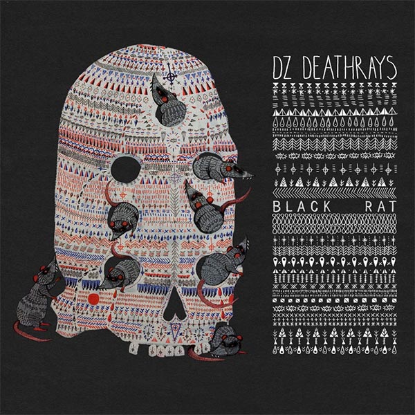
DZ Deathrays – Black Rat (Dine Alone Records Records)
Artwork by Unknown
Ekoplekz – Unfidelity (Planet Mu)
Artwork by Zeke Clough
Design & Layout by Ben Curzon
Sounds by Ekoplekz
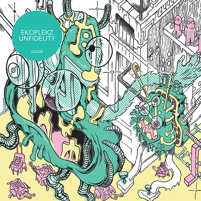
– Zeke Clough, Artist“Zeke is a friend of mine who has done many excellent record sleeves. It was great to finally get him to do one for me! The artwork came entirely from his mind. I had very little input other than offering encouragement and enthusiasm for his amazing work.” – Nick Edwards, Ekoplekz
Flying Lotus – You’re Dead! (Warp Records)
Artwork by Shintaro Kago

Great Pagans – Cupid in Error (Anti-Ghost Moon Ray Records)
Artwork by Oliver King
Sounds by Great Pagans
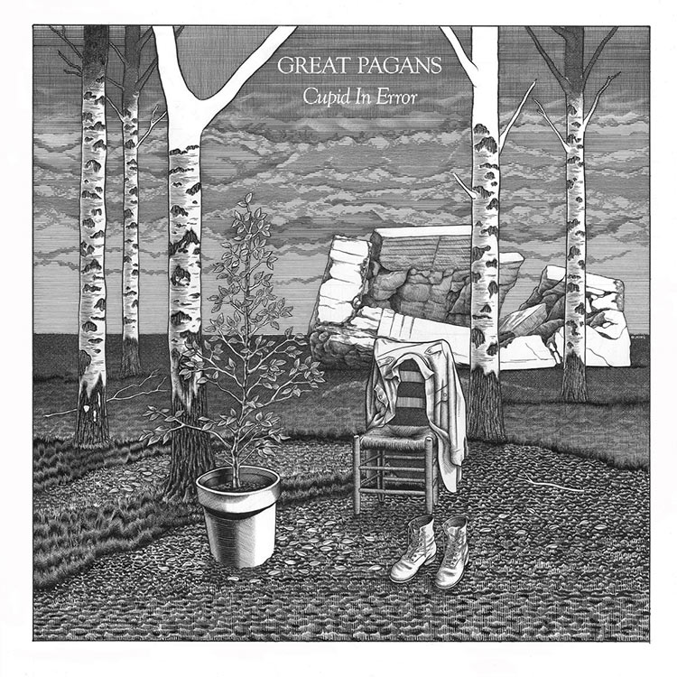
Oliver King (Artist):
Having done the artwork for the band’s debut EP, my initial idea was to make something that served as an explicit continuation of the narrative in that first drawing (right), but after doing some preparatory drawings it became clear that the band wanted something else. This was actually very helpful, as it demonstrated that the band was evolving both musically and thematically, so I decided to create a “mood piece” that would highlight that evolution using the progression of my own drawing as a yardstick: some elements were drawn in the older style of the EP cover and others in the style I had been inexorably moving towards since then which, I hope, creates an interesting tension in the finished image. Needless to say, this became quite a personal piece of work.Alex Painter (Great Pagans):
I’ve known Oliver since we were pretentious teenagers doing our GCSEs and have long been a fan of his art. When we were working on the debut EP, he was the obvious choice. Very kindly, he agreed to work on a cover for the release which incorporated elements of pagan symbolism alongside a nod to Charles Burns, I think mainly to keep me happy. When it came to the album cover, beyond hearing the demos and initial discussions about atmosphere/progression, I wanted him to have a pretty free rein with the project. We’re incredibly happy with the work he created for us.
Great Pagans EP Cover

Hercules & Love Affair – The Feast of the Broken Heart (Atlantic Records / Big Beat)
Artwork by Marianne Vlaschits
Design by Alexander Nuss Baumer
Sounds by Hercules & Love Affair

Marianne Vlaschits (Artist):
“Andy Butler described the upcoming album and that it would have a much darker atmosphere than the previous ones and that there would be a lot of tragedies in it. So I came up with these complicated yet amusing relationships of the caveman-couple you see on the EP, Do You Feel The Same. All the cover artwork I did for Hercules & Love Affair share the same narrative, ranging from intimate moments to an orgiastic island-party. For example, the caveman (or cavewoman) on the Talk To You-cover is talking on the phone with the red haired cave(wo)man on Feast of the Broken Hearts. Besides telling a story, they are representatives of that primal, untamed desire you feel when you’re in love with somebody. The characters all have hairy, somewhat imperfect bodies with no clearly defined gender, to leave an open space for interpretation and identification, and this openness is a huge part of what Hercules and Love Affair is standing for.”We wanted the artworks to look really different to everything else out there on the record market. When you look through the records in a store or on iTunes, everything is very cool, elegant, minimal and mysterious at the moment. We wanted something fun, loud and offbeat. I love working with tacky aesthetics because they create so many contradictory emotions within the observer. My favorite critic for the artwork was by some online-commenter, writing that Do You Feel The Same looks like a terrible ‘Clinton’ greeting card”; that’s exactly what we wanted to achieve!
– Marianne Vlaschits, Artist
HOMESHAKE – In The Shower (Sinderlyn)
Artwork by Salina Ladha
Lettering by Luke Norrad
Sounds by HOMESHAKE

Matt Kivel – Days of Being Wild (Woodsist Records)
Artwork by Max Markowitz
Sounds by Matt Kivel

“Max Markowitz did the art on my last record, Double Exposure, without any guidance. For Days of Being Wild, told him that I wanted green and salmon colors on the art, and his first draft ended up being some really cool line drawings of animals with paper cut outs, but it didn’t seem to fit the vibe of the record. So I told him to just make something more abstract, and that was it! He’s brilliant… I don’t have much business telling him what to do, aside from some very basic concepts or colors I might want him to try… When he paints the album art, he’s listened to the record. I feel like he tries to internalize the music and make something that feels connected to the sound … but maybe not. I don’t know much about his process. I just trust him.” – Matt Kivel
“The images I made were supposed to seem like these living organisms trying to communicate with each other. At least that’s what I was thinking of when drawing them. I knew I wanted to use ink and water color and controlled lines and loose color.” – Max Markowitz, Artist
MONO – The Last Dawn / Rays of Darkness (Temporary Residence LTD)
Artwork by Pat Perry
Art Direction, Design & Layout by Jeremy deVine
Sounds by La Piramide Di Sangue

Taka from MONO expressed a desire to make two albums simultaneously – one with a “lightness, a sense of hope,” and the other “darkness, a sense of despair”. He asked me to art direct and design the project, and I bounced around a bunch of different ideas and mediums for this project before discovering Pat Perry’s work. I knew the moment I saw his journals that he was the one to execute these covers… He was super receptive to my original idea, and I was super open to his interpretation of those ideas. It was really a very easy, fun project to work on together. I’d love to work with him again in the future.
The artwork was started in Oregon, and drawn in various places between there and Michigan. I was driving across the country in a pickup truck while we were working on the project. It’s a 1983 Toyota, and the motor blew up in Idaho. I rebuilt the engine from the ground up in Colorado during the same days I was starting the art for the MONO album. I hate to interject too much of my personal life into it, but I think that travel affected how the art turned out. Doing back-breaking work and jacking the block of a motor in sync with a transmission kept me feeling that drawing is still an escape for me as it always has been.
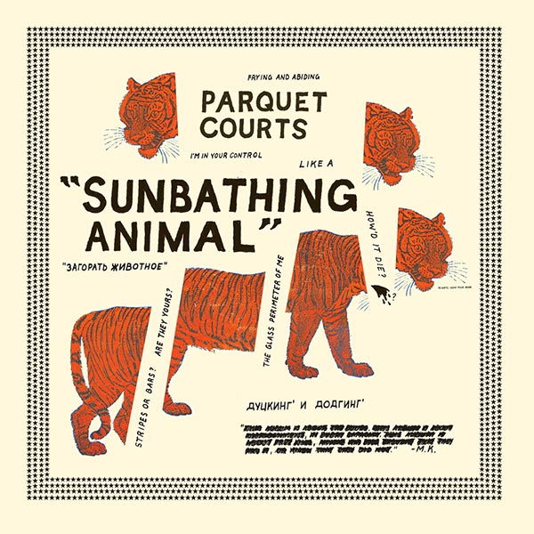
Parquet Courts – Sunbathing Animal (What’s Your Rupture?)
Artwork by Andrew Savage of Parquet Courts
Protomartyr – Under Color of Official Right (Hardly Art)
Artwork by Joe Casey of Protomartyr
Sounds by Protomartyr

“With album or flyer art, I usually have a grand idea that gets ground down by deadlines and the limits of my artistic ability. Having those pressures helps me though, and I am often happy with the unplanned results. With Under Color of Official Right, I had originally envisioned a very detailed drawing of the Detroit skyline as the City of Dis in the style of Gustave Doré’s illustrations for Dante’s Divine Comedy. I dreamed of having that cover with a lot of Caravaggio-influenced drawings representing the songs for the inner sleeve.
So I basically sat around dreaming of this ‘perfect’ cover for months and not working on it. As the full weight of what my daydreaming had concocted came up against reality, I decided it was smarter to fall back what I could actually pull off. The City of Detroit/Dis still exists on the inner sleeve. It was a test drawing I had done that made me realize what I could and couldn’t pull off. I picked the dog for the cover from an earlier flyer I had made because there are a couple of dogs in the lyrics, and I thought the image hearkened a bit to my Caravaggio fascination (beautifully lit characters against a perfectly inky black background). I also figured the red pattern on the dog would complement the bluish cover of our first record, No Passion All Technique. I like to keep the look of the band’s releases roughly unified, and it was art I already had on hand, so that was nice. I do all the art by hand (no computers), so I like the limitation of only getting collage images from whatever old magazine I can find and buy for cheap. I have recently discovered that the image of the dog has been used on other punk records in the past. So I am either continuing a visual conversation that has run throughout music history or some deadline sweating dope that stumbled onto a popular image by chance. Take your pick.” – Joe Casey, Frontman of Protomartyr
SBTRKT – Wonder Where We Land (Young Turks)
Artwork by A Hidden Place

The Soft Pink Truth – Why Do The Heathen Rage? (Thrill Jockey Records)
Artwork by Mavado Charon
Sounds by The Soft Pink Truth
Swans – To Be Kind (Young God Records)
Artwork by Bob Biggs

Available in six different covers.

Todd Terje – It’s Album Time (Olsen Records)
Artwork by Bendik Kaltenborn

together PANGEA – Badillac (Harvest Records)
Artwork by Penelope Gazin
Additional Artwork by Randall Leddy

together Pangea: William Keegan (the main songwriter) was in a 4-year relationship with the artist, Penelope Gazin. In that time, he consistently saw her work grow and evolve and thought that this specific piece fit thematically with the lyrical content and mood of the album… At the same time, aesthetically, it is a beautiful painting.”
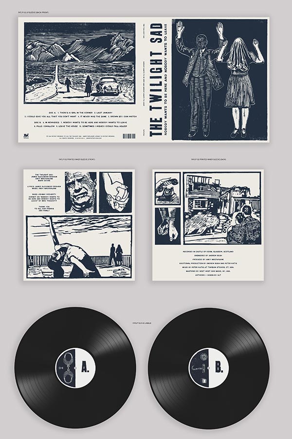
The Twilight Sad – Nobody Wants to Be Here and Nobody Wants to Leave (Fat Cat Records)
Artwork by DLT

DLT (Artist):
Fairly early in the conversations, Andy had indicated that he’d seen some woodcut or linocut images that he really liked, and that he’d like to try using that as a medium for creating the images for the new album. For the last few albums, Forget the Night Ahead and No One Will Ever Know, we’d focused on single characters on the covers of the album, but this time, we’d talked more about going back to the sorts of things we’d been thinking about during the design of the first album artwork… showing relationships between characters, and creating a world for them to exist within.As with all the albums I’ve worked on with the band, again we wanted to be more suggestive with the artwork, rather than revealing a single idea in one image. The band’s music and subject matter of their lyrics can be pretty dark, and people looking at the artwork will always look for the relationship between the images and make up their own minds what it means. If we can just hint at a narrative, I think people’s imaginations will fill in the blanks and make their own version of events as they’re listening to the album.
The main idea I kept coming back to as I was listening to the album was one of a relationship between an unnamed man and woman… so that was something that I thought would be the main focus of the imagery for the album. Something in the narrative of the lyrics reminded me of some sort of couple who were together despite all odds — maybe like some sort of fugitives, like Bonnie and Clyde-type characters.
The illustration I made for the cover ended up almost being a suggestion of the end point, the couple being caught. I wanted to leave it fairly ambiguous I suppose, so people would wonder what they’d be caught doing, maybe. The rest of the artwork could then be illustrations that could be the back story of how they got to that point… I kind of see it almost as if they were single images pulled out from a storyboard for a film, and the album is the soundtrack to that film.


[…] spin. That dynamic is well supported by the album’s cover art, a collage Noah recently told Redefine […]
[…] an album cover he designed for the Philadelphia based band Cassavetes was as picked as part of Redefine Mags“best album covers of 2014”. I thought it was aesthetically pleasing and not much else until I […]
Hey guys, l made that Mansions album art. Thanks for the inclusion! Can you add my name? – Jesse Treece
yes’m! if you have any website or insight to include, feel free to e-mail! huav@redefinemag.com
Cover photo for “To The Top” by Twin Shadow is incredible, I believe Milan Zrnic is the photographer
Indeed!!! An accidental one we forgot to include. Will make a note. Thank you!!