Mixed Media & Collage Album Covers
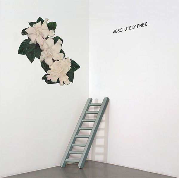
Absolutely Free. – Absolutely Free. (Lefse Records)
Artwork by Absolutely Free.
Applescal – Mirage EP (Atomnation)
Artwork by Hessel Stuut
Sounds by Applescal
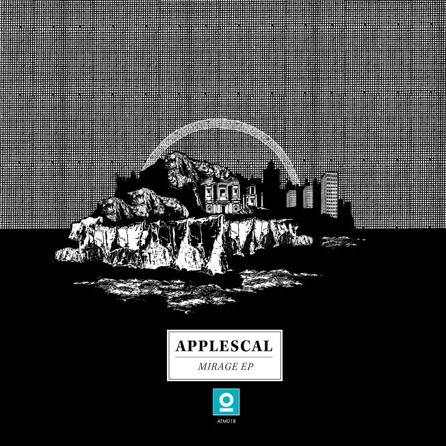
“The briefing was to make something that was kind of a revelation, like returning to some sort of core/soul and realising that is somehow a bit darker then expected. I took [Pascal Terstappen’s] words loosely and tried to make something darkish and kind of sacred. The whole idea was based on a series of drawings I made for the singles released before the Mirage EP. All drawings are impressions of each track, based on the title and the darkish/spiritual vibe from the samples Pascal used on the EP. The final cover is a collage of all drawings, almost like an island appearing as a mirage.
All drawings for the singles were placed on the background pattern, black horizon and a circle — a halo that is always in the background, almost like some sort of surrounding consciousness in which the different landscapes appear. The use of black and white is something I do often, and in this case suited the initial idea Pascal had. I also really like the aesthetic quality of pen drawings accompanied by a minimal amount of colour in typography or other elements. As we both fancy old scientific drawings, I found some inspiration in those, as well as in some Japanese pen drawings.” – Hessel Stuut, Artist
The Cosmic Dead – EasterFaust (Sound of Cobra)
Artwork by Bryan Olson
Additional Artwork by Henri Claudel
Sounds by The Cosmic Dead

Lewis Cook (The Cosmic Dead):
The artwork for EasterFaust was created independently of the music by an American artist, Bryan Olson. It’s unknown to us exactly what inspired or guided the original creation of the image but we’re happy for that to remain a mystery.Julian from the band, who is also an artist, brought Bryan’s work to our attention when we were working on mixing EasterFaust and considering artwork. I think they had been in touch previously, sharing appreciation. When we saw the image which we used for the artwork, we all agreed it would work perfectly. Interestingly, I don’t get the impression that Bryan had any intention of his work being used this way until we contacted him about it…
Initially, it seemed the choice was purely aesthetic in that the imagery tickled our minds in the right way enough to work well with the music, but on reflection, there seems to be a resonance which transcends that initial reaction. In the image, the micro meets the macro where the obvious sense of perspective is confused — something we try to achieve in our music as well. Similarly, the collage technique resonates with our methods of practice on the sonic realm. Where found sounds and segments are included in the production.
Deaf Wish – St. Vincent’s (Sub Pop Records)
Artwork by Tony Garifilakis
Design by Carl Breitkreuz
Sounds by Deaf Wish

– Jensen Tjhung, Guitarist and Vocalist of Deaf Wish
Dear Criminals – Crave EP (Self-Released)
Artwork by Erin Case
Sounds by Dear Criminals
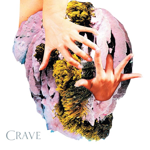
“We were fans of Erin Case’s work we had discovered randomly through a blog last year. From the technique and her style to the textures and colors, we felt like her work could easily represent our sound and the mood we try to set. We asked Erin if we could use this particular image for our EP Crave, not only because it felt close to the themes found in our songs, but also for its provocative/subjective yet soft feel.”
Devon Williams – Gilding The Lily (Slumberland Records)
Artwork by Joel Galvin of Ventral Is Golden
Sounds by Devon Williams
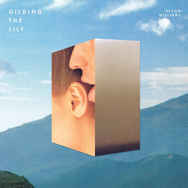
– Joel Galvin, Artist
I had seen collage work by Ventral is Golden, and I got in touch. I told him Gilding the Lily was the name of the album and wanted to follow the theme of perfecting beyond necessity. But I really left it up to him. His first pass of the cover is what became the final cover. For me, it was an exercise of trust. I loved his artwork, so I had to take a step back. We agreed that whatever the cover was it had to have purpose. Something strictly aesthetic to me is 100% useless.
I felt there was an interesting relationship between how we use language in terms of analogy to make sense of the world, words as stepping stones towards human possibility or feeling, and the images we strive to create. For me, it is the disconnect that occurs in between language and meaning where ideas can become most lucid – when attention is not focused on making your way from one side of the stream to the other, but instead on the flow of the stream itself.When we look to communicate, we look towards the conclusion as opposed to enjoying the act. I’m not sure if this comes across in the imagery, but if not, that’s okay too.
Devon gave me a lot of freedom with this piece in terms of visually interpreting the music. However, there was a concept within the music that Devon expressed before the design process began, which helped to gently guide the artistic direction. It was a well-balanced, reciprocal process.
Doprah – Doprah (Arch Hill Recordings)
Artwork by Ryan Achten
Sounds by Doprah

Doprah:
Ryan has been a long-time friend of the band, and there is a lot of mutual creative appreciation between us. It seemed like an organic pairing, and we’re really stoked with how the final product turned out. There was really no collaboration between us and Ryan on the cover. As fans of his art, it made sense for him to have free creative reign.Ryan Achten (Artist):
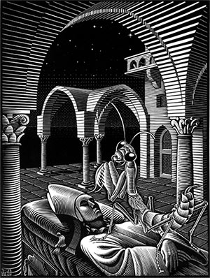
This project was done quite a while ago so I’m pretty vague on the whole process. The conceptual aspect to the project probably began when listening to an early version of Doprah’s upcoming album at the end of last year. The overall theme is intended to reflect the way I interpreted Doprah’s music. I got a pretty psychedelic impression when listening to these guys so I guess that’s how I approached the artwork.The imagery in Doprah’s artwork was largely derived from lyrical cues within Doprah’s music. I remember the children for the subject matter was a decision made while listening to the track “San Pedro” – particularly the opening line, “Mother turn off the light…” The woodcut, “Dreams” by M.C. Escher (right), also helped sculpt the composition.
DoublePlusGood – You Can Master Life (SoHiTek Records)
Artwork by Andy Carlson
Sounds by DoublePlusGood
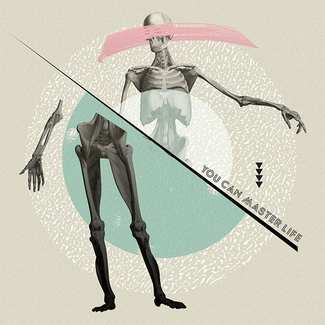
When talking with Andy Carlson, I kept talking about the tone of the record being somewhat sarcastic. We had the idea of collage, and we had some sorta sci-fi inspired pictures. The name of the record comes from an old self help book, and the title sounds so flippant and nonchalant (“You Can Master Life”), we wanted and image that inspired some humor.I think we were sold on the skeleton from the get-go. The artwork was presented to us nearly finished, and we were thrilled with it right away. I think just the juxtaposition of a title like You Can Master Life with this skeleton in this sorta pensive pose hit the right chord… The skeleton seemed to be something that resonated with a lot of people. Our friend Amy Kuttab animated a video for the song “Words Fall Asleep” where skeletons also make an appearance. Cool coincidence.
Erik Carlson put together an art board of visuals he liked, and I drew from them. Specifically, the color palette, historic feel, and photo collage-based compositions. The music also has vibes from the ’80s so I wanted to incorporate that. From there, I just went on my way and didn’t present the work to the band until I felt like it was “done”.
Gentle Friendly – KAUA’I O’O A’A (Fat Cat Records)
Artwork by Lloyd Bowen
Sounds by Gentle Friendly

– David Maurice and Richard Manber, Gentle Friendly
Lloyd Bowen (Artist):
I’ve known David Maurice from GF my whole life and I’d made a couple of videos for songs from their last few records. DM had an idea for the cover based on something he’d seen in a short film, a stack of amps in the middle of a forest, and he’d thought it could look good put together as a collage. I had a go at making that and it looked pretty bad. I had a few other ideas but they didn’t turn out very well. We went on holiday to a cottage in the countryside where the first GF album was recorded and some of the things I was talking about there with David and my girlfriend tied in with things I was getting from listening to their new album. I thought of some pictures I had hoarded away in the stuff I use for making collages and how they could represent what we’d been talking about. Also, the man in blue underwear looks like how I image Rich from GF looks in his pants, so that seemed like a fitting image to use.The cassettes not only seemed like a nice way to present the idea, they’re also a tribute to the way David’s recorded most of his music since he was about 13, and the two sides to a tape fitted with this idea of there being two sides you need to find a balance between that we’d been discussing. I made a vine for each track on the album, based on a one-or-two second loop DM sent me for each song and we put those up online in the run-up to the album getting released. I thought they’d loop more seamlessly than they actually do so the idea didn’t really work, but it gave me a chance to build on the concept behind the artwork and to find ways of using stuff that didn’t seem right for the cover.
I keep going on about this concept without actually saying what it is, but that’s because I’d prefer for anyone who gets the album or watches the vines to be able to put their own spin on what they see. For example, after watching one of the vines, my brother asked me ‘Do you have sexual problems?’ Of course I do, but these manifest themselves outside of the stuff I make. I sent the tapes off with an explanation of how I thought the record should be laid out, so it kind of has two ‘front’ covers rather than a front and a back, and Dave Thomas at Fat Cat Records sorted out the layout, hand-printed the text and photographed it. I should also say thanks to Andy, from the band Sunshine Frisbee Laserbeam, who helped me out with photography stuff when I had to send some examples of how I thought it should look to the band. Good work everybody!
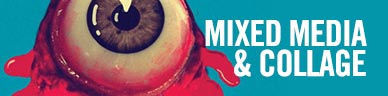
Hundred Visions – Spite (Pau Wau Records)
Artwork by Jaime Zuverza
Sounds by Hundred Visions
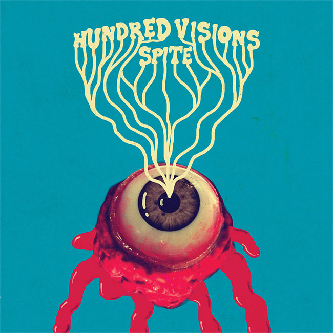
Ben Maddox (Hundred Visions):
Our current record SPITE needed a cover, and I knew Jaime Zuverza was the best man for the job. I had always been a huge fan of the show flyers he’d made for our shows and others and I thought his aesthetic would be the perfect match for the overall theme of the record — kinda dark and funny at the same time. He came up with this design based on a flyer he made for one of our shows.
It’s kind of hard to get deep about a picture of a bloody eyeball but it’s also hard not to get deep about it. The initial idea for the cover came from the expression “cutting off the nose to spite the face”, which is used to describe an act of revenge that ends up hurting you more than the object of your displeasure. The first draft showed the disengaged eye as a cherry on top of a scoop of chocolate ice cream which was presented as a spiteful gift to the offender, but we thought it would be more interesting if we took the scoop out. This left the image more open to interpretation. Did the vindictive person get proper revenge or did they succumb to self-destruction? Who did the eye belong to? Who or what is this resentment directed toward? Maybe it didn’t have to be a person, maybe it could be directed at a god figure or power structure.
An all-seeing eye that has been gouged out and deposed can be a comforting thought to some people since life under the scrutiny of a watcher generally sucks. But even non-operational eyes can exert their influence just like a fake surveillance camera can curb misconduct, like an eyespot on an animal can fool a predator, or like an illusory enemy can be used by a government to create fear. The all-seeing eye can be seen as one of totalitarian oneness, so it’s nice to think that one day it will experience a hundred visions, a hundred epiphanies, and a hundred regrets and leap from the top of the pyramid down 13 stories to its death splat. But this might be wishful thinking because balls are notoriously good at bouncing. If you’ve ever seen pictures of someone’s head squashed under the wheel of a bus or an unrecognizable mound of flesh you’ll know that the eye has the remarkable ability to retain its semblance. Maybe its weasely nature can be owed to its slippery shape and its constant state of lubrication. Maybe it’s best to be in a constant state of lubrication.
– Jaime Zuverza, Artist
The Intelligence – Boredom and Terror Reissue (In The Red Recordings)
Artwork by Erin Sullivan
Photography & Writing by Laura Sullivan Cassidy
Layout by Jun Ohnuki
Sounds by The Intelligence

“When the original CD came out ten years ago the computer was just barely invented, so the art was crudely scanned by Luddites. With the reissuem Jun Ohnuki photographed the original artwork (as well as extra pieces that couldn’t fit in the original budget CD) so glue/shadows/bends/acne really shine. Our photo historian, Laura Sullivan Cassidy, made a collage from the band members and times from that era, kind of a high school yearbook for dropouts.”
I just followed Lars lead on the theme: suburbs, graveyards and government weirdos, boredom and terror. I was living in New York that summer and walked past Ground Zero every day; it was just a big hole at that point. Typographically speaking, I only like generic Helvetica; a poor workman blames his font.I spent that summer collaging in my apartment in New York. We picked up books and magazines we thought were cool; something about these pictures worked for me, and I did a bunch of different images. I always like black and white the best, and… the theme and crude style just seemed to fit with the record perfectly.
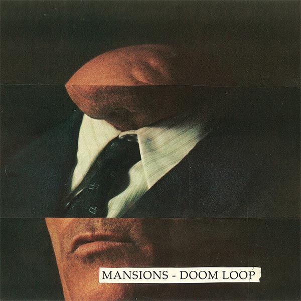
Mansions – Doom Loop (Clifton Motel Records)
Artwork by Jesse Treece
Nick Hakim – Where Will We Go, Pt. 1 & 2 (Earseed Records)
Artwork by Nick Scott
Photography & Creative Direction by Terence Nance
Sounds by Nick Hakim

– Terence Nance, Photographer
Nick Scott came into the whole picture after Terence Nance and I, who live up the street from one another, created this world for these little figurines that I’ve collected and keep around when I make stuff… It was a collaborative exchange of ideas between everyone involved and everyone had an opportunity to bring their own touch.
Nick Hakim came to me with photographs that he and Terrence had constructed, and I decided to mimic the feel of the music by looping and distorting and submerging this diorama inside itself and within a galaxy.
Noah Wall – Print The Legend (Driftless Recordings)
Artwork & Sounds by Noah Wall
Peaking Lights – Cosmic Logic (Weird World)
Artwork by Rob Carmichael of SEEN Studio
Sounds by Peaking Lights

Rob Carmichael (Artist):
We’ve known each other for a while — mostly through social stuff, playdates with the kids, etc., so working together felt pretty natural. We collaborated very closely; they have very strong ideas about the visual direction of their albums, so there was a lot of sitting in the same room and hashing it out, sketching ideas out on paper in real time.
I think it’s pretty fair to say that the artwork is pretty much 100% made up of stuff that has symbolic importance, in one way or another.
Most folks who buy the digital miss out on the back cover and inner gatefold image, which both resolve the complexity of the front cover and add another (inter-) dimensionality to the world we created.

She Keeps Bees – Eight Houses (Future Gods Records)
Artwork by Romain Bardot
Sounds by She Keeps Bees
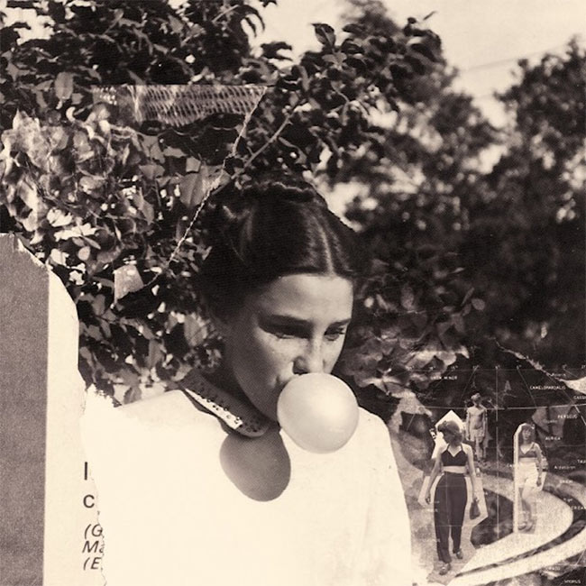
Jessica Larrabee (She Keeps Bees):
Andy and I found all the pictures in an old family photo album at a thrift store in Wisconsin. We fell in love with the girl with the bubblegum; you see her grow up through the photos. We love the idea of taking something old and forgotten and giving it new life. The back of the picture on the cover says “June, 1943”.I’ve always loved collage. It’s how I made the art for all our previous albums, so Romain used my older work as a template. I told him elements of album involved inner power and how you direct it. I’ve been studying constellations and birth charts in astrology as well. He has such an eye for detail and beauty… We met in 2009 when he helped put a show together for us in Toulouse. We had the most magical time. We have been friends ever since.
Small Reactions – Similar Phantoms (Bear Kids Recordings)
Artwork by Guy Maddin
Sounds by Small Reactions


[…] spin. That dynamic is well supported by the album’s cover art, a collage Noah recently told Redefine […]
[…] an album cover he designed for the Philadelphia based band Cassavetes was as picked as part of Redefine Mags“best album covers of 2014”. I thought it was aesthetically pleasing and not much else until I […]
Hey guys, l made that Mansions album art. Thanks for the inclusion! Can you add my name? – Jesse Treece
yes’m! if you have any website or insight to include, feel free to e-mail! huav@redefinemag.com
Cover photo for “To The Top” by Twin Shadow is incredible, I believe Milan Zrnic is the photographer
Indeed!!! An accidental one we forgot to include. Will make a note. Thank you!!