
Nature-Inspired Album Covers
BAPTISTS – Bloodmines (Southern Lord)
Photography by Jillian Mann

Andrew Drury (BAPTISTS):
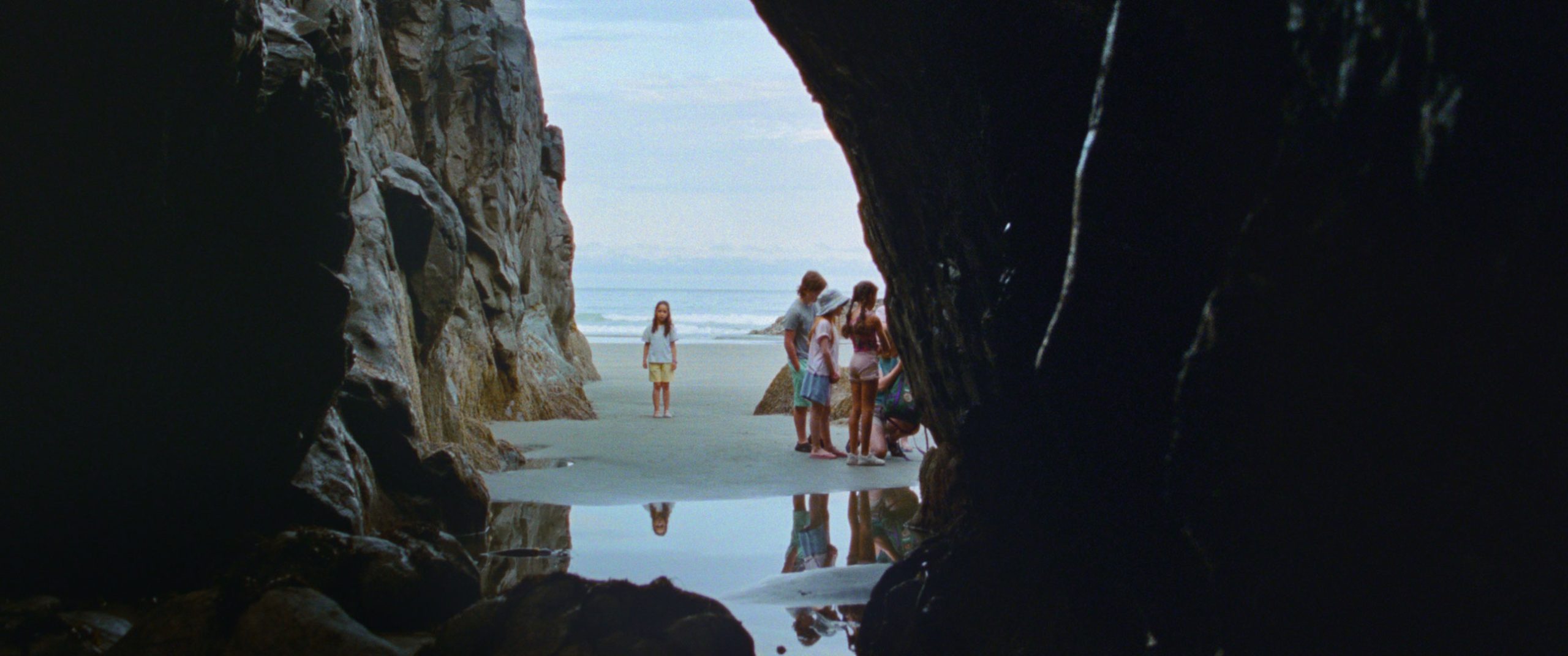
The photographer, Jill and I have been friends for a long time. She shot our last two album covers. Around the time of the photo shoot, I had been hiking in the mountains a lot with my dog. The caves that I had found were (around) a half hour rough 4×4 drive and then a 45 minute hike to get to. Past a certain point on the hike, there is no trail at all. I’ve tried to Google the caves, but haven’t found anything about them online. It was kind of brutal carrying in the costume, lanterns, gear and everything, but once we got there, everything went smoothly…The shots are pretty self-explanatory and don’t necessarily need too much explanation. We had toyed with the idea of having a fallen support beam crushing the miner, but there were so many fallen beams in there, which the more time I spent inside, the more freaked out I got. We got the shot that we were initially going for, and I got the hell out of there.
Fun Fact: “I thought we were going to die together in there and leave a lot of really confused friends.” – Jillian Mann, PhotographerThat whole area is insane! I saw the biggest spider that I have ever seen in that cave. It was literally the size of a tarantula. There are a few small caves within a couple hundred meters of each other around there. I’m pretty sure that they all connect. We had to break down a makeshift fence that was blocking off one of the caves; that was pretty cool.
The massive cave from the inside cover of the gatefold is easier to get to. You can basically 4×4 right up to it. It’s about a kilometre from the little caves. It was filled with freshly melted snow run-off. I put a wetsuit on under my costume and got waist deep for a bunch of shots. That cave is so huge, that it just didn’t look right. I froze for nothing!
There is a lot of logging going on up there right now. The last time I was up there, I saw that they’re starting to plow a road in the direction of the hard-to-find caves. I’m super worried that the caves are going to be easily accessible/findable now!
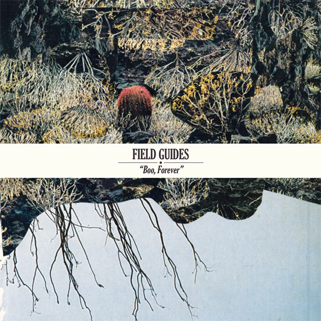
Field Guides – Boo, Forever (Muir Woods)
Artwork by Elaine Winter
Design by Benedict Kupstas of Field Guides
Sounds by Field Guides
Benedict Kupstas (Field Guides):
This band is all about symbolic importance… Both the cover collage and the overall type treatment were inspired by and partially sourced from a ’70s field guide to desert flora. I liked how the muted colors seemed to suit the music; there’s something a little bleak but also neutral enough to allow for an accretion of meaning. We really wanted a design that felt more like a book jacket than an album cover, in part because the songs are a bit loaded with literary allusions. We wanted something that sort of begged to be opened. There’s something that feels arid and warm which I love about the original collage, but I made some color adjustments to bring out the blues and to make that little red cactus really burst. The way Elaine layered and deconstructed and repositioned the imagery is so subtle and has this almost palimpsest quality. It works well with the naturalistic imagery of the lyrics, and plays off the band name in a way that’s not heavy-handed.
HERS – Youth Revisited
Artwork by Unknown
Mimicking Birds – Eons (Glacial Pace Recordings)
Photography by Nate Lacy of Mimicking Birds
Design by Skylar Jessen
Sounds by Mimicking Birds
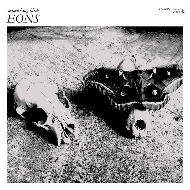
I raised Polyphemus moths (moth species on cover image) during the summer of 2013. During this timeframe, we were also recording our album, Eons. It was somewhat of a nostalgic endeavor for me as my mother and I had raised them when I was young, along with many other types of butterflies, moths, and other insects. I ordered the cocoons from a gentleman in North Carolina the fall of 2012, and wintered them over. The first cocoons started to hatch the following June. One day, I was letting a couple go outside my apartment when a male crawled up near some possum skulls I had set out on a stump in search of a good perch to dry his wings. He proceeded to crawl up onto one of the skulls, and it was then I noticed the eyespots on the wings lining up with skull’s eye sockets. With a light brush, he moved slightly and the eyespots matched up perfectly. I was then able to capture the photograph.A couple weeks later, when a few hatched at once, I set up my camping tent outside and let them loose inside the tent. Overnight, a pair mated and the female laid eggs all over the inside of the tent (paying no attention to the maple bows I had set upright in a vase; usually females will lay their eggs on the underside of the leaves). I collected the eggs and about 10 days later, they hatched. I would bring the caterpillars to the studio, and we would watch them feast as we took breaks between recording. There were about 40 caterpillars total; they all cocooned and hatched late that summer/early fall and were all released.
When first approaching the artwork and layout for Eons, I spent a large majority of time just listening to the songs, not spending any time looking at typefaces or imagining color schemes. The album exists in numerous spaces of mood and tone that push and pull at one another in subtle ways. Through my own experiences with the album I focused on four keywords that I felt built the entire piece. The keywords that resonated with me were: ethereal, but organic, and expansive, yet subdued. These words, and the deeper concepts behind them, led me to explore a wide variety of visuals to help influence color, layout, and type choices. An influence that came out of this visual audit was the work of sculpture Andy Goldsworthy, whose pieces create otherworldly objects out of very worldly materials, much like the sounds I felt while listening to Eons. It was his work that helped influence the monochromatic scheme of the album packaging, enhancing Nate’s great photos to a more otherworldly place.With the typeface used, I looked to something that felt more grounded and human, and settled with Garamond. Garamond is a humanist typeface from the 1500s, meaning it was originally designed to have characteristics of handwriting at the time, and helped me achieve the organic and slightly subdued portions of the mood I was wishing to build. To then take that typeface and create a more ethereal feeling, I set most of the text in white, at as small of a size as I could get away with, allowing for a lot of visual expanse between the text and photos, almost letting it get lost. Through the interaction of the very organic photos taken by Nate, with the monochromatic shades shifting them to more unearthly places, and the small text sitting in vast open space, I landed somewhere close to the feelings I had when first listening to the album.
A secondary part of my process leading up creating the layout was to look at the history of the word “eon” itself, as it shows up on the album multiple times. A point of personal inspiration was finding how the Greek philosopher Plato used the term. Plato used “eon” to represent an “eternal world of ideas” and that this world of ideas exists as other dimensions and realities. The idea that “eon” could represent something as organic as a human interacting with other unearthly realities buttoned up my feelings of ethereal, organic, expansive, and subdued pretty well for me.
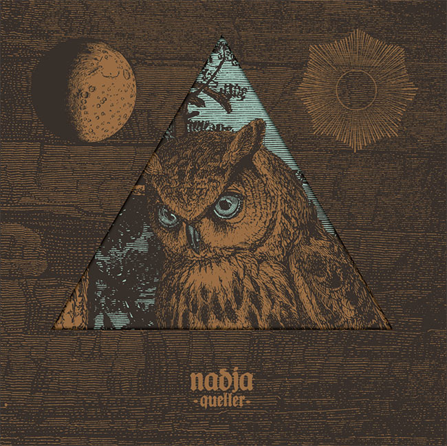
Nadja – Queller (Essence Music)
Artwork by Xavi Forné of Error! Design
Art Direction & Packaging by Uirajara Resende at Essence Music
Sounds by Nadja
Uirajara Resende (Art Direction):
Normally, as soon as I get track previews, titles or the basic theme of an upcoming album, we try to sketch a whole new packaging and artwork direction based on that info. That’s something we love to do, as I’m very picky with the visual aesthetic of our releases, so most of the musicians give us total freedom to create, which is always great. On Queller, Aidan [Baker] had mentioned that “Lidérc” (the third track) is a Hungarian word for incubus or nightmare and, after listening through the album and perusing the actual meaning of the title, I thought that nature and especially owls could be an interesting subject. I’m totally obsessed with these little fellows.Xavi Forné from Error! Design in Spain had caught my attention with his awesome gig posters — some of them featuring old engravings of birds and such — so approaching him to do the artwork was a very natural decision. I had a clear idea and specific direction for the LP packaging (die-cut jacket, fold-out poster-like innersleeve with no text, silkscreen printing, paper weight and color) and after a few brainstorms, Xavi came up with a beautiful artwork to adorn it.
The packaging was completely screenprinted in-house and we had a kinda short deadline to prepare copies in time for a pre-release during the Nadja Brazilian tour that was approaching. All sorts of problems started to test our patience, including inks not mixing due to the hot and humid weather and a visit to the doctor after having an eye hit by emulsion when washing a screen. The LP edition of Queller was definitely one the most “stressful” packagings we ever produced, but it’s a wonderful record, and we are proud of how the whole thing turned out — from mastering to printing.
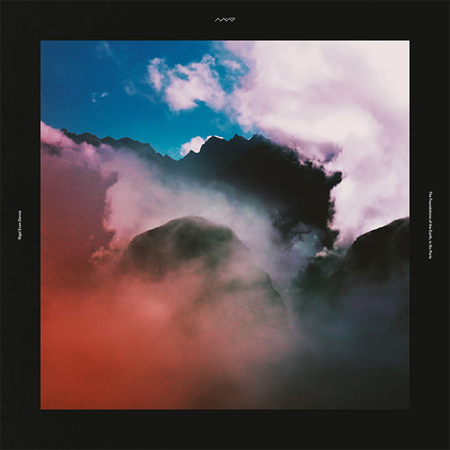
Nigel Evan Dennis – The Foundations of Earth, in Six Parts (Self-Released)
Photography by Mike Brown
Design & Sounds by Nigel Evan Dennis
Painted Zeros – Svalbard (Black Bell Records)
Artwork by Helen Hofling
Sounds by Painted Zeros-

Still Parade – Fields EP (Serve & Volley Records)
Artwork by Cody Cobb

“The concept of the EP was to create music, that brings you to places, where you can be alone with yourself and let your mind flow. A bit like a daydreaming and getting out of your daily routine. And I was looking for a way to illustrate this, without giving it too much of an otherworldly feel.
While I was doing some research, I stumbled across Cody’s work and especially the picture we used for the artwork. It is perfect, because there was everything in there I was going for with the EP. There’s this beautiful photography, but at the same time you have this dream-like quality, which makes it very special.” – Niklas Kramer, Still Parade
Taxes – It Never Ends (Breakup Records)
Painting by Hickory Mertsching
Collage, Design & Layout by Annie Szafranski
Sounds by Taxes

Hickory Mertsching (Painter): “The philosophical idea behind the cover painting is about the life cycle of all living things within the passing of time. In which, once the cycle is completed one returns to the cycle via being engulfed by foliage and organic matter. Hence, It Never Ends.
Annie Szafranski (Designer): “When Taxes told me they wanted me to design this album, I knew I wanted to do some type of collage because the album had been remixed. While listening to the new tracks on repeat, I started duplicating and cropping the image in various ways that were captivating and recognizable. I tried to keep a similar composition to the original artwork, but mostly started piecing it together in a way that the organic shapes all connected to form something new. Eventually it resulted in a nice balance between organic and geometric shapes that looked like they were meant to be together.”
Thug Entrancer – Life After Death (Software Recording Co.)
Artwork by Gretchen Marie Schaefer
Design by Bobby Houlihan
Sounds by Thug Entrancer

Gretchen Marie Schaefer (Artist) & Ryan McRyhew (Thug Entrancer):
Thug Entrancer’s sound and Schaefer’s drawings leave the listener/observer in a tentative, humming space between two poles. Oscillating between the macro and micro, the internal and external, the organic and synthetic, life and death, it made sense to select these drawings for the record. Schaefer’s work evokes ideas of ambiguity, interconnection, and peculiarity. Her work provides beginning points of recognizable natural forms (hair, bone, teeth, wood) but abstracts the forms, never fully completing the identification. Death After Life considers the awareness of now, exploring a desire to be present in the moment while also acknowledging the challenge of existing in this unstable, fleeting, tentative space. The record relates to futurism and contemporary culture, which seems to lack a sense of the present, or at least recognizes the difficulty of being truly in the current moment. All the songs on Death After Life were formed with acute awareness of the present, while simultaneously equally aware of the challenge, even futility, of staying in the moment, especially as incessantly changing time, like death, is inevitable. For both Thug Entrancer and Schaefer, exploration of delicate, unsettled spaces is a constantly moving target.Bobby Houlihan (Designer):
When I came on as the designer, I was given Gretchen’s drawings and Ryan’s finished Death After Life tracks, and the two made immediate sense as a pair. Even though Gretchen’s drawings made a lot of sense for the record, they weren’t made for the record. My challenge was try and keep the integrity of the art intact, and hopefully frame it in a new way that made it actually “for” the record. I guess it’s pretty simple, but the title of the record is Death After Life, the inverse of the popular saying as we know it, so I thought that maybe just inverting the (very fine) line work that Gretchen provided would be enough to make it belong more to Ryan’s music, and vice versa. I think that it worked.


[…] spin. That dynamic is well supported by the album’s cover art, a collage Noah recently told Redefine […]
[…] an album cover he designed for the Philadelphia based band Cassavetes was as picked as part of Redefine Mags“best album covers of 2014”. I thought it was aesthetically pleasing and not much else until I […]
Hey guys, l made that Mansions album art. Thanks for the inclusion! Can you add my name? – Jesse Treece
yes’m! if you have any website or insight to include, feel free to e-mail! huav@redefinemag.com
Cover photo for “To The Top” by Twin Shadow is incredible, I believe Milan Zrnic is the photographer
Indeed!!! An accidental one we forgot to include. Will make a note. Thank you!!