
If you are just joining us, START FROM THE BEGINNING.

#72
All That Remains
For We Are Many
Prosthetic Records
All That Remains vocalist, Philip Labonte, was the conceptual mastermind behind the album cover for For We Are Many. According to illustrator and designer Travis Smith, “He had a specific vision in mind as well as the concept, which was to be a representation of the fact that there’s lots of people in the world. Most walk around blindly, but there are enough to affect positive change.”
Appropriately, the album artwork seems to capture the essence of the Massachusetts-based metalcore band. Equal footing in heaviness and lightness in the artwork seems to mirror the band’s music, which is brutal when it needs to be, but catchy in its accessible hooks.
The creation of the artwork involved photography, combined with digital and traditional painting.
About The Artist
Travis Smith is an illustrator who has done his fair share of album art design; in 2010, he worked with Opeth, nevermore, and Avenged Sevenfold, as well. – www.seempieces.com
Art direction by band member Philip Labonte.

#71
Drum Eyes
Gira Gira
Upset The Rhythm
Most bands we’ve spoken to for this article have found self-creation of album artwork to be the easiest and most obvious route. Sometimes, though, coming to a consensus in a band with multiple people – six, in the case of Drum Eyes – can be difficult.
“Because we all had different opinions on how it was to look… it became quite a time consuming process trying to attain something we were all happy with,” says designer and band member, Kai Wong. “The final result is very different to how it would have looked had I worked on it alone, in a good way, I think.”
“Being an active member of the band and having been involved with the songs since their early incarnations allowed me a pretty good feel for the vibe Shige (DJ Scotch Egg) and E-Da (Ex-Boredoms) were after. Having listened to the songs hundreds of times in some form or another during the writing and recording process already gave me an intimate connection with the songs that an ‘outside’ illustrator wouldn’t have had, for good or bad,” says Wong.
Wong’s initial set of directions was centered around the album title, Gira Gira, which E-Da loosely translated as meaning dazzling or shiny. “Apparently, Gira also translates as a name of God in an ancient middle eastern religion,” says Wong. “[The band members] were quite keen on the idea of the artwork featuring the Japanese gods of wind and thunder, Raijin and Fushin, but we eventually decided the cover should be related to, without being tied to, the music or title, capturing the feel as opposed to being a literal illustration of the concept.”
That idea led to suggestions of temples, the cosmos, and out-of-body experiences, until the band finally settled on a final product, which seems to be a combination of all of these things.
About The Artist
Artwork by Kai Wong, freelance illustrator and graphic designer, and member of Drum Eyes.
The Extras
“On the record and CD, the back is kind of the front and the front is kind of the back. Neither is supposed to be only the front or only the back, and I didn’t actually want to have the name of the band or the album anywhere on the cover,” says Wong. “The ‘other’ side is kind of a garish image of a star partly obscured by a giant skull being beckoned by a couple of disembodied hands.”

#70
Maserati
Pyramid Of The Sun
Temporary Residence LTD
Upon initial glance at the cover of Maserati’s Pyramid Of The Sun, one feels a comfortable sense of mystery. Not mystery of the Jekyll and Hyde variety, but that of a Mayan temple or Atlantis — ancient symbols which represent beauty in the unknown.
For the album cover, Temporary Residence LTD’s founder, Jeremy DeVine, enlisted the help of artist Adams Fuchs. It was a natural extension, as Fuchs is the brother of Maserati’s late drummer, Jerry Fuchs. Pyramid Of The Sun was named after Teotihuacan, a compound of ancient ruins of Mexico, and the cover art seems to subtly address that visually-enticing theme. Fuchs primarily crafted the album artwork in Adobe Photoshop and Illustrator, but made certain to incorporate many personal touches — primarily in the type, which may be the most mystical part.
“I did lots of hand-written type and op-art lettering,” explains Fuchs. “Doing the type by hand meant more to me than finding some basic font. It’s like receiving a hand-written letter in the mail, as opposed to an email.”
About The Artist
Illustration and design by Adam Fuchs, who is also an animator. – www.lilfuchs.com

#69
Flying Lotus
Cosmogramma
Warp Records
Those of you familiar with Flying Lotus probably know that the music of Steve Ellison converts basic building blocks of music and turns them into fully-rendered compositions full of intricacy and delicacy. For Cosmogramma‘s album artwork, Ellison enlisted the help of artist Leigh J. McCloskey, and it became apparent during the collaboration that both have similar paths to creation. Working together was a natural process which spoke to an unseen world — one of order beneath chaos.
“Much like Steve’s remarkable music, my journey as well has been improvisatory and devoted to seeking and listening to the depth of things, rather that just making noise about the surface,” says McCloskey.
Ellison approached McCloskey with a set of McCloskey’s images in mind — specifically, ones from McCloskey’s illuminated book series.
“I had bound these books blank and spent 21 years working on them; there are over 500 hand-painted and drawn images in the books…” reveals McCloskey. “What is fascinating and revealing about Steve’s genius is that he intuitively choose images relating directly to my experiments in visually searching for the basis of music beyond notes…”
Though the images were simply chosen by Ellison, the final design and packaging were much to McCloskey’s delight as well. “The album design is brilliant,” he gushes. “They took my art and created more art, and it is a perfect complement to the genius of Flying Lotus; for me, this all feels like the dawning of an emerging age of collaboration and imaginative renaissance.”
About The Artist
Leigh J. McCloskey is an artist, author, and actor. – www.leighmccloskey.com/

#68
Tobacco
Maniac Meat
anticon. Records
When Tom Fec, aka Tobacco, was asked by Oregon Music News to describe Maniac Meat in one word, he said, “Microwaved–That time when people were all into neon slime and stuff and all the toxic movies. It just fits there.”
Hence, the disgusting portrayal of chow and use of multiple visual styles on the album cover.
Hence, the mash-up of electronic diversity throughout Maniac Meat.

#67
The Silent League
But You’ve Always Been the Caretaker
Something In Construction
With collage as such an accessible artistic medium for just about anyone, musicians are finding that the possibility of creating their own album artwork through exploratory means is becoming easier and easier. Take The Silent League, for example; band members Shannon Fields and Justin Russo collaborated together on the artwork for But You‘ve Always Been the Caretaker by simply sitting at a kitchen table and letting the creative juices flow, without much of a plan.
“For me I just liked the idea of our collaborating on the cover together without the clearest roadmap but [with] a lot of good feelings, the same way the record itself was made,” says Fields.
“It wasn’t all that much of a process really! As Shannon mentioned, we found a stash of Time Life magazines and spent a few hours cutting out things that made us laugh. Then we scanned it all into Photoshop and messed with it until we felt satisfied we had something that looked like the music sounded,” Russo explains. “I think it worked in this case because, musically speaking, Caretaker pulls from a lot of different places as well.”
Such a tactile approach is embedded throughout the artwork, and certainly seems natural when one takes into account attitudes regarding album artwork. As Russo says, “I grew up listening to music with the packaging in my hands, so I think it’s great if more musicians are considering their album’s artwork as an extension of the overall vision and a means to enhance the listener’s total experience. That’s what it’s there to do.”
About The Artist
Collage by band members Shannon Fields and Justin Russo, “two dudes with a dream and a frying pan.” – www.silentleague.com
Fonts and layout by Derek Rush.
Hand-written lettering by Morgan Canizares, Fields’ 6-year-old niece.

#66
Neverest Songs
Small Voyages
Unlabel
There was a time not too long ago when we would play with toys and pretend we were giants. Each object would have a certain feel and smell — that of the rubber of army men or the grain of wood block cars — and each of those feelings and smells were tied to our memories.
The cover art for Small Voyages holds the musk of the past. It displays small, playful things which are arguably children’s toys, in the form of a pseudo-owl head, a Viking boat, and something imagined. It is colorful, yet filled with textures reflecting decay and worn-out innards. It’s a perfect reflection of the music, which carries the same textures. Each beat is haunting and emotional, like an old man recalling his childhood and wishing for a glimpse of it back.
Perhaps the message Neverest Songs tries to get across is that the small voyages we take lead to the larger voyage of living life to its fullest. Or perhaps it is simply showing that we’re all on small voyages somewhere.
About The Artist
Illustration by Luke Twyman, who is also the musician behind the art. – www.whitevinyldesign.com

#65
Violens
Amoral
Static Recital
Violens is yet another band that executes its own visual identity extremely well. With Violens band member Alejandro Cardenas serving as art director, Violens has a design style which combines minimalistic design elements with colorful fine art pieces. For Amoral, the band followed the same set of rules it has used in its previous releases, but gave the artwork a little more room to breathe.
“Since I already make all of the artwork for the band, the album cover has been a topic of conversation almost as long as the record has been in production,” says Cardenas. “We tend to look at the artwork as a panorama, where everything the band has released makes sense with everything else; Amoral‘s cover was a recombination of things we have already used in the past, but arranged for a presence that reads “album,” as opposed to single or EP.”
Violens creates its artwork in an experimental and fun way. The main image featured on Amoral is an old medical print vocalist Jorge Elbrecht located in a junk shop a few years prior, and Cardenas explains the subsequent design process by saying, “We basically sit at the computer together and just play with it until it clicks for both of us at the same time. In a strange way, it’s akin to writing music; it’s like jamming visually.”
About The Artist
Artwork created by Violens. – www.violens.net
Art direction by Alejandro Cardenas, who is the art director and textile designer for a fashion company called Proenza Schouler, and is also an exhibiting artist at James Fuentes LLC in New York. He also directed Violens’ “Violent Sensation Descends” video.

#64
Geographer
Animal Shapes
Tricycle Records
With the band’s last 7″, Kites, Geographer enlisted the help of designer Drew Bennett to create an eye-catching piece of geometric artwork. For it, Bennett had hoped to craft a “concentric spray diamond… on a wall-large scale… in a neon full spectrum,” but budget limitations resulted in a 2-color vinyl pressing rather than a full-color pressing. It wasn’t until the release of Animal Shapes that Bennett was able to revisit this idea, this time with permission for a full-color output. Together with designer Katie Wilson, Bennett went wild with the project.
“The only instruction I remember getting was that [vocalist] Mike [Deni] wanted to move away from the illustrative feel of his first album, and full license was given to Drew (and myself by extension) to make that happen,” says Wilson.
Beginning with Bennett’s “trademark” spray diamond, Wilson went “nuts with dozens of design answers to any given project, from color to spacing and fonts,” says Bennett.
“I started manipulated the color of the various spray diamond rings in Photoshop,” says Wilson. “Then I started manipulated the diamond itself, layering two different diamonds at various transparencies on top of one another. Everything clicked pretty quickly. My only requirement for the type was to be simple and legible, so as to let the art shine.”
Geographer is a electronic band which builds upon textures and synths until a simple note or two progresses into a full-grown explosion of a song. The final album artwork for Animal Shapes seems to feature a diamond that ripples outwards in a cacophony of colors, suiting the band’s music immensely.
About The Artist
Graphic design by Katie Wilson, who creates digital and fine art and works with MAKE Magazine. – www.makezine.com
Design by Drew Bennett, who works with wood and many other mediums. – www.iamdrewbennett.com

#63
Wax Fingers
Self-Titled
Self-Released
Although Wax Fingers’ album cover its self-titled 2010 release seems to only feature one person, it was the result of a huge collaborative effort. “… Unexpected and sometimes amazing things can happen when you bring in outside creativity and perspective,” says Wax Fingers’ Pete Bosack. “My girlfriend, Julie Gliniany, got her nails done and had the guy write ‘Wax Fingers’ on there… The whole thing was kind of a joke. Our friend Steph Lawson, who was also on the acrylic nail expedition, has luscious lips and very much enjoys taking pictures of them. She and Julie decided that we should do a photo shoot involving Julie’s acrylic nails and Steph’s pouty lips.”
The band enlisted the help of photographer Kat Matthews, who donated her talents to the cause. Vibing off the moods of cosmetic ads, the band hoped to capture an aesthetically-pleasing “weirdness [that] could almost go unnoticed or be hidden in plain sight.”
“There we were, one Sunday morning, with some glossed up lips, acrylic nails, fish, eggs, knives and a camera,” Bosack recalls. The resulting photograph is a far cry from the musically-tight and smart compositions found on the disc.
“At first glance it appears to be a cliche ’80s rock album cover, but when you notice the raw fish, it becomes quite discomforting, a little disturbing, bizarrely sexual, and a bit subversive. It’s also kind of beautiful,” Bosack says. “Likewise, I think the music has a lot of hidden elements that aren’t evident at first listen.”
About The Artists
Concept by Wax Fingers and friends. – www.waxfingers.com
Photography by Kat Mathews.
Modelling by Julie Gliniany and Steph Lawson, of the band Pancake Breakfast. – www.pancakebreakfastmusic.com

#62
Blunt Mechanic
World Record
Barsuk Records
Blunt Mechanic is the phoenix project of Ben Barnett. After taking a few years between the dismantling of Kind Of Like Spitting and the creation of Blunt Mechanic, Barnett spent his time teaching children music and overcoming his demons. World Record is Barnett’s first record in years, containing reflections of what he’s learned and experienced during his hiatus. World Record‘s cover is a joyous projection of his new life view.
Colorful characters fill the world, easing a viewer’s eyes. Randomly placed in what could be a park, a colorful array of characters are present, from a “burger chef” to a melting kitty. It is whimsical and light-hearted and reflects the material and stories told by Blunt Mechanic. Illustrator Ian Lynam drew the characters and lettering in sketchbooks while riding trains around Tokyo. He then scanned them in to the computer, traced them, colored the in Illustrator, and put the whole layout together in InDesign.
Through it all, it’s great to see that World Record‘s cover is a hopeful and entertaining one, representative of Barnett’s style. “The characters on the cover are part of a larger world that includes more than a few that Ben Barnett has gotten tattoos of,” Lynam reveals.
About The Artist
Illustration and design by Ian Lynam. – www.ianlynam.com
#61
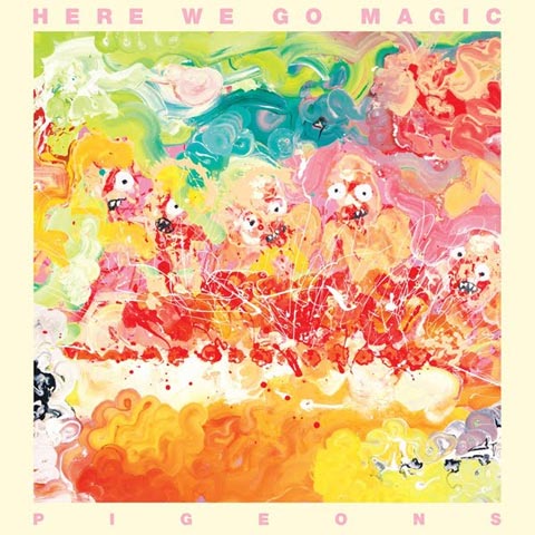
Here We Go Magic
Pigeons
Secretly Canadian
Rising from the bright swirls of paint on Here We Go Magic’s Pigeons seem to emerge demented faces of bug-eyed monsters. Luke Temple, frontman and main mastermind behind Here We Go Magic, created the artwork himself in his mother’s studio in Mexico.
“I just started messing around with different ideas, and that was my favorite,” he says. The piece, created with acrylic paints on a large piece of masonite board, involved Temple placing the board on the ground, pouring paint straight from the can onto it, and swirling it around with his hands.
Ultimately, the image captures a collective band memory.
“During the recording of Pigeons, we lived in a house in upstate New York together,” recalls Temple. “Four out of the five of us really like to cook, so dinner became a very important part of the experience. I wanted [the painting] to look like we were feasting, and it ended up looking more like some cannibalistic frenzy.”
About The Artist
Painting by band member, Luke Temple.

#60
Junip
Fields
Mute Records
Remember when album covers from the ‘60s had symbolism and mysticism? And as far-fetched as some of it appeared, once you heard the music on vinyl, it all made sense? Fredrik Söderberg was able to capture that same essence for Junip’s newest LP, Fields.
Söderberg describes the imagery, stating, “I listened to the record, and I immediately got a feeling of this big nature scene with the volcano. It’s always important for me if I do covers that they have a feeling of timelessness.”
Crazy enough, Fields definitely has that age-defying quality within. With a sound reminiscent of The Eagles and early The Beatles, Junip wouldn’t have been dated 30 years ago, and probably won’t be 30 years from now, either. Söderberg’s use of watercolor is an easy contrast of an archaic medium placed against digitized art. Utilizing the type of arrangement and detail usually found in galleries, his cover art creates the type of refinement and hallowed space you’d expect from a vaulted painting. With “esoteric thoughts and religion [impregnating] everything” Söderberg creates, Fields is a great addition to his works.
About The Artist
Fredrik Söderberg is a professional artist who mostly works with private art galleries and museums, and only takes on commissions for cover art if he enjoys the music. – www.fredriksoderberg.org
#59
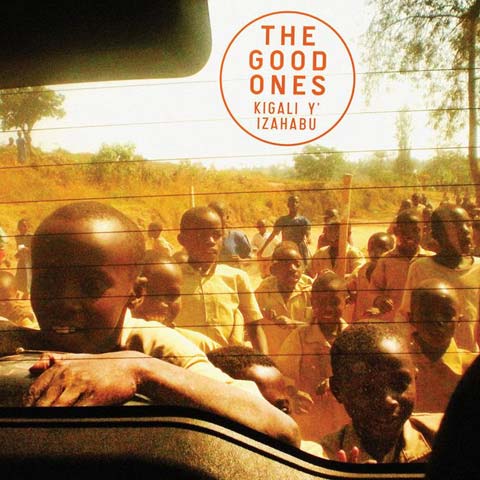
The Good Ones
Kigali Y’ Izahabu
Dead Oceans
In 1994, the Rwandan people found themselves faced with a mass murder that resulted in an estimated 800,000 deaths over the course of 100 days. Dead Oceans signee The Good Ones is comprised of a trio of three Rwandan genocide survivors – just some of many who have left behind a bleak past in favor of a brighter future.
Kigali Y’ Izahabu was crafted in the summertime with a dirth of instrumentation, yet it sounds rich and hopeful. Daniela Delli’s cover photograph captures joyous moments in human existence, and its warm color palette bolsters this feeling. The photograph was taken on a family trip to Rwanda, her mother’s first time returning to Rwanda in over thirty years.
“We were just doing our best to document life as we found it throughout Rwanda — in the city and in the rural areas. The children there are especially moving, and so alive,” recalls Delli. It was clearly a transformative experience full of creative output, for Delli, and for others around her.
“My sister, Marilena Delli, directed a documentary, Rwanda Mama, about the experience,” says Delli. “My brother-in-law, Ian Brennan, discovered the band while we were there.”
About The Artist
Photography by Daniela Delli. – www.rwandamama.com

#58
The Octopus Project
Hexadecagon
Peek-A-Boo Records
Oh, what’s in a name? For The Octopus Project, it’s everything.
On its latest LP, Hexadecagon, The Octopus Project captures exactly what the band is and what it does. The cover art, created by Wiley Wiggins, is a still from the band’s video accompaniment for its live show, which uses 8-channel surround sound and “360-degree panoramic video projections.” And why not? The cover art is a perfect representation of what you can’t get from simply looking at this album artwork. The Octopus Project’s live shows are such a visual and musical spectacle that both static image and recorded version of the band’s music do no justice to them.
“The LP cover is from the video accompaniment to the final song on the album, ‘Catalog’. The video used repeating spirograph-like patterns adapted from the early computer graphics experiments of John Whitney Sr.,” Wiggins explains. “As the song climaxes, the video builds the repeating rosettes of moving points up into an explosion of swarming, colorful daubs of what almost look like paint.”
Wiggins chose a moment from that sequence, blew it up, and cropped it to fit as a square album cover. But he stayed true to the video, opting not to edit the image further than that. “Initially, we reworked the image to remove visual artifacts from the resizing,” Wiggins admits, “but in the end, we found we liked having a certain level of ‘crunchiness’ that connected the image back to the video.”
With music that is about symmetry, balance, and multiple levels, both the band name, The Octopus Project, and the album title, Hexadecagon, are perfectly represented and underrepresented by this cover. Go out to one of their live shows to see what The Octopus Project is all about.
About The Artist
Wiley Wiggins is close friends with the band; he has created the video sequences for their live shows, off and on, for the past six years. He is also a video artist, web designer, performer, and is involved in the independent game scene. – www.wileywiggins.com
The Extras
“The gatefold image of the LP (and the cover of the CD) use another image from the video accompaniment to the show,” describes Wiggins. “The image of the two little girls dressed identically, reflected in carnival-mirror pairs, is from the song ‘Hallucinists.'” You can see a one-screen version of the video at http://wileywiggins.com/hallucinists/.
#57
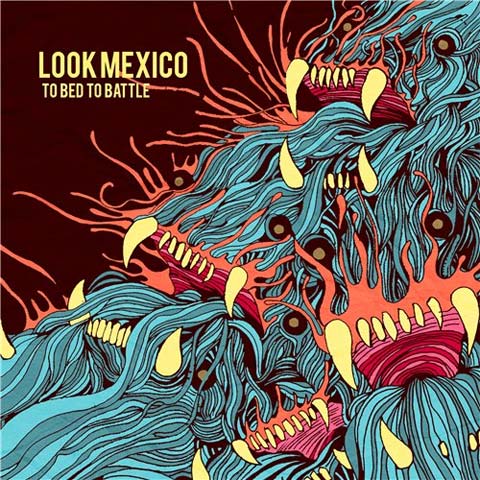
Look Mexico
To Bed To Battle
Suburban Home Records
The cover artwork for Look Mexico’s Gasp Asp EP, which came out in 2008, was so visually enticing that, according to designer and artist Joshua Mikel, “… a lot of folks seemed to like [it], [and] a few even got tattoos…”
And when a band’s album artwork is so well-received, it’s only natural that there might be a bit of pressure for its next release to be just as visually appealing. As Look Mexico’s former drummer and long-time designer, the success of Gasp Asp‘s cover gave Joshua Mikel a wee bit of self-imposed pressure when it came time to design the artwork for To Bed To Battle.
“I was constantly feeling like I needed to design something that stood up to that piece. I had also started to think of the band’s “brand”, which is something I hadn’t really considered in a lot of my previous work for the band,” says Mikel. “I wanted folks to recognize it as a Look Mexico album just from the artwork, in the same way I remember seeing Hot Water Music cover, or more recently, an Okkervil River or Decemberists cover, and knowing who was responsible before even picking it up.”
Using a blend of hand illustration and digital colorization, Mikel’s piece for To Bed To Battle shows a blue and orange monster baring its teeth to the world. And though it may seem unlikely, the image does symbolically represent the album’s music. Mikel explains the thought process, saying, “I wanted to give a sense of what [people could] expect from the record. We had started embracing more straight-forward songwriting, but there were definitely some teethier tracks mixed in on the record. So, to give a sense of that flow we were finding in our new stuff, I went with those watery veiny calm blues and then tore them up with those literally teethy monsters. I also chose to go with a warmer color palette to keep the feeling of the piece a bit brighter.”
About The Artist
Joshua Mikel is a multi-disciplinary artist who runs Sharkguts Design. He has also created music videos for Look Mexico, and is working on one for Ninja Gun. – www.facebook.com/sharkgutsdesign + www.behance.net/joshuamikel

#56
The National
High Violet
4AD
As The National’s High Violet was one of 2010’s critically-acclaimed albums, it seems fitting that the lofty artwork of Mark Fox was used on the album’s front cover. Fox creates intricate mixed media paper sculptures hinged together with linen tape, his sculptures growing out of and invading rooms with their sheer magnitude and creative power.
About The Artist
Sculpture by Mark Fox, a sculptor, fine artist, video artist, and performance artist. – www.markfoxstudio.com

#55
Munch Munch
Double Visions
Upset The Rhythm
Munch Munch’s album artwork for Double Visions takes the idea of “double visions” and runs with it. As an experimental electronic pop quartet, Munch Munch might be better suited for other album covers, but the image is captivating nonetheless.
“The band had a very clear idea of what they wanted and had already picked out stuff that I’d already done. I was very reluctant, as I would have much preferred to do something original for the release,” says artist James Hines. Although Hines created twenty varying treatments for Double Visions, Munch Munch ultimately returned to an original image the band members had seen.
“If I’m being perfectly honest, it was a very frustrating process,” Hines admits, “but the band is happy, so that’s great.”
The collage materials come from a book about the Kennedy family. “[It] had some great shots of John and Jackie and family having fun at Cape Cod,” he says. “I really didn’t want to cut up this beautiful book, but I could see there were some good images for collage, so eventually, I took the scalpel to it.”
As a former record store employee, Hines is adamant about the role good artwork plays in album sales.
“I think it’s is very nearly as important as the music, and if you can give it that extra bit of something, like some nice spot varnish or a really nice card stock, it could be the difference between someone buying the LP or downloading it for free,” Hines says. “I’m totally guilty of it; I will hesitate or often not even buy a album if I don’t like the artwork, even if I know that the album is good and I actually want to own the record. I only buy vinyl, and I’m one of the dying breed of people who still objectify and pay for music. It’s a shame that music is seem as almost valueless these days.”
About The Artist
Collage by James Hines, a multi-disciplinary artist who “[doesn’t] want to be limited to one thing.” “I like to adapt, and if there is a technical obstacle getting in the way of an idea, I will try and remove it — whether that is through collaboration or learning how to use something like a fancy camera or some Photoshop wizardry. I’m a mature student at art college, and I’m still learning new things everyday, so I don’t want to focus on one area in particular. That freedom to experiment is something that I’m not keen on losing any time soon.” – www.jameshines.blogspot.com


[…] I had the distinct pleasure of designing album art for the San Francisco indie rock band, Geographer. Kites, a limited-release LP, came out in 2009, followed by Animal Shapes (EP) in 2010. Both covers centered around a triangle spray pattern created by my friend, Drew Bennett, that I then digitally manipulated and colorized. It was a fabulous collaboration that was included in Redefine Magazine‘s Most Notable Album Covers of 2010. […]