Another year of our favorites in Top Album Cover Artwork, and once again, we interview musicians and artists on the often-underappreciated work that goes into creating a product that not only tickles your ears, but speaks to your eyes and hearts. Album artwork, though often only viewed on tiny screens in this day and age, is indeed a long and laborious process that we love to give its due credit.
So read on, and choose your own artistic adventure:
> Digital & 3D Album Covers
> Fine Art & Illustration Album Covers
> Mixed Media & Collage Album Covers
> Photography & Digitally-Manipulated Album Covers
Digital & 3D Album Covers of the Year 2015
Amon Tobin – Dark Jovian (Ninja Tune Records)
Packaging & Design by Alexander Brown
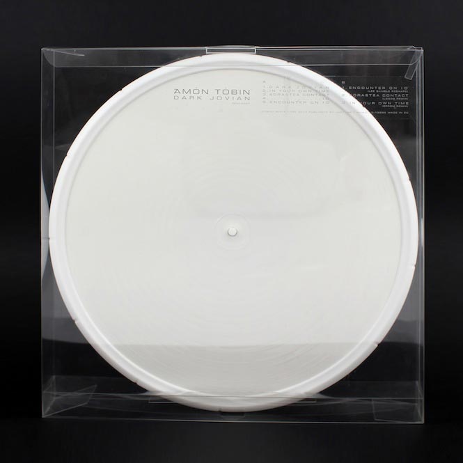
A limited edition Record Store Day release, distributed as a set of two single-sided heavyweight 180g white vinyl 12″s with etched markings, encased in a white, branded, rubber wheel and housed in a transparent plastic box, designed by Alexander Brown.
Amorphis – Under The Red Cloud (Nuclear Blast)
Artwork by Jean-Emmanuel Simoulin
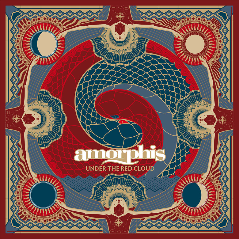
Jean-Emmanuel Simoulin (Artist):
This artwork is a distant evocation of a thematics based on threat. Threat of fate, threat of destiny, threat of the End itself. It represents the sacrifice, brother killing brother, under the observation of the unstoppable power of time (represented by the four seasons, surrounding the whole scene).
I simply got contacted by the band’s manager, like it almost always happens with bands of that size.
The funny thing is that I was a fan of Amorphis since I was 16, in the mid-‘90s. The first time I saw them live might have been as early as 1996; they were playing in a shitty club in Paris, and the sound was horrible. Second time I saw them was last month: biggest indoor arena in France, and they played in front of 15,000 people. I guess we both managed to find our place in life and managed to do alright.
When I was working on the artwork, I really insisted on using their old ‘90s death metal logo –being a real pest – for I had a strong nostalgia related to this logo. Unfortunately, I pathetically failed 😀
Ben Zimmerman- The Baltika Years (Software Recording Co.)
Design by Bobby Houlihan
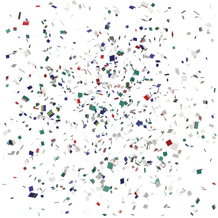
“Ben [Zimmerman] made all of this music with Radioshack’s Tandy computer at home in Bay Ridge, Brooklyn, throughout the ’90s. It’s pretty amazing music considering his constraints (technologically) and is equal parts modern classical, experimental noise, drum n’ bass, and whatever else. It’s nuts. F or this art, I reconstructed in Illustrator the three Tandy software interfaces that Ben used to make music, and then deconstructed them into various compositions. All the colors used are to spec for what he would have been seeing on screen, and all the type is organized to reflect the user interface and visual hierarchy from the Tandy computers of that time.”
The album cover is an “explosion” of several abstractions of screenshots from the Deskmate programs I used to make my album. The artist, Bobby Houlihan, stripped down the images of meaning by eliminating text and parts of the score (i.e. clefs, time-signatures, tempo and notes). However, he did include the staff lines and the Deskmate color scheme. When I look at the cover, I can get a sense of the design of Deskmate; its nuances, like the shape of dialogue boxes and buttons – i.e. the general layout of this – [is a] precursor to our modern day operating systems.
NOTE: “The video for ‘Pausebreak 1’ contains only the source material used for the album cover. In the video you can see some of the elements in a more dissected form.” – Ben Zimmerman, Musician
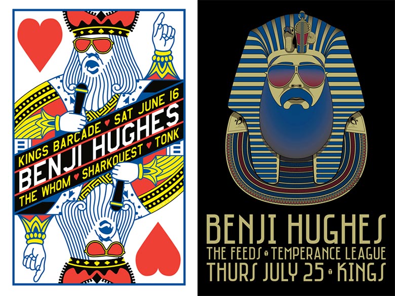
Benji Hughes – Shark Attack” b/w “Mama, I’m a Zombie (Merge Records)
Design by Mark Elmore
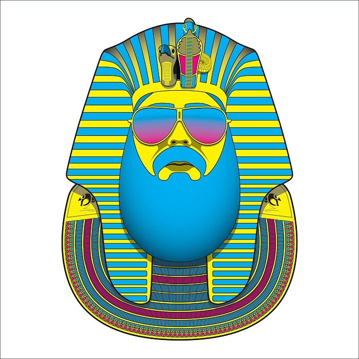
Mark Elmore (Artist):
I created the design, Tut Uncommon, as a gig poster for one of Benji’s shows at Kings Barcade, in Raleigh, NC. I had previously portrayed Benji as the King of Hearts on a poster for an earlier show at that venue, and wanted to continue the ‘Kings’ theme with this one. After toying unsuccessfully with a take-off of the famous portrait of Henry VIII, and then a King Cobra, I hit upon using King Tut. The hardest part was translating his beard into something that matched the stylized geometry prevalent in Egyptian design. It ended up rather looking like a scarab, or one of Yul Brynner’s headpieces from The Ten Commandments.
NOTE: I’ve done gig posters for Benji for the past seven years, for his shows at various venues in North Carolina. He has always been supportive of my work – and the creative freedom he has afforded me, has made it possible for me to design some of my strongest pieces.
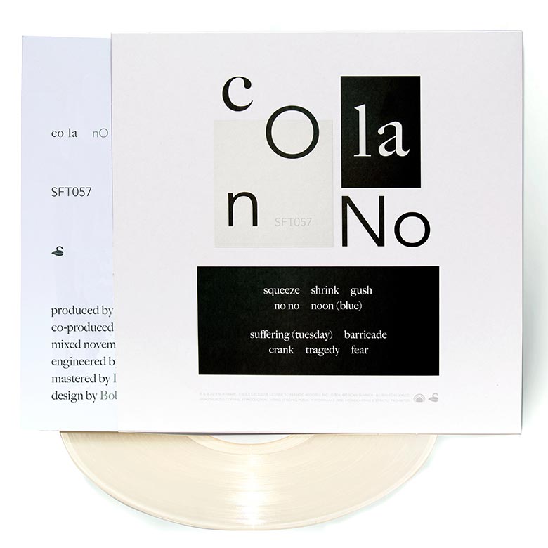
Co La – No No (Software Recording Co.)
Design by Bobby Houlihan

CRYSTAL – Crystal Station 64 (flau)
Artwork & Music by Keita Onishi and Sunao Maruyama of CRYSTAL

CRYSTAL:
 For the cover of our first EP, we used a strange image of CD held by a bizarre hand. And it became like a symbol of us. So we choose the image of the CD for our first LP cover. We considered using Laserdiscs instead but it seems hard to let the people understand “oh it is Laserdisc!” at first glance within the size of the package of CD.
There are three CDs because we are three. We tried to create interesting formation of them but it was difficult… So we put each CDs at the same positions as each our heads are at on the band portrait (The portrait is on the booklet). Then, it turned to a very artificial, unusual formation and we like it a lot.
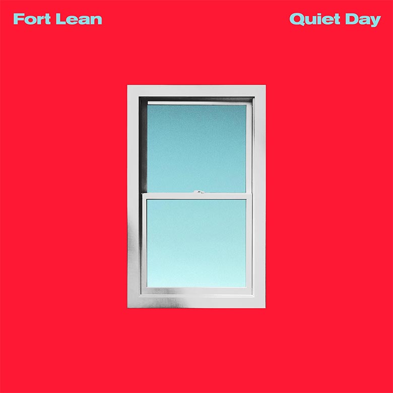
Fort Lean – Quiet Day EP (Ooh La La/Caroline Records)
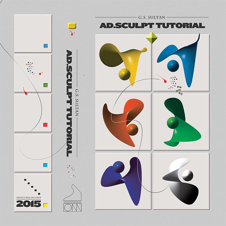
G.S. Sultan – ad.sculpt tutorial (Orange Milk Records)
Sounds by G.S. Sultan
Artwork by Keith Rankin of Orange Milk Records
Keith Rankin (Orange Milk Records):
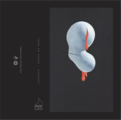 The way I described the G.S. Sultan album was “digital modern avant-garde MaxMSP pointilism”, which is a very specific sound which I thought the art had to mirror. Everything I was doing tied back to that theme and the imagery it invokes.
I think the artist asked for something similar to the Jung an Tagen art, which is another Orange Milk album from earlier in the year. That piece is a simple white painted shape on a black background, it’s really minimal, but multiple musicians have asked for something similar. I understood the request as the artist wanting a minimal understated piece that evokes a sort of clinical or neutral feeling. But honestly the music alone suggested such a specific visual that I didn’t really need additional direction.
I think that I associate color palette with harmonic content a lot of the time. This G.S. Sultan music was more about timbre than harmony, so the base color needed to be a neutral grey with the bright colors representing momentary bursts of harmony. Maybe that’s a cliché or simplistic way of color coding? It’s just a way to mentally organize what I want to achieve while listening to music.
The Galleria – Calling Card (Environ Records)
Art Direction & Design by Drew Heffron
Photography by Nate Dorr

Drew Heffron (Artist):
The album cover is a graphic simplification of a revolving door, typically found at shopping malls such as The Galleria, a shopping center my parents frequented when I was young… Initially, the cover was going to be a photo of an old abandoned American mall, but we landed on this because it felt right.
This cover was an unexpected production challenge — probably made more difficult by me sending a 1990s .bmp file to be ripped by the printer for one-color Pantone printing. (Hey, gotta stay true to the music!) I wanted it to have that kind of halftone effect when printing — not totally solid.
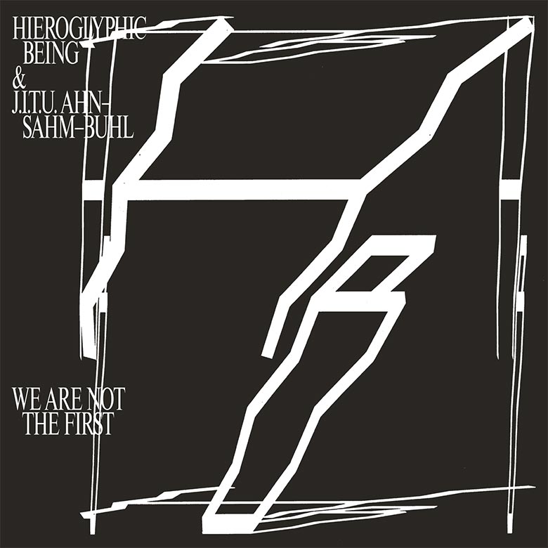
Hieroglyphic Being & J.I.T.U. Ahn-Sahm-Buhl – We Are Not The First (RVNG Intl.)
Artwork & Design by Karisa Senavitis and Kevin O’Neill of Will Work For Good
Hot Flash Heat Wave – Neopolitan (Self-Released)
Artwork by Ted Davis of Hot Flash Heat Wave

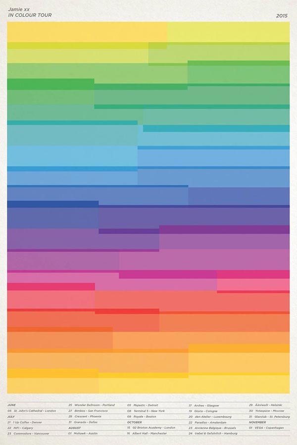
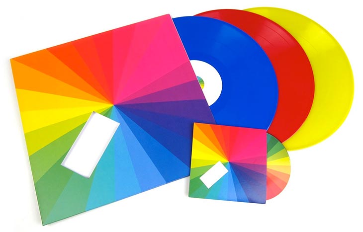
Jamie XX – In Colour (Young Turks)
Artwork & Design by Jamie Smith & Phil Lee

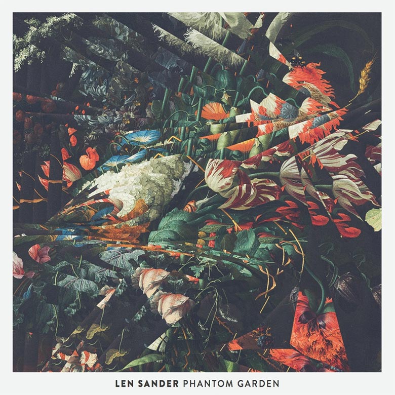
Len Sander – Phantom Garden (Mouthwatering Records)
Lightning In The Twilight Hour – Fragments Of A Former Moon (Elefant)
Artwork & Design by David Duprez and Luis Calvo of Elefant

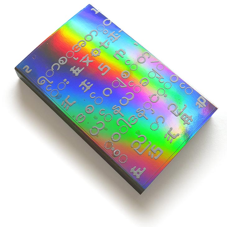
Matthewdavid – Mindflight – Ashram / White Rainbow – 21 Exoticism (Leaving Records)

Limited edition of 150 cassettes with hand-painted shells and rainbow reflective OCard.
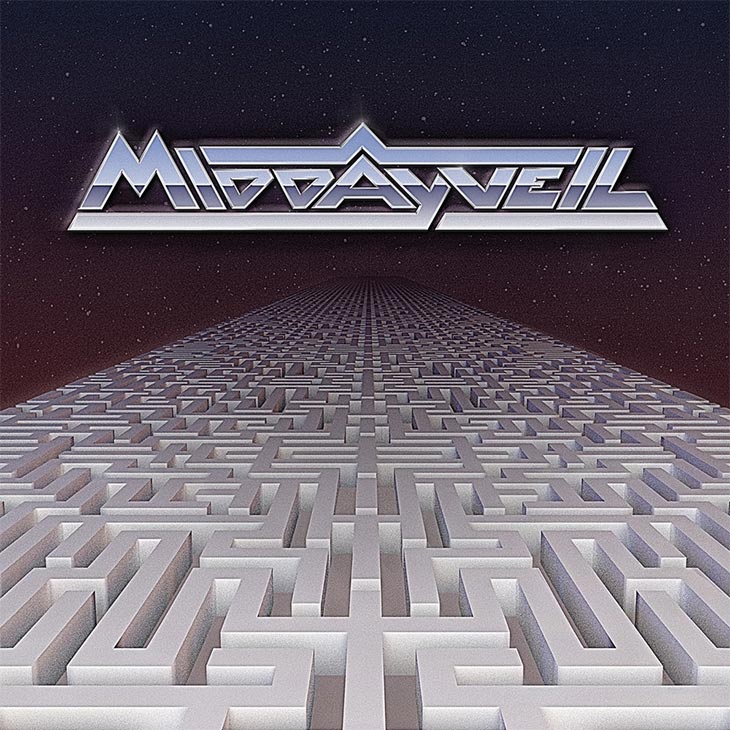
Midday Veil – This Wilderness (Translinguistic Other)
Artwork & Design by Emily Pothast of Midday Veil
3D by Jordan Rundle
Additional Design by David Golightly of Midday Veil
Emily Pothast (Midday Veil):
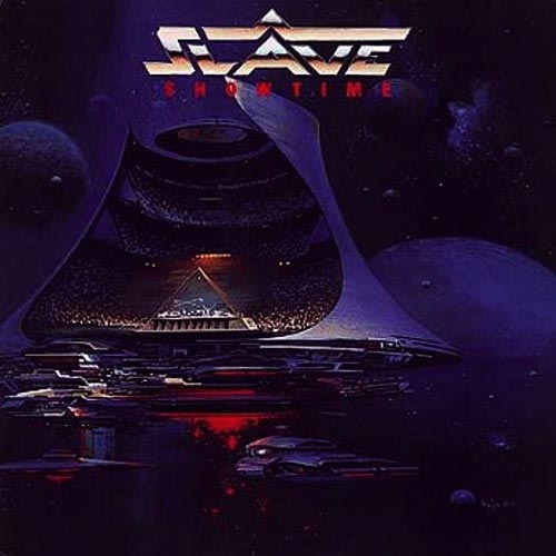 The first thing I did was that chrome text. Hopefully this doesn’t kill the mystique, but I was inspired to make that logo based on the cover art for Slave’s Show Time.
The maze element was something that developed more gradually. (I’m a notoriously slow, meticulous worker). I wanted to convey something related to the themes of the album — specifically about the things that human beings build because they’re useful, but quickly become alienating. Early incarnations of the idea were more like a Tower of Babel before I decided that on that labyrinthine Highway to Nowhere, which gets more at the way it feels to me like our culture is headed. An inorganic, manufactured order with no point, that still manages to have a strange, apocalyptic sort of beauty.
The title, This Wilderness, is taken from the lyrics of the song “Babel,” which is about these systems that we build, and how there is a kernel of self-destruction implicit in our impulse to devise written language and build civilizations and so on:
this wilderness amazes me
but covers me with shame
when I aspire to codify
the thing that has no name
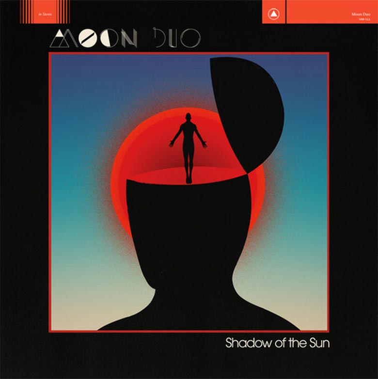
Moon Duo – Shadow of the Sun (Sacred Bones Records)
Artwork & Design by Jay Shaw
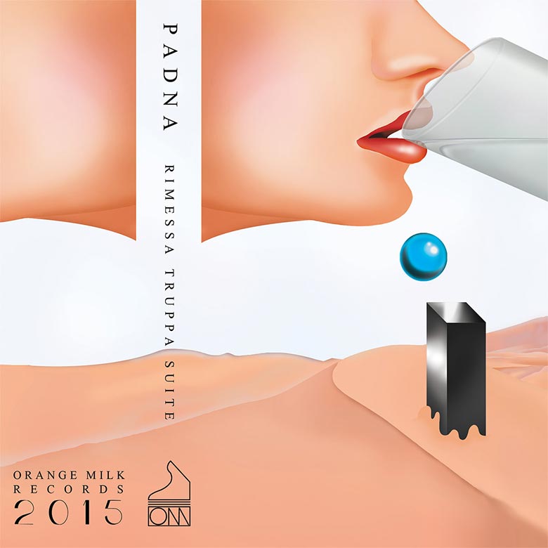
Padna – Rimessa Truppa Suite (Orange Milk Records)
Sounds by Padna
Artwork by Keith Rankin of Orange Milk Records
– Keith Rankin, Artist & Founder of Orange Milk Records
Panda Bear – Panda Bear Meets The Grim Reaper (Domino Records)
Artwork by Marco Papiro
Illustration by Hugo Olivera
Layout by Rob Carmichael
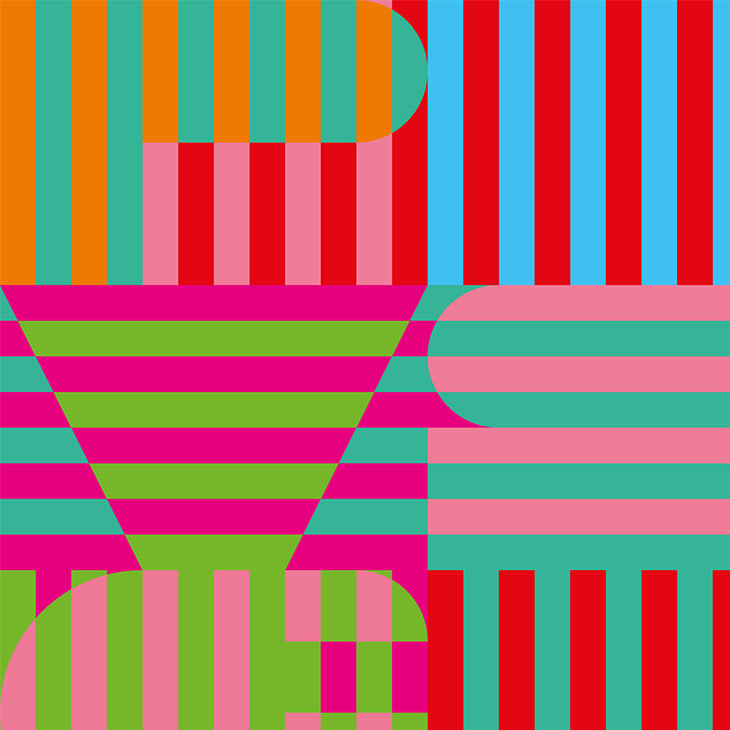
Marco Papiro (Artist):
I’m not sure about earlier conceptual thoughts, but at the time of my inclusion, Noah [Lennox] was already spinning around the letters P B V S G R (Panda Bear vs. Grim Reaper). I had designed a poster for Panda Bear a couple of years earlier, so he knew about my work with typography, specifically with letters — thus it seemed natural to use the same method; the letters trigger a grid, basic form,s and rules for an arrangement. After that, it’s trial and error, and once a system is established; the design becomes largely self-generated, and the main work is checking out the variations. It’s very intuitive, like a game really, ruled by reduction, causality and chance.
When I start, I never know how things will eventually look, and this unpredictability is one of my main incentives. I’m still amazed by the multitude of possible variations. I know I’m finished when I feel a certain vibrant sound or rhythm when looking at my work.
Rémi Parson – Précipitations (Objet Disque)
Artwork & Design by Rémy Poncet of Objet Disque
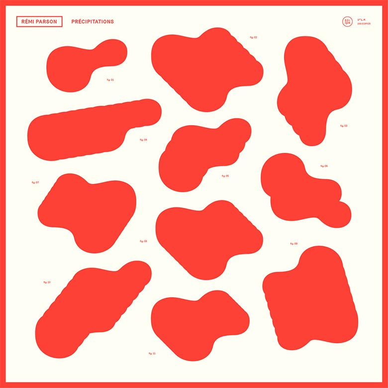
Rémy is the mastermind behind both Brest Brest Brest and Objet Disque which is great as I really like the idea of a label with a strong and cohesive aesthetic. I didn’t want/need to give him any direction and the first project he showed me was the one for me. Spot on.
First, listening to the album, I had a very simple desire to work on something conceptual, a sort of variation on a theme. The cover is built on a simple grid. I’ve only used one shape – the one in the top left corner of the cover, which I duplicated or pasted, turned and moved around… to obtain a series of shapes. I had this feeling that it was close to the process of creation of the record. Something as elaborate as raw. Strangely, working on this cover was a very quick process. I was in phase with the record. I also liked the idea of something organic and digital, mixing hot and cold.
Seabat / Lucky Dragons – Special Effect (Vestibule)
Design by Eric Timothy Carlson
Art Direction by Peter Burr

Peter Burr (Art Director):
I worked very closely with Seabat and Lucky Dragons throughout the process of developing Special Effect. While I was working on this script, I was thinking a lot about language as a musical instrument. Lucky Dragons were investigating these aural illusions that the psychologist Diana Deutsch has researched, which relates to minimalist music in terms of creating sound objects that you can step into and out of, understanding them as concrete or abstract or full of meaning. So these compositions became sequences in the performance that I would actually perform with. Representing another side of the project, Seabat drew direct inspiration from the history of Soviet science fiction, especially with the work of Eduard Artmiev, who composed the music in Tarkovsky’s Stalker. I had been working with Seabat prior to this collaboration and as Special Effect began forming in my head, I noticed a common thread in Seabat’s work. As part of the project, I was spending weekends camping in abandoned resorts across upstate New York’s Borscht-Belt and shooting footage of these pregnant ruins. At that time, John Also Bennett from Seabat had just returned from the former Soviet Republic of Georgia, where he had been doing his own explorations of abandoned realms — old Soviet hydro-electric plants, ancient castles, and abandoned hospitals across the Georgian countryside. These parallel explorations mirrored the tone of Stalker in a great way, laying the foundation for our collaboration.
Upon establishing the conceptual intent of the packaging and the elements through which it would be addressed (the interactive sleeve and graphic motifs from the film) I worked with the artist Eric Timothy Carlson to compose the typographic layout and finalize the design for print. Carlson is a frequent collaborator of mine, has extensive experience designing album art, and has a sound understanding of both the work’s intent and aesthetic — all of which allowed a natural and intuitive collaborative process. John [Bennett, who as well as composing music as Seabat, runs Vestibule] was also working at Brooklyn Phono at the time, giving us direct access to the process in which the object was being created, and allowing us all to be as hands on as possible.
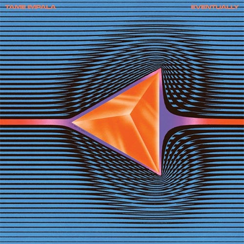
Tame Impala – Currents (Interscope Records)
Concept by Kevin Parker of Tame Impala
Artwork & Design by Robert Beatty

Robert Beatty (Artist):
“Kevin Parker of Tame Impala came to me with lots of scientific images of fluid dynamics and vortex shedding. Kevin related these images and processes to the themes of the record, the chaos of change and transition.
I had no idea what to expect, but I knew Tame Impala had a devoted fanbase. That said I definitely had no idea things would go this far. I was on tour om the West coast this past August and would see posters and billboards for it everywhere I went, and it ended up being featured in a commercial for the new Apple TV. The response has been very overwhelming at times.”


[…] http://www.redefinemag.com/2015/album-covers-of-the-year-2015/ […]